HOME | DD
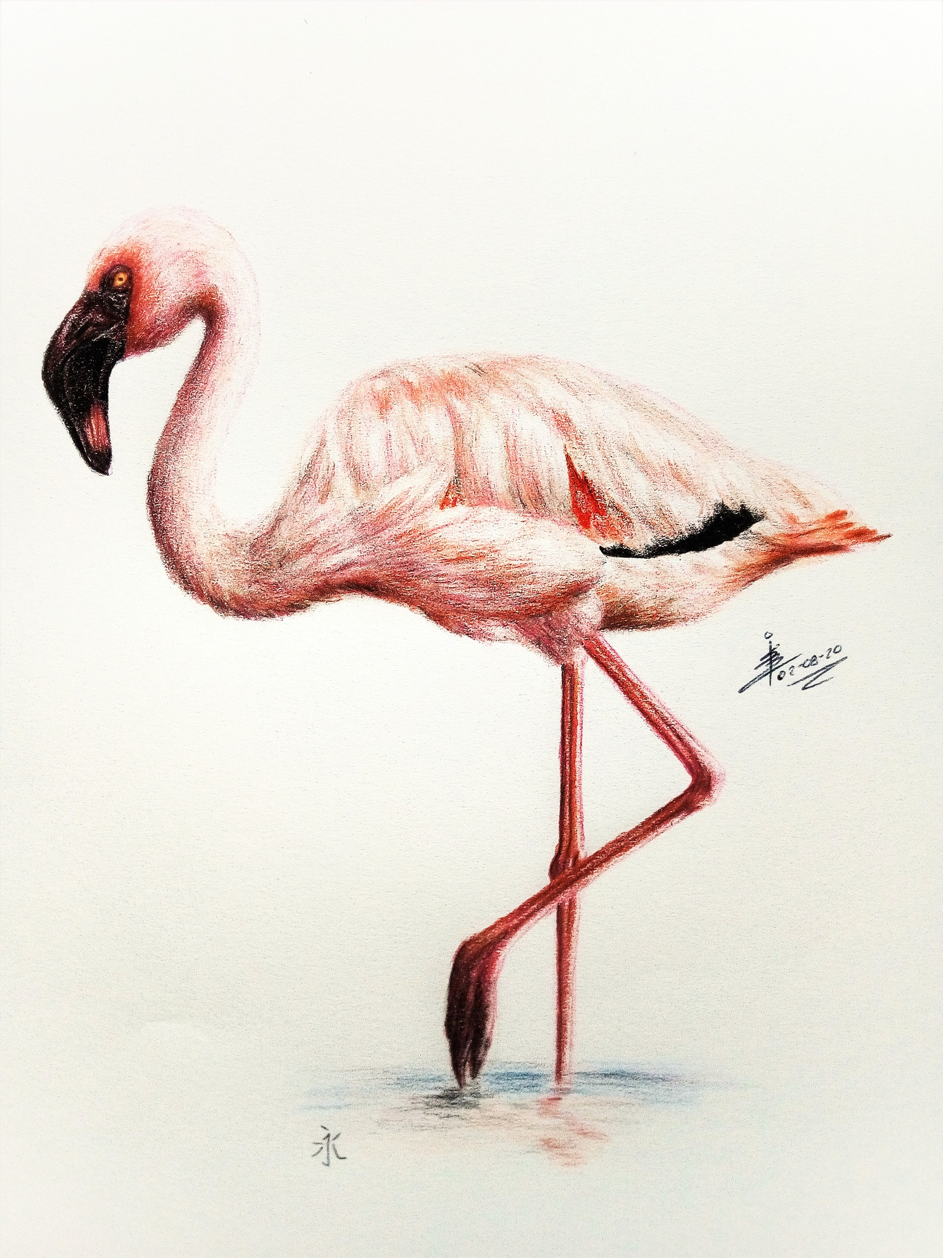
 DrawingNynke — Pink is the color

#pink #coloredpencils #drawing #flamingo #traditionaldrawing
Published: 2020-03-18 18:19:01 +0000 UTC; Views: 970; Favourites: 68; Downloads: 6
Redirect to original
Description
Well here is a new drawing I made a while back ago, but still didn't posted yet.Made with colored pencils at A4
Reference: nl.pinterest.com/pin/541769030…
I made some changes to the original, because I realy love the details of the featers, but I didn't liked the way the head was on the photo. So I decided to make it my way
")
Let me know what you think about it
Have you any critique, feel free and let me know
Related content


Comments: 17

👍: 1 ⏩: 1

👍: 1 ⏩: 0


Once again, a stunning drawing! I just love the colors 
To the things you could improve. The only "major" thing is the composition. Although the legs and the head are about the same distance from the edge of the paper, the drawing still is "top-heavy" - by far most of the bird is in the upper 50% of the paper. It would have been a better composition if the bird had been a bit smaller, with more space at the top. The artwork would have been more "balanced" that way.
Another way to great more "balance" is to add elements to the lower part of the drawing. In this case, drawing a rock or something which the flamingo stands on would be an idea. This would also prevent having a "floating subject". As a general rule, subjects should usually stand on something.
But that's nitpicking. You did and excellent job, and I have to say your drawing looks better than the reference photo
👍: 0 ⏩: 1
Thank you very much for you critique it helps me a lot to improve my artwork
I ddin't saw the 'mistake' I made with the composition, but now you mentioned it I see indeed that it would be something that can be improved. It looks a little bit unnatural.

👍: 0 ⏩: 0


👍: 0 ⏩: 1
Thank you so much!!!!
👍: 0 ⏩: 0

Zulke mooie vogelsoort en schitterend getekend Nynke
👍: 0 ⏩: 1
Dank je wel Maria
👍: 0 ⏩: 1
Graag gedaan Nynke
👍: 0 ⏩: 0

Beautiful feathers! For some reason, this piece was marked for "mature" content, in case you were unaware o:
👍: 0 ⏩: 1
👍: 0 ⏩: 1
I agree! I'm not a huge fan of the headache it causes me... haha!
👍: 0 ⏩: 0