HOME | DD
 drcloud — Metal Mittens: The Unlazying

Published: 2005-10-07 21:52:41 +0000 UTC; Views: 5320; Favourites: 49; Downloads: 425
Redirect to original
Description
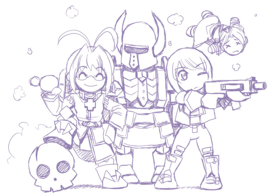
This is the finished version of the Lazy Mittens pic I posted yesterday (which will be moved to my Scraps in due course). I didn't even really plan to do this, I just thought it would be nice to have a proper picture of all the characters... can't remember the last time I did that, although I think it might've been the picture involving the lava...This might go nicely in the game (title screen, or part of it?), assuming I ever actually write it XD
I intend to submit this as a print, although I'm sure it'll sell about as well as all my other prints (read: it won't sell at all
") ). In the meantime, just gasp in amazement at the fact that I've managed to draw a proper picture with:
). In the meantime, just gasp in amazement at the fact that I've managed to draw a proper picture with:1. as many men as women in it, and
2. no enormous boob syndrome to be seen.
Feels quite nice to be drawing again
")
Related content


Comments: 14

That would be perfect for the title screen. Everybody's ready for battle!
👍: 0 ⏩: 0

Very very nice! Great colors and lighting! I like this!
👍: 0 ⏩: 0


It's amazing the difference ther is between your doodles and things you put actual effort in. I mean, your quick stuff is better than most people's best work, but this shows more of your true ability. Also, the change of Delta's change from unproportional KOS-MOS to I want to say a cross between Resident Evil and Mokoto Kusanagi for Ghost in the Shell is kinda cool. Her new look here takes out some of the cute and adds a bit more dark, kick ass-ness to the team.
👍: 0 ⏩: 0

AWESOMENESS!!! A lot more clearer looking than the last sketch. I like the shiny...the coloring is really awesome...looking forward to any upcoming Mittens games...
👍: 0 ⏩: 0

teeheehee... see? isn't it so much nicer to draw things people like for reasons besides that "teh chix r hott"?
...*takes a bit of credit >;3*
👍: 0 ⏩: 1

Yup. You're such a good influence (among other things ;3)... thank you~

👍: 0 ⏩: 0

Looks real nice! Great color choice! I love the shine on the armors.
👍: 0 ⏩: 0

Nice its got lots of really neat detail. especially on there outfits. I liked the colors you picked for the characters.
👍: 0 ⏩: 0


It's refreshing to see some work from you again with your unique colouring and style. Nothing like a bit of shinyness to 'cool' up a picture. Rhino is looking particularly monolithical and intimidating there. Great unlazying job there.
👍: 0 ⏩: 0

you seem to hae broken away from your older 2004ish cutsy/ boobish stuff to a more mature *no offence ment* style of anime drawing, I cant say I like the new Rai to the Old Rai *or Rai just in this picture anyway* but Delta * i think* Looks like one bad ass mother fucker and Rhino... well... Rhino.
Peace

👍: 0 ⏩: 0


