HOME | DD
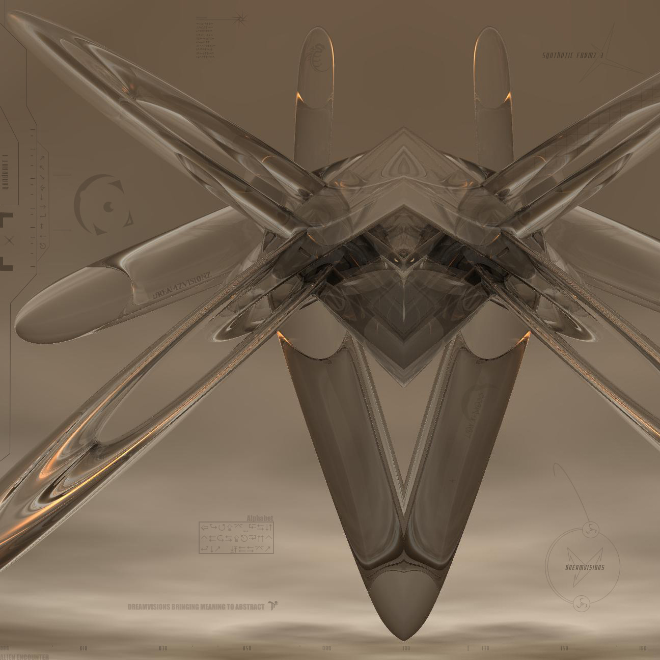
 dreamvisions — Synthetic Formz 3
Published: 2002-06-23 00:46:56 +0000 UTC; Views: 902; Favourites: 0; Downloads: 26
Redirect to original
Description
I haven't had it too long, I really liked working on it basically because of the concept and it being abstract and all but has some meaning ...Related content


Comments: 10

Awesome color depth, and very smooth details! I wish I could give the details that good
👍: 0 ⏩: 0


thats some nice typo and the color is really nice, but like alot others the commented on this piece said it is very jaggy and that thing in the middle reminds me of a space ship too, which is freakin awesome =]
👍: 0 ⏩: 0


so symmetrical....and has the look of some sort of evil space ship.... like from titan a.e. or something.... *phew*
//spunj13
👍: 0 ⏩: 0

looks veyr kelw..but aveyr low quality..lots of jaggys..kind of like 7th sign's work.
👍: 0 ⏩: 0

holy crap. alot alot of jaggies here.
work a little bit more on this. i love the color and typo in it. this has _lots_ of potential
👍: 0 ⏩: 0

great transperancies, there are a lot of great details in this piece, its fun to look at... great job.
👍: 0 ⏩: 0

really aweosme! the background colors there are alittle blocky... it could help if you made it all a bit more seamless. but its a wonderful design nonethelesss.
👍: 0 ⏩: 0
