HOME | DD
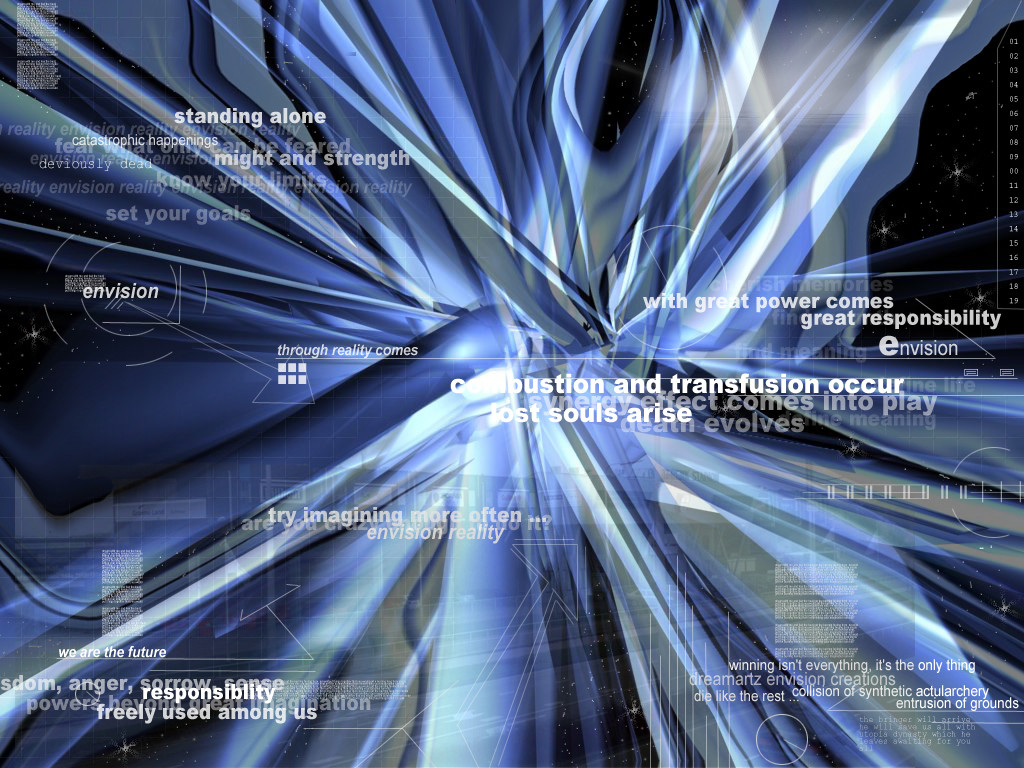
 dreamvisions — System Synthesis

Published: 2002-06-26 08:12:26 +0000 UTC; Views: 11708; Favourites: 53; Downloads: 1387
Redirect to original
Description
I tried seprating the details so it didn't seem too crowded, but then also made sure it wasn't too empty with leaving icon spaceUmm also I tried using soft colors so that it was gentle on the eyes. It seemed alright but the jpeg format messed the colors a bit ...
Hope ya like it ...
Related content


Comments: 90


Just to keep a tally, who else almost had an orgasm when first viewing this piece?
👍: 0 ⏩: 0


this is so sweet man... i love this dark metal/charcoal look/chrome... i also love how it has an underwater look and feel to it.
the 2d is amazing as well...
+fav
👍: 0 ⏩: 0


Smooth and soothing. That softness relaxes Great wallpaper!
👍: 0 ⏩: 0


The color in this is very smooth, and the design is done well. nj.
👍: 0 ⏩: 0

Great job with this... you did a really nice job turning an otherwize mimilistic 3D render into a full-blown furturistic style wallpaper. And the grid works well on this aswell
👍: 0 ⏩: 0

make the art you wanna make. if its trendy, its trendy. dont listen to anyone who tells you otherwise.
ROFL justin..
who said anything about hatin on it cuz of the genre'?? .. all i've seen that has been said is simply opinion on why it isn't tip top ... which gives him sumpin to look forward to, and gets him to maybe not make the same mistakes.. you can't change, what you dont know what to change.. tis why all these comments are beneficial ..
*dayum!* nuff said... oh yea.. and .... its godly
o' man .. wtf is that supposed to mean?! .. godly.. haha.. how is something godly.. **sigh** kids these days and their automatic responses.. eh.
👍: 0 ⏩: 0


*dayum!*
nuff said... oh yea.. and .... its godly
👍: 0 ⏩: 0

This just rocks...didn't hesitate to use it for my wallpaper! Awesome job
👍: 0 ⏩: 0

well laid out, and definetly good use of colour.... that's for sure. i like the contrast of the tech elements with the natural flow of the 3D elements
//spunj13
👍: 0 ⏩: 0


Really like the colors. Simple yet very stylish. Nicely done
👍: 0 ⏩: 0


make the art you wanna make. if its trendy, its trendy. dont listen to anyone who tells you otherwise.
👍: 0 ⏩: 0

i'm sorry sometimes i don't like pieces it is the case now. i just don't see the artisitic vision of a minimalistic render on a grid with a dark background and some common typo works with no effect. In fact i may get the thing it is just to have something quite inexpressive thing that can suit a desktop at work when u REALLY need to work and don't trip on the wallpaper.
No meant to offense btw just wanted to explained what i felt about it
take care
👍: 0 ⏩: 0

Quite amazing. Really nice renders, and great colors too! And what do we get, when we sum all this?
+
👍: 0 ⏩: 0


very snazzy I like it very much, it just became my wp
and fav.
👍: 0 ⏩: 0

colors look good to be, i always output in jpeg high format, seems to work flawlessly
👍: 0 ⏩: 0
personally im not diggin on it.. the vector shape that u cloned all over the place caught my eye before anything.. the renders are sleek, but dull.. and i think the layout w/ all the other vector work, grid, trendy lines etc .. is too uniform .. there is at least 1 lil thing in EVERY lil calendar looking box .. eh. keep practicing .. i was gonna put dislike.. but i do actually happen to like the logo hand.. w/ the thumb..
..
👍: 0 ⏩: 0


Wicked, i like darker//abstract works, +fav and onto my desktop
👍: 0 ⏩: 0
damned smooth piece homeboy.... drop me a mail about that collab
👍: 0 ⏩: 0


if there was a vote that said : I love this deviation and it is my new favorite that is what i would put I LOVE IT extreamly unique!
👍: 0 ⏩: 0

Cool! I like how it's simple, but really clean. Good Job!
👍: 0 ⏩: 0

whoa that is the most beautiful thing ever! it looks like fingers wow.
👍: 0 ⏩: 0


Tré smooth. Nice colours, and smooth render make for an easy to look at background.
👍: 0 ⏩: 0

Nice render, but I dont like the vector "missle" like stuff.. Looks a little too wierd.
👍: 0 ⏩: 0

This is the shit i haven't seen anything like it in a while and god its awesome. sweet ass work dude
👍: 0 ⏩: 0


I must agree, he is highley deserved of the oh so devine poopy award. let it be known....
👍: 0 ⏩: 0

you have won the runner up in the poopy awards. you get nothing, but let it be known you came in second
👍: 0 ⏩: 0


this is nice... reminds me of war in the ocean... and the design idea and calendar thing is awesome
👍: 0 ⏩: 0

sweet !!! so soft , glossy , smooth perfect
keep it up
👍: 0 ⏩: 0

I love the simplicity and the trendyness.. (ha! didnt know it was you when i first commented!! when i went y to your page and saw all the top faves and stuff I was like WOW!!)
👍: 0 ⏩: 0
| Next =>