HOME | DD
 Drewdini — Beizer Curve for MLP-VectorClub

Published: 2013-10-08 16:53:46 +0000 UTC; Views: 3121; Favourites: 58; Downloads: 12
Redirect to original
Description
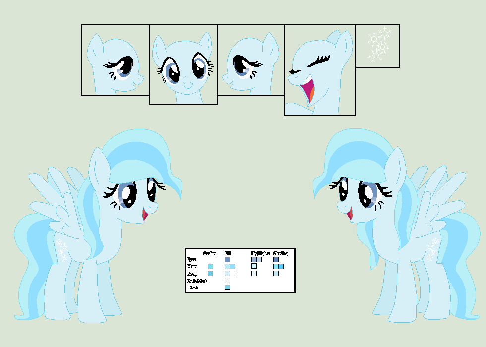
Hey hey, everyperson! Wow, that sounds stupid. Kind of makes me rethink the whole "everypony" thing... This here's my submission for the contest over at the %MLP-VectorClub . Basically -- as explained in this journal entry here -- they're looking for a new mascot, and they've left it up to us, the members of the club, to design him/her.When I saw the journal entry, my first thought was, "She needs to have anchor points in her mane, sort of like the pony outline in their group icon."
<-- See, right there.
My second thought was, "To sort of represent the sort of clean nature of vector graphics, she should have a smooth, streamlined design to her, without all those choppy, messy bits in her mane or tail that Rainbow Dash or Applejack have."
A few thoughts later, and her design was completed. Obviously, I had to name her Beizer Curve, because that's what vectors are made of.
Looks like I'm about the sixth submission to the contest, but we've got until the 17th of November so who knows who else is going to enter? In any case, I wish all of the rest of the entries luck.
 (Smile)")
You're going to need it to beat this design. (mostly joking.)
.SVG
Hey, I'm a good sport, so check out all the entries for this contest!
EDIT: Contest over. I didn't win it sadly, but I had a lot of fun designing ol' Beizer. And plus, now that she hasn't become property of %MLP-VectorClub , she's fair game, and I can now freely claim her as one of my own personal OCs.
Anyway, here's the guys that won. Go give them props!
Related content


Comments: 51

Nice! Also what does the cutie mark stand for? I always like to know these things(I'll also tell you what mine means)
👍: 0 ⏩: 0

this is a quality design right ere yes siree bob
👍: 0 ⏩: 1

Thanks. Even though she didn't win, I'm still proud of her. ^-^
👍: 0 ⏩: 0

Finally figured out how to work the curves on my paint shop pro XI after like.. 6_9 8 years of owning the darn thing.. hehe
👍: 0 ⏩: 0

Ah dang really sucks you didn't win dude, yours was my favorite entry! But hey yeah at least now you can use her as a personal oc now haha. Can't wait to see more of her if you do plan on keeping 'er
👍: 0 ⏩: 1
Hey, thanks man. Way I see it, I had fun just coming up with the design and entering her in the contest.
Sure, it would have been nice to have won, but why let focusing on that get in the way of enjoying myself, right?
👍: 0 ⏩: 1
That's true!
That's a great way to look at it and I'm glad to hear you're approaching it that way
👍: 0 ⏩: 1
Yep. Always look on the briiiiight side of life!
👍: 0 ⏩: 0

Ohh she's so cute ")
👍: 0 ⏩: 1
Hey, thanks. make sure you let the other guys know it as well.
👍: 0 ⏩: 0

I love every contest submission and I really wish the best of luck to you 
👍: 0 ⏩: 1
Hey, thanks a lot.
Those anchor points (which is what they're called.  (Wink)")
👍: 0 ⏩: 1
That's very original! I wish you the best of luck!
👍: 0 ⏩: 1
Thanks. I'll be needing as much of it as I can get.

👍: 0 ⏩: 1

Hee! Awesome job! I love the name and the whole concept of the OC! Best of luck in the contest! May the "Horse" be with you
👍: 0 ⏩: 1
I see what you did there...
I wish you luck as well. As we all know, "There can only be pun!"
Nah, that one stinks.
👍: 0 ⏩: 1
That was so bad, it needed to be "pun"-ished xD
👍: 0 ⏩: 1
I think it's best when these things go pun-der the radar.
👍: 0 ⏩: 1
All these puns are a "pun" in the arse...
👍: 0 ⏩: 1
But I'm having a punderful time.
👍: 0 ⏩: 1
I wonder is any-"pun" else is having as much of a good time as us xD
👍: 0 ⏩: 1
Are we only allowed to have "pun" with the word pun here?
👍: 0 ⏩: 0

And as a result, her mane is the easiest to vector.
👍: 0 ⏩: 1
If it weren't for the fact I had to vector in those anchor points!

👍: 0 ⏩: 1

Hey, thanks. I thought it was the most appropriate.
👍: 0 ⏩: 0

Nice one! Hey, I was also gonna do an earth pony with anchor points in the mane and tail. Guess you beat me to it ")
Anyway great design and CM.
👍: 0 ⏩: 1
Hey, thanks. 
Anyway, thanks again.
👍: 0 ⏩: 0

Yes sir, I like it! Lovely colour scheme too. I also thought of adding some "Nodes", but didn't go with it for some reason. Also, cheers for the 1st Earth Pony of the competition *cough* Unicorns *cough* Master Race *cough*...
👍: 0 ⏩: 1
Yeah, I dunno. I guess I was always an Earth Pony guy. My ponysona's an EP, most of my OCs are EPs, and even the ones that are unicorn or pegasus, I play them like EPs.
Hey, thanks for the lovely comment thing.
👍: 0 ⏩: 0

It's like you vectored the vector of a pony in a program used to make vectors. The meta's tripping me out. Probably just need sleep....
I like the colors though! Perhaps if the nodes and such were actual hair clips or jewelry? Nicely done in any case!
👍: 0 ⏩: 1
Haha this pony is definitely filled with meta. Of course, actual anchor points wouldn't have shown up in the final render, so I had to go in and individually vector false anchor points to make sure they were visible in the final product. Yes, it was a bit of work, but it was totally worth it for this pony to gush meta.
So basically, I used the things that make up a vector to vector the things that make up a vector.
")
👍: 0 ⏩: 1

Yo dawg, heard you like vectors. So I vectored a vector vector so you can have a vector of a vector for your vectors!
👍: 0 ⏩: 1
Thanks, foxy! You gonna enter the contest?
👍: 0 ⏩: 1

NP! Maybe, but, probably not. XD
👍: 0 ⏩: 1
I understand. I mean how can you expect to beat a design like this?
I... mean...
👍: 0 ⏩: 2
CAN'T.
JUST. YOU CAN'T.
JEEBS!
👍: 0 ⏩: 2
Okay. I'm done being a douchenozzle. :3
👍: 0 ⏩: 0
Aww but don't let it discourage you from trying.
Yours just has to be better than mine is all.
👍: 0 ⏩: 0

Looking awesome to me man! 
I hope you nail it man!

👍: 0 ⏩: 1
Well sure, they have high standards, but with an infinitely scalable image, any mistakes you make are also infinitely scalable, and they only get bigger and more obvious the more you zoom in. So I understand why they have high standards, and I don't mind fixing anything they point out when I've submitted the thing.
I'm actually gonnabe submitting a something to the Original Style folder closer to Halloween.
Hey, thanks for the well wishes!
👍: 0 ⏩: 1
Actual mistakes are one thing, style of character/technique is another.
Sweet.

No probs man!
👍: 0 ⏩: 1
Ah, that's true. It does have to be pretty close to what they have in the show. Otherwise, they shove it into "Original Style." Didn't think'a that one... I think original style is allowed for this contest, though.
👍: 0 ⏩: 0