HOME | DD
 dripplet — clockwork

Published: 2009-04-30 14:10:47 +0000 UTC; Views: 1336; Favourites: 65; Downloads: 0
Redirect to original
Description
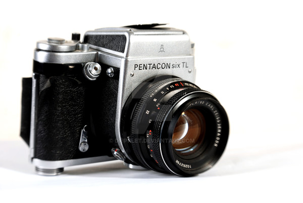
colors and contrast enhanced in photoshop CS2.Featured in:
[x] [x] [x] [x] [x] [x] [x] [x] [x] [x]
Related content


Comments: 30

Congratulations! 


👍: 0 ⏩: 0


This looks great. ")
👍: 0 ⏩: 1


Hi! Your work has been featured in a news article here: [link]
Please fave the article if you enjoyed it
 (Smile)")
👍: 0 ⏩: 0


It's wonderfull... You've been featured here: [link]
👍: 0 ⏩: 0

hello! your work has been featured in my journal: [link]
thank you!
👍: 0 ⏩: 1


I love old clocks like these! And this is a really nice shot
👍: 0 ⏩: 0

The colors and toning that you did on the photograph works really well, there is a good color contrast between the red in the clock and the yellow background.
You lighting on the clock is very good and the reflections/highlights are well positioned on the top left of the clock with the hour hand pointing at them. Also these highlights do well to give us hints about the shape of the plastic and metal form of the clock that I dont think we would otherwise be able to see.
While your focal point is good, I think that you could have set the aperture higher to achieve a higher depth of field. While the left side of the clock is in focus, the middle and right parts of the clock are blurry and out of focus. I feel the the photo is very much about the form of the clock, its hand and the numbers on it, and the blurriness in these areas subtract from the impact of it.
Overall the composition is pretty good. I like being that you showed about 2/3 of the clock in both width and height, however I do wish you cropped a litte higher at the bottom so we did not see the two small black dots of text that was cut off at the bottom.
👍: 0 ⏩: 1

this has been featured here [link]
hope you'll look at the other works featured too
👍: 0 ⏩: 0

This is amazing. It's your strongest out four you showed me!
👍: 0 ⏩: 0

Very well done.
The color and contrast is excellent.
👍: 0 ⏩: 0

THIS DEVIATION IS FEATURED in my journal.
Thank you for posting!
see here: [link]
you may also please check out my new MANIP: [link]

👍: 0 ⏩: 0


hey!
you were featured here
[link]
Please
can see that wonderful artwork too
Thanks!
👍: 0 ⏩: 0


Simply an incredible shot. The clarity is amazing.
👍: 0 ⏩: 0