HOME | DD
 DrStrangebob — Misha Lightspear

Published: 2007-01-23 01:30:37 +0000 UTC; Views: 458; Favourites: 5; Downloads: 1
Redirect to original
Description
Misha and her spear of light.I'm still working on refining this but it is at a stage where comments and advice would be helpful for the future refinements.
Got any?
Related content


Comments: 13
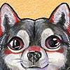
It looks really awesome! The only thing I would do is make the background even darker so she stands out even more ")

👍: 0 ⏩: 1

I'm redrawing the wings and I'll try darkening the sky as well, when I do that.
Thanks!
👍: 0 ⏩: 0

Maybe her eyes glow like Storms (X-Men) when she gets her dander up.....?
👍: 0 ⏩: 1
Exactly!
Thanks for the fav, btw!
It's so nice to be able to use this site properly again!
👍: 0 ⏩: 0

The only thing I can point at this point is that her hair and upper portions seem somehow seperate from the rest of the picture... I don't know if it's the outlines around her hair or the fade out/in of the wings, or something else...
She looks very cool Bob, but very freaky at the same time.
k
👍: 0 ⏩: 1
Her major function is to look demure and harmless, and then scare the crap out of the guys.
👍: 0 ⏩: 1

Dude! youve been gettin a lot better at photoshop. i do have one or two small suggestions tho. i think maybe the highlights look a little too white in a couple of spots........not sure tho, cause of the bright light source. Although, i think maybe at least the reflective light on the hair, you could use the cut/gradient style with the lasso tool. I think a slightly harder line on some highlights would give a better sense that the light is bright (in contrast to the rest of the hair). I dont know though. honestly i dont know a whole lot about artistic princibles. i just kinda go by my eye a lot of times.
👍: 0 ⏩: 1
Thanks. I am going to redraw the hair but as you'll soon see, I'm really getting into the new story.
👍: 0 ⏩: 0
I really like her, she be righteous! Her wings are different, kind of like chrysanthymum petals rather than butterfly wings. I like how you've incorporated the rust tones in the wings - it's a different color scheme. Maybe raise the hairline - yeah, I think more forehead. Are her eyes meant to be glowing? It's a little creepy with the eyes glowing and no iris/pupil. Also, the left hand is a bit masculine (compare it to the right.)She reminds me of an older version of Brenda Starr - like from the 70's... only with magical powers. I think its the poofy red hair. I don't think I'd cross her, or her wand...
👍: 0 ⏩: 0

Her left hand looks off, and I think her hair should be higher up.
But otherwise, It's amazing.
👍: 0 ⏩: 1
You're the first to mention her hand, but it's really my least favorite part and will be changed soon for the better.
👍: 0 ⏩: 1