HOME | DD
 DrUnKChIcKeN — Raider

Published: 2005-03-30 07:54:02 +0000 UTC; Views: 2579; Favourites: 32; Downloads: 110
Redirect to original
Description
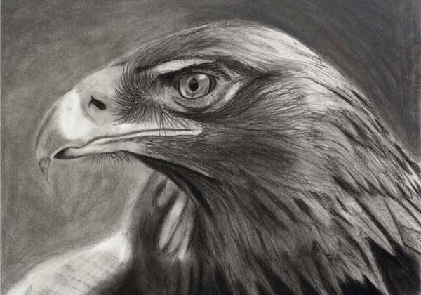
Comission for the principal at my high school. Well I hope he pays me, he DID say comission.Our school mascot, an eagle, aka the Raider Bird.
7 references used
5 days
pencils: H, 2B, 3H, 4B, 7B, HB, 2H
Kneaded Eraser
Tortillion
Related content


Comments: 22


ooo, awesome! gorgeous eagle *envy* the way you left all of the white space is really nice and really adds the effect of the drawing. good job<3
👍: 0 ⏩: 0


Love the feathers on his wings and fierce looking his eyes. The right wing is a bit bright in spots where it's supposed to be darker, but overall it looks great.
I always love good pencil work.

👍: 0 ⏩: 1

thanks, yeah the wings might look a bit odd, i just had a hard time getting everything correct with a bunch of different references that told me different things and didnt reveal to me what i needed. yep, i have to work on my lighting issues
👍: 0 ⏩: 0

I love how you handled the strong light!!! Very majestic~
👍: 0 ⏩: 1

Very pretty birdy.
Great detail on the feathers and the head ^_^
Looks very nice.
👍: 0 ⏩: 1

lol sorry about that I have a drawing called Raid on village, and I haven't taken a look at it for and while and messed up and thought I called it "Raider" I thought you were complementing on it. lol :laugh:
👍: 0 ⏩: 0
I'd put a little more into the background, all that whiw really makes it bright. And again just like your iguana drawing his head is too light making it hard to see it. The biggest problem I see is that it's not only the head that's too light, but the feet and wings are also to light, they almost disapear.
Don't get me wrong it's starting to look incredible, but putting a little improvement in those area's would really make it an incredible peice. Hope you aren't done with it, can't wait to see the complete peice. Huge chance of it being breathtaking.
👍: 0 ⏩: 1
i kinda like the intense lighting, lets the viewer imagine where the body parts are supposed to fit in, kindof a neat effect i think. But maybe i did make it too intense, lol
👍: 0 ⏩: 1
Thanks for the comment. Yea I also liked how the picture turned out as first attempt I thought it was that intense lighting I added to it that made it stand out. This might sound corny but to tell the truth this was actually the drawing I drew (out of the blue) that made me start out drawing after a five year hiatus.  (Smile)")
One day I’ll still make a remake of it, it deserves it in my opinion.
👍: 0 ⏩: 0

WOW!!!! I only have one critisism.... the feet aren't quite right... they're a bit chubby maybe! I am being nitpicky though!
👍: 0 ⏩: 1
heh ,thanks, they probably are a bit stubby, a classmate of mine also mentioned that point
👍: 0 ⏩: 0


ooook not the emote i was lookin for lol 

👍: 0 ⏩: 0
")