HOME | DD
 DrUnKChIcKeN — WIP
Published: 2005-11-22 04:18:56 +0000 UTC; Views: 82; Favourites: 0; Downloads: 8
Redirect to original
Description
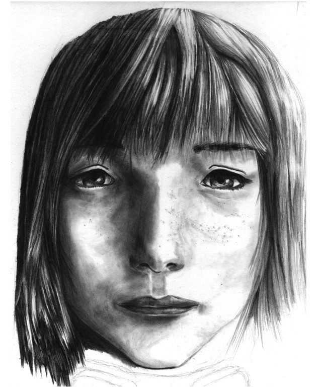
wip something, i dont like the features of the face, unattractive i think. somewhere it is making it look odd, any suggestions?Related content


Comments: 10

I think it is the distance between the eyes being too great, but I'm not sure alot can be done with it now... But its not bad over all. I kinda like the intresting twist to the features
 (Smile)")
👍: 0 ⏩: 1

yeah heh, i tried to fix it in the next wip, eeh duno if that worked out
👍: 0 ⏩: 0
I think it is the distance between the eyes being too great, but I'm not sure alot can be done with it now... But its not bad over all. I kinda like the intresting twist to the features
👍: 0 ⏩: 0

If you can't move the eyes in, maybe try making the nose slope there smaller and having flatter face surface out to them? I think making the head taller will help too. 
👍: 0 ⏩: 1
hmm, might work, thanks, ill try it!
👍: 0 ⏩: 0

very nice, I think it might look better with the eyes a bit lower ( you eyes are at the middle of your head, befor you draw the eyes try finding the middle of the head) and posibly a little closer together. . .but a realy realy great drawing, i love shading. And i dont think it looks so much as unatractive, but more over a sad little , and posibly slightly dirty, needs a bath. . .but great drawing. . .
👍: 0 ⏩: 1
i might be able to fix that... maybe i can just make the head larger by adding more hair on top and on the sides, maybe i should try that. I have a bit of space under the paper im working on, maybe to make her dirtiness look fit in more I can give her some sort of outfit or something that works with her appearance. as you can see ive started to add googles, haha maybe a mechanic. anyway, i hope the enlarging of the areas around her head doesnt make her eyes seem too tiny, hehe, thanks for critique!
👍: 0 ⏩: 1

I'm not good enough to really critique. But I think the distance between the eyes may be a little bit large.. Maybe?
But hey, you might be going for that look, I see your icon is cartoonish.
so who knows.
👍: 0 ⏩: 1
yeah its supposed to be a bit cartoonish, maybe they are too far apart, what i was thinking was maybe they were too small... hmm. thanks for crit!
👍: 0 ⏩: 0