HOME | DD
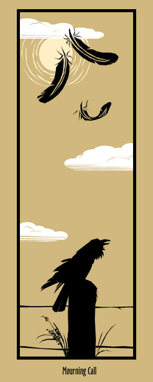
 Dubhghall — Mourning Call
Published: 2005-08-24 19:15:51 +0000 UTC; Views: 1153; Favourites: 40; Downloads: 61
Redirect to original
Description
i was thinking about submitting this for printing. but i would like to run it by some people first.i would like to know what you think. whats missing? should i change something? be brutally honest -- i dont mind.
 (Smile)")
Related content


Comments: 26


Hey there,
I wanted to let you know I put you in my journal with this work... You don't mind, do you?
👍: 0 ⏩: 1

Not at all
Thanks for the feature!
👍: 0 ⏩: 0

I like the simplicity of this picture, really nice!
👍: 0 ⏩: 1
as in reference? or program?
^_^
👍: 0 ⏩: 1

prog of course..it looks so nicely done >_>u have tablet or sumth?
👍: 0 ⏩: 1
yup! i use PS 7 and a Wacom Graphire ^_^
👍: 0 ⏩: 1
cool... wish i could have wacom >_>
👍: 0 ⏩: 0

Man I'm sorry I didn't comment on this earlier. I love this. Its that simple ")
👍: 0 ⏩: 0

Very nice, I love the composition and design in this piece

👍: 0 ⏩: 0

I love this, the composition, the colors, the simplicity all positively gorgeous!

👍: 0 ⏩: 1


wow this one's pretty awesome too. I like how it's got the whole silhouette look to it and yet it has more then just 2 colors because of the clouds and the sun...I also happen to like birds so thats an added bonus.
👍: 0 ⏩: 0

ohhhhh..dats pretty, i like the style, kinda a split focal though, perhasp sumtin in the middle to help lead the eye, instead of force it....but who am i to say anything.
👍: 0 ⏩: 1
ya know what, i take that back...i wasnt seeing the whole thing before,, had to scroll...sry, the clouds and the black frame kinda take care of what i said up there..*points up*
👍: 0 ⏩: 0


I really like this, the color choices and the silhouette of the bird. ^..^ I think it looks great the way it is, but if you want something to improve: I don't know much about bird anatomy, but perhaps the head needs to be more rounded, the beak looks a tad too high.
👍: 0 ⏩: 0

I'm actually very impressed. I like the style, I like the minimalist colours. Very persuasive bringing the idea to fruition.
If anything, I'd consider changing the sun to white instead of off-white, if only to keep the whole piece to 3 colors.
I also have this habit of looking at a piece and seeing 3-4 different versions of it, and I see this no differently, so I hope you don't mind. If you were to take out the one of the clouds in the middle, or even both, it would still look excellent, and perhaps enhance the vertical balance. I also think that for some added drama you could blacken the border, and have the text in that darker off-white.
👍: 0 ⏩: 1
thanks for the input and thought out comments
i think i will take your advice, try out a couple more versions.
really appreciate the help
👍: 0 ⏩: 1
You're welcome. I'm glad I could help.
👍: 0 ⏩: 0


It's wonderfull, it's so simple and beuty^^
I love it
👍: 0 ⏩: 1