HOME | DD
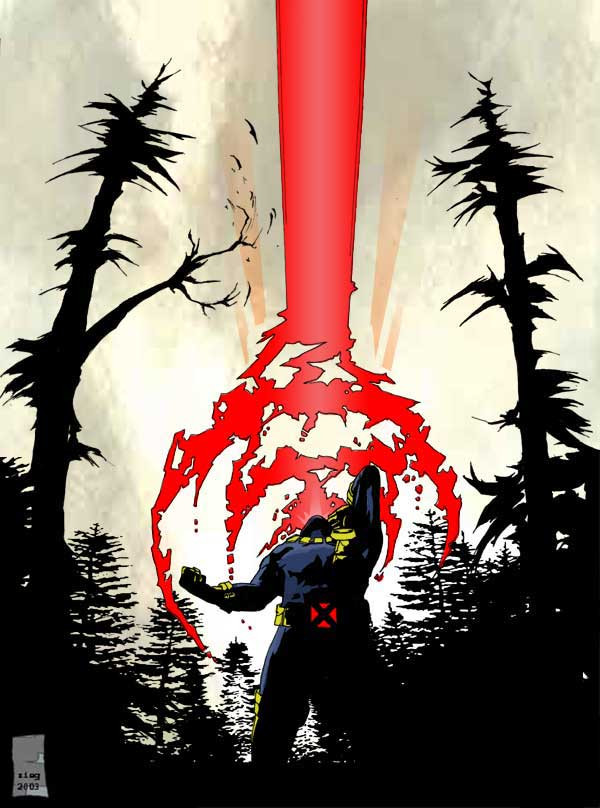
 dullboyjack — cyclops by DULLBOYJACK
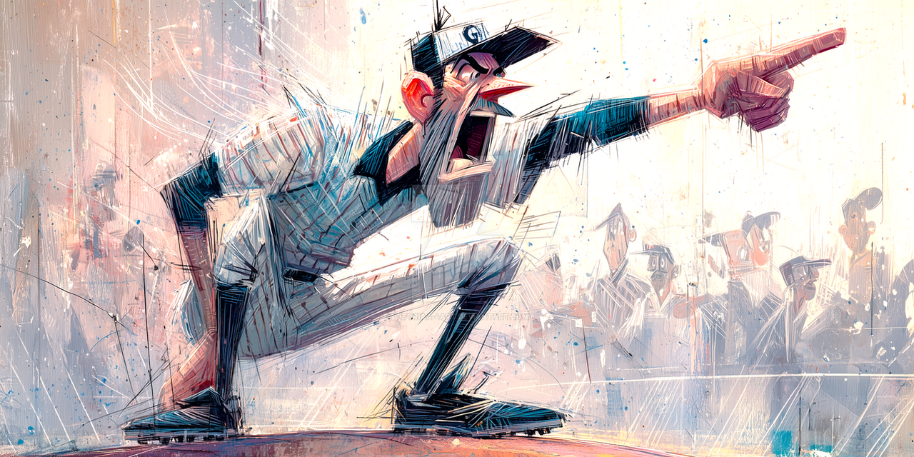
Published: 2003-06-16 15:00:53 +0000 UTC; Views: 7513; Favourites: 161; Downloads: 234
Redirect to original
Description
did this drawing to give him bit of a angry side, i think he needs it sometimes.i'm pretty happy with it. the background sky colors to ages to get right
Related content


Comments: 32


i love the feel of this one. the contrasts are amazing and the dispersal of the energy blast make it feel even more powerful! incredible!
👍: 0 ⏩: 0


Love this! The X should definitely stay - reminds me of when superman is drawn in silhouette with just the red eyes.
Would you mind if I had a go at recreating this as a practice piece? I'd like to sketch it and photoshop it if I could?
👍: 0 ⏩: 0

Hi, your artwork was featured in Comic Hero news: [link]
👍: 0 ⏩: 0

The drastic contrast between fore and background is stunning. I love the simplicity of your pin ups; they say so much with so little. Also, big fan of a) angry Cyke and b) old school uniform. He's the leader, or rather was (not sure any more, haven't kept up to date to be honest), and there must have been a reason for it, other than he was an insesant boot-lick. I like the idea that Scott had a bad side, an angry side.
👍: 0 ⏩: 0

Oh! I love this piece! It's just too amazing for words
-Shadow

👍: 0 ⏩: 0


cyclops is way better than wolverine. one of my faves too.

👍: 0 ⏩: 0

lolz he's so gangsta. I love the red X on his belt, it has great impact, I also love the trees.
props
👍: 0 ⏩: 0

I love the angle on this. The sharp edginess of your style really shines. and nice contrast overall. cyke's one of my favorites and you draw him quite well.
👍: 0 ⏩: 0

WOW really really nice. Cyke is one of my favouritescharacters of the X-men :3
👍: 0 ⏩: 0

I really like the compostion, also the colors are very well done. Overall the concept is cool too especially after cyclops just wandered off into the woods in the last x-men movie, well done
👍: 0 ⏩: 0

It's very impressive because Cyclops is such a hard charactor to draw in a way that isn't with either static or obscuring a lot of him with that damn beam, with is visually boring. You've made it far more interesting than Marvel usually managed.
👍: 0 ⏩: 0

yeah it gives it an impression of feeling and depth. Also the perspective makes it work well^^.
👍: 0 ⏩: 0


aww damn the full view is messed up, all I see is an x
👍: 0 ⏩: 0


I love the darkness of the picture contrasted with the light sky. Visually very beautiful, I love it
👍: 0 ⏩: 0


Yeah... very, very nicely done. I'm not a big Cyclops fan, but you make him look really bad. (I mean the positive version of bad...  (Smile)")
I salute you!!
Joeri
👍: 0 ⏩: 1

thanks, i'm not a cyclops fan either
👍: 0 ⏩: 0


this is a fav.
no critiques on this from me. this is fabulous work!
👍: 0 ⏩: 0


Wow really nice angle! And the whole image is very dynamic. I like the sky and the red that sticks out really well.
👍: 0 ⏩: 0

i know the belt wouln't show in the shadow.... i just added it for a graphic design feel...and the powerful xmen feel
👍: 0 ⏩: 0

VERY cool, the background is good, the angle is great too, overall very well done
👍: 0 ⏩: 0

Very nifty. I think you're right about his attitude, I wouldn't doubt that Wolverines antics would get to him every now and then.
I think there might be something odd about the belt too. Since it's in the shadow, it would have to be completely black, or it would have more a glowing feel to it. Not straight red.
~Orion
👍: 0 ⏩: 0

wow,
major drawing
i like the sharp trees in contrast with the blurry sky..
just get rid of the red cross on his belt.. it disturbes the piece...
very nice!
👍: 0 ⏩: 0

Wow, i must say that that is a great drawing i really like the way the sky was done in it.
👍: 0 ⏩: 0