HOME | DD
 duraluminwolf — Revised 1937 Speed Week Poster
Published: 2009-09-01 02:00:49 +0000 UTC; Views: 2953; Favourites: 46; Downloads: 102
Redirect to original
Description
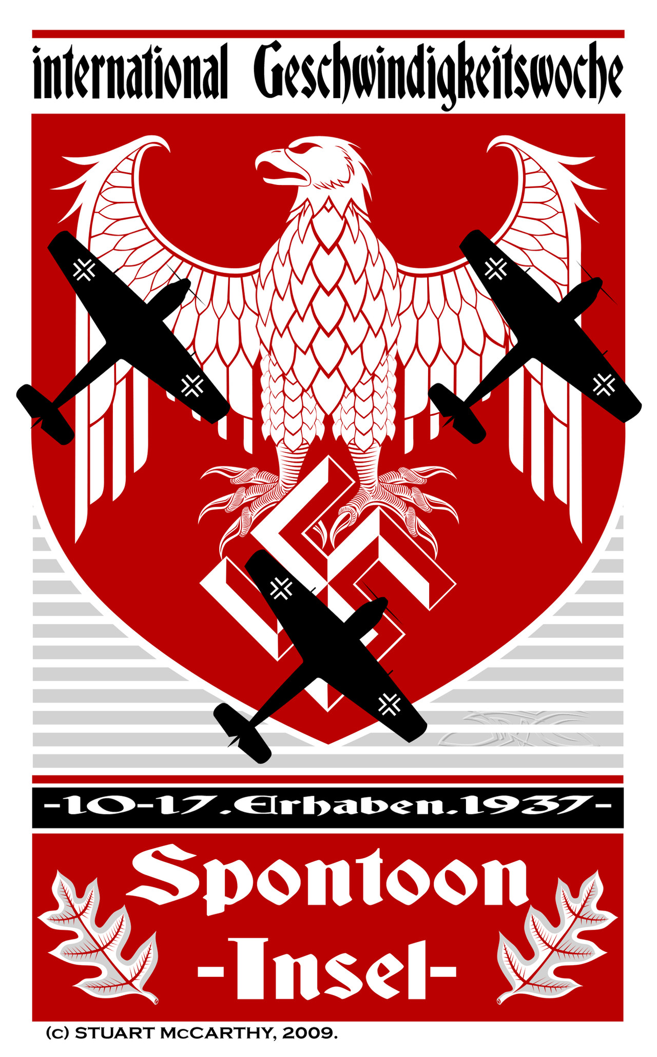
I felt that my previous poster design for "Spontoon Island" was lacking a little something, so I decided to make certain parts of the image look more "three-dimensional".Related content


Comments: 13

Very nicely done - you captured the feel of the period very well indeed.
👍: 0 ⏩: 1

HMmm........I never really though about that.
I haven't had any problems with it,
so far.
👍: 0 ⏩: 0

Nice piece of art.
PS consider marking it Mature Content, before someone ^sensitive^ reports is because of the swastika
👍: 0 ⏩: 0

Great layout, lots of visual impact. I really like the planes juxtaposed over the eagle.
👍: 0 ⏩: 1
Thanks-much appreciated!
👍: 0 ⏩: 0
Thanks. Have you seen the
updated version of this
poster?
👍: 0 ⏩: 1

Yep the changes are subtles but ...It makes te design more alive, And looks better!
 (Smile) - :)")
👍: 0 ⏩: 1
Good to know it does the job!

👍: 0 ⏩: 0

I like this version better, Stuart, but both have a dramatic visual impact.
👍: 0 ⏩: 0
