HOME | DD
 dustindemon — Rotor the Walrus

Published: 2007-04-08 20:27:52 +0000 UTC; Views: 3468; Favourites: 54; Downloads: 238
Redirect to original
Description
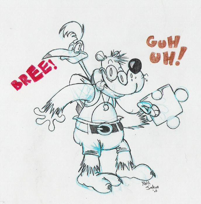
Rotor was pretty awesome until they fucked him over in season 2 of the show. Ah well, at least he's still awesome in the comics.Related content


Comments: 15


Season 2 Rotor made Sonic kinda embarrassing to watch.
👍: 0 ⏩: 0

 (Smile)")

Season 2 designs. Sucked. All the ones they "Upgraded."
Plus, what was with the arabian font? The hell?
👍: 0 ⏩: 0

Rotor Walrus! That is a very excellent choice of expression for him. It totally fits him! The drawing overall is totally cute, and it pretty much summarizes who Rotor is!
I agree, he looked totally iffy in Season 2. I could not stand his new appearance; they even used the new appearance for the Blast to the Past episodes. WHY?! That is one huge inconsistency!
👍: 1 ⏩: 0

Rotorrrrr, I like him 83 I like this design better then season 2
👍: 0 ⏩: 0

how they messed him up in season two? was it his design? I remember they had another virsion of him that did not look so good.
👍: 0 ⏩: 0

he's a nice character, too bad nobody pays him attention
")
👍: 0 ⏩: 0


 (Wink)")


I've heard of him. He was pretty good, but how did he change over the seasons? I've never seen the show.
👍: 0 ⏩: 0

I agree, I didn't like his season 2 redesign either. I don't mind how he looks in the recent comics now though. (The jacket is kinda cool, but the glasses, make him look a li'l old sometimes.)
Anyways great pic of Rotor. ")
👍: 1 ⏩: 1

Yeah, but how about my processor speed, GUI, keyboard ergonomics, hard drive, and backlighting?
👍: 0 ⏩: 0