HOME | DD
 DynamicSavior — Planet Savior concept MMXXXXCCVIII

Published: 2018-03-21 22:25:23 +0000 UTC; Views: 1742; Favourites: 19; Downloads: 1
Redirect to original
Description
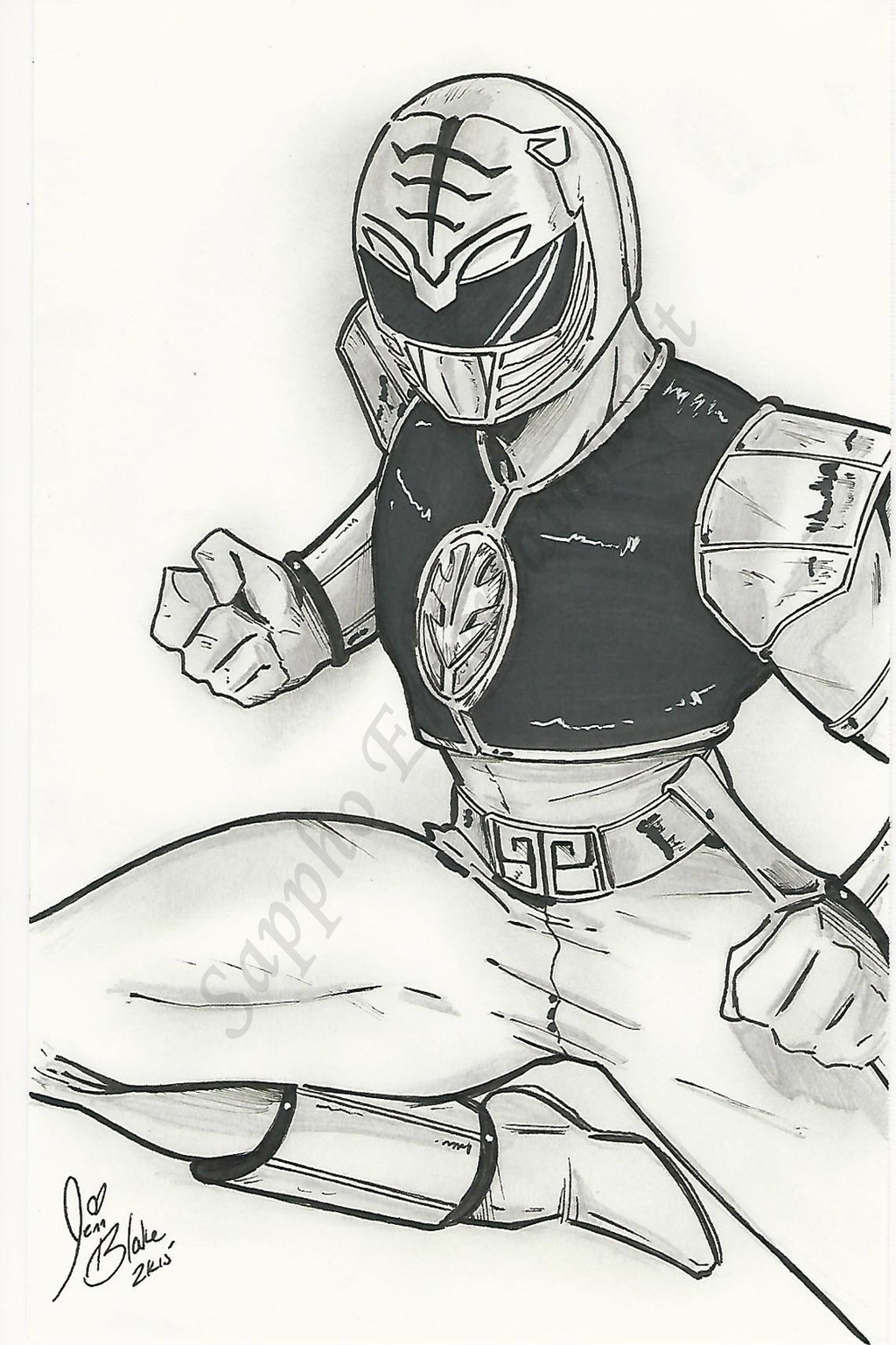
Didn't know where I was going with it...design was getting too cluttered 🤔Related content


Comments: 12

Nice! I love how the visor is based on the symbol.
Btw, is that the actually planet on his helmet?
👍: 0 ⏩: 1
Cool! You did so many planet designs XD
👍: 0 ⏩: 1

I feel like I haven't got it right yet 🤔
Besides the helmets lol
👍: 0 ⏩: 1
I feel that for this one you went with a more astronaut theme.
It's really cool, but maybe in combination with the helmet it's a bit too much. So maybe you can try something more simple for the suit.
You know, let the helmet be the main part.
👍: 0 ⏩: 1
You're right. I felt like the suit was getting too busy. What I want to do for the suits is a simple design with a symbol. I've been looking at a lot of Saint Seiya for this design
👍: 0 ⏩: 1
Gla to help.
While Saint Seiya designs are awesome, they're not exactly subtile XD
👍: 0 ⏩: 1
Haha!
They're awesome
I like this look
fernandohko.deviantart.com/art…
👍: 0 ⏩: 2
Okay, I remember why I put that shoulder pad on that side...
With the streaks going across the chest, I was trying to give the idea of a rocket blasting off
Hmm...Now I'm getting an idea for another design XD
👍: 0 ⏩: 0
That's cool. I can see where you got the idea for the design from XD
👍: 0 ⏩: 1
Hmmm....I think that shoulder pad should go on the other side 🤔
👍: 0 ⏩: 1
Yes. With the symbol on the other side, it might look less busy.
👍: 0 ⏩: 0