HOME | DD
 E-Mann — Batman Beyond 2.0 - Issue#40
Published: 2014-10-20 03:31:44 +0000 UTC; Views: 17381; Favourites: 575; Downloads: 0
Redirect to original
Description
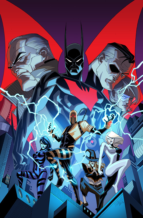
Cover to the final issues of Batman Beyond 2.0. I had to come back and give Terry Mcginnis a proper send off (Wink)") It was Great to finally get to do a cover by Thony Silas.
It was Great to finally get to do a cover by Thony Silas.As I said before when I left Batman Beyond 2.0 earlier this year, it was an incredibly fun book to work on. We had an awesome team. If the stars align and the chance for me to work with Thony, Kyle and Alex appeared I would definitely do it.
Lineart
Color
Related content


Comments: 14

👍: 0 ⏩: 0

This has been one of the most-looked-forward-to titles each month...and the 1.0, too....was never sure why the re-name (that and starting at ish 1 w/ teen titans also had me at a loss). I'm sorry to hear it's cancelled. Do you know why it was cancelled?
👍: 0 ⏩: 0

Really good work!! Love the lighting! One small thing I noticed though, is that batman's symbol seems to be excluded from the blue lighting.
It should be purple, with blue hitting it.
Everything else looks great though! The warm, cool separation, the saturation of the characters, to draw your eye from one to the other.
 (Smile)")
👍: 0 ⏩: 1

That's because E is trying to bring focus to the the logo, he's not going for realism. The red is the most prominent thing on the page. This is a cover and you want things to pop from across the room and when sitting on the rack next to hundreds of other books.
It's all intentional.
👍: 0 ⏩: 1
I thought about that, but there are other ways to make it pop, for example: turning up the saturation levels, your eye is drawn to saturation.
It was just supposed to be a friendly critique, if anything I was hoping to learn something from him. I'm working my way into the industry as a colorist and I just thought it might be interesting to find out why he did that.

👍: 0 ⏩: 1

What said is exactly right. As a colorist on covers you are looking for impact from a distance even the use of certain colors can catch a persons eye. Red inherently catches peoples eye and i didn't want to muddy it up by letting it be affected by the blues also not to mention there is a lot of purple on the cover I didn't want it to get lost.
Saturation is a possibility for separating planes like for ground midground and background but when dealing with print media you can't Saturate your pages too much. I am already pushing it as far as saturation. When that Cyan prints it is going to knock down a lot but I knew that. not to mention blues and Cyans print darker so those guys in the front will pop a bit more in the printed version.
I know what I did on Thony's art doesn't make a lot of sense in reality but his work isn't exactly reality. It is graphic and I wanted to reflect that in my color work almost as if he was coloring the work himself. My Theory on coloring is that it all should feel like one hand created the artwork. For me each person I color is a unique equation. I apply what I know as and illustrator, try to get in their head and give them each a tailored color job as opposed to rinse and repeating the same thing on a different artist.
👍: 0 ⏩: 1
This is what I was hoping for... some knowledge on covers and what to do for the industry.
I've read up on color theory, so I was aware that red catches the eye. But, what I don't know is what looks good in print, how much the producers change your work and what you want on a cover.
Thank for this! It was helpful.
👍: 0 ⏩: 0

I did a quick wiki on the Comic Book version of this series, it seems that since 1999 that this version of Batman Beyond has had trouble finding solid footing and getting a long running series going which is sad. and now this series is being stopped because of some issue with digital release schedules.
hopefully it gets picked up again.
👍: 0 ⏩: 0

Damn it, this is cool. This show is so cool ... I can't get over it.
👍: 0 ⏩: 0

Wait—where will I go to get more Batman Beyond after this? I haven't heard anything about a new series. Is he slated to appear in another ongoing publication about which I know nothing? This is very important to me.
👍: 0 ⏩: 1
Unfortunately, I have no idea what DC plans to do with Terry Mcginnis and the Batman Beyond univers.
👍: 0 ⏩: 1
I guess we'll just have to get good and create the stories ourselves if we want to be sure.
👍: 0 ⏩: 0


👍: 0 ⏩: 0