HOME | DD
 e12dollarz — Scram Final
Published: 2008-06-06 05:53:21 +0000 UTC; Views: 3188; Favourites: 70; Downloads: 47
Redirect to original
Description
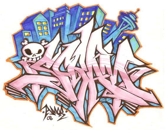
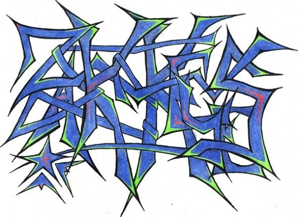
Well here it is. All that practice and I ended up going a different direction in some ways... Had to represent Seattle ya know (Wink)")
Hope ya like...
Tune in to Marker Wars for the vote coming soon.
Related content


Comments: 42

")

dude ya should totally submit this to battlegrounds.[link]
theyre having a scram battle in remembrance/honor/idk to the markerwars moderator
did the original markerwars moderator ask ya to draw SCram?
👍: 0 ⏩: 1

I don't remember, it was a while ago. Might be too late to submit now, but I'd definitely have submitted if I'd known.
👍: 0 ⏩: 1
damn!
ya woulda so taken that battle!
killed em all.
i submitted mine. it was shit tho.
dude come battle![link]
👍: 0 ⏩: 0


damnn! comes out all guns blazing, the pink with brown band looks fresh as hell.
im liking these refined pointy styles heaps
👍: 0 ⏩: 1

you are definitely inspiration for a practicing graffitti artist like me!
-watching-
👍: 0 ⏩: 1

Everything about this is ridiculous
In a good way
👍: 0 ⏩: 2
Ha ha, thanks  (Smile)")
👍: 0 ⏩: 0
Nice to see more of your stuff btw!
👍: 0 ⏩: 0


Awesome coloring skills, I like how everything is so well placed in the page and in balance, the only thing I don't like is the color scheme, but that is amatther of taste, good job!
👍: 0 ⏩: 1
Not diggin' the pink huh?
👍: 0 ⏩: 1
lol, no it's more like the Blue/Pink combo I'm not diggin, if I just look at the buildings or at the letters it rocks a lot, also as a whole, but as I said not feeling those colors together
")
👍: 0 ⏩: 1
Gotcha. Sometime soon I'll be getting some more markers. I have Copics, which rock, but I only have 12, so my color palette is limited.
👍: 0 ⏩: 2

Work with some sharpies..
They aint that bad..
Or sum prismas..
👍: 0 ⏩: 0
Yeah, I understand.
Just don't stop submitting your stuff
👍: 0 ⏩: 1


very nice, i think this is your best scram so far...
great style and fillin...
👍: 0 ⏩: 1


is this still an open battle!?!?! @ MW's
BTW I think you got it done right. Went with sharper edges, totally moved away from the swirls and arrow forms. Very aggressive style. Nicely done.
👍: 0 ⏩: 1
I don't know if the battle's still open. I am also quite pleased with this one, but there's still room for improvement. Sometimes you just have to scrap the original plan and go with your gut.
👍: 0 ⏩: 0

