HOME | DD
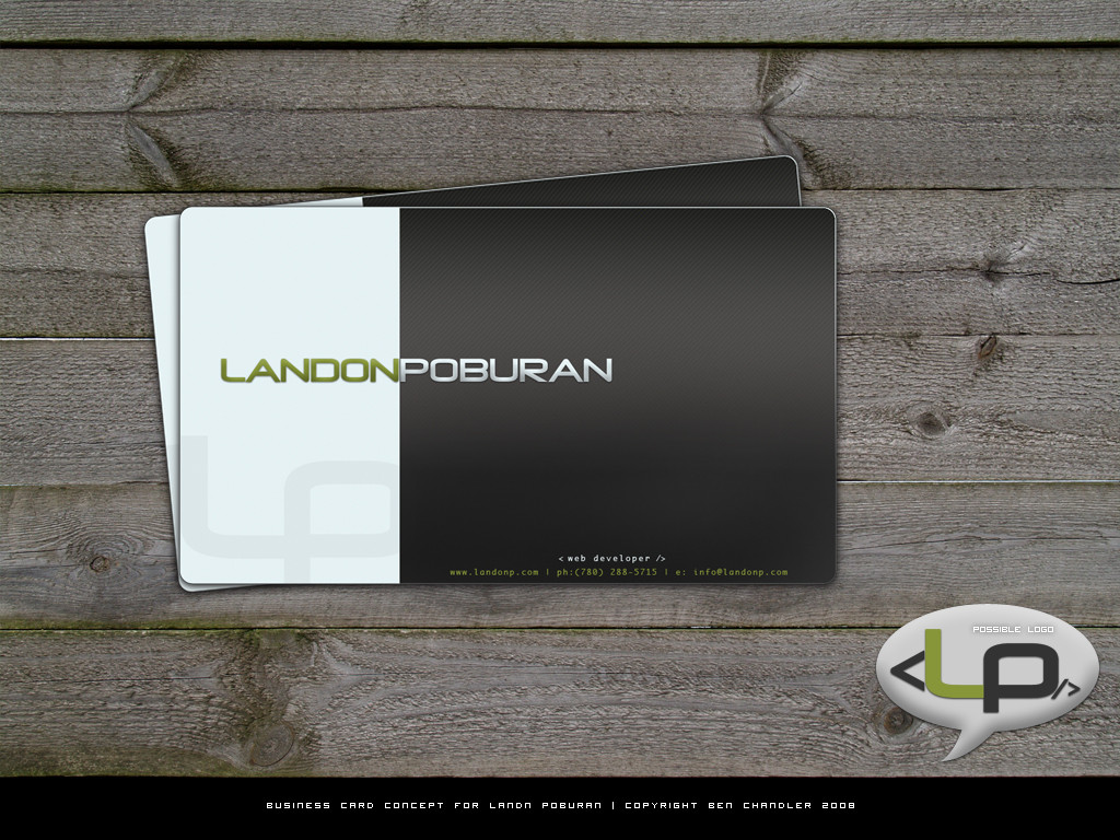
 e1337zA — Business Card Concept
Published: 2008-02-09 06:40:58 +0000 UTC; Views: 30267; Favourites: 92; Downloads: 2841
Redirect to original
Description
business card conceptstock from sxc
Related content


Comments: 16

nice video...bro..
Hello guys.... are you looking for a professional , unique and creative business card
then order it now..
here is link >> goo.gl/5KUp9v <<
👍: 0 ⏩: 0

would like to know what you would estimate for a logo and business card for photographer many thanks info@cymontaylor.com
👍: 0 ⏩: 0

Nice work, Thanks for sharing.
-
Also Find Free PSD Business Card Templates Renewed and Exclusive At: PSDFly.com
👍: 0 ⏩: 0


can anybody tell me that how can I get the businesscard's psd version? I would like to use the card of mine new business card
👍: 0 ⏩: 0


A nice layout and some real nice details, particularly like the design of the text.
👍: 0 ⏩: 1

thanks! too bad the client didnt like it
")
👍: 0 ⏩: 0

really like that design, personally i would have only the title on the front. information such as mobile, email etc would be on the back. while the website i would make larger, more readable without having to look closely and i'd move it below Poburan but slightly offset to the right. **shrug**
with regards to ur "possible logo" i like it, but the only thing i would change is the chat-bubble, i feel that it doesn't really go with whole web development industry.
i also like how u did the stripped-black section and the title font with its effects is very nice.
what did u use, photoshop?
 (Smile)")
👍: 0 ⏩: 1
oh thanks! yeh i agree with the overall layout of the design if i was going to get it printed it would be two sided as u said.
in regards to the logo, the bubble is just a way a bringing attention to the text.. i suppose looking at it now i can see how it could be taken differently.. thanks for the feedback
yeh photoshop mate..
thanks for the kind words
")
👍: 0 ⏩: 0

design is great, text at bottom is very small, and i like small text. maybe if it was around 7-7.5 pt at least and arranged differently.
otherwise nice card.
👍: 0 ⏩: 1
thanks for the feedback! I was thinking the same thing myself.. will go and change it
thanks for the comment mate!
 (Wink)")

👍: 0 ⏩: 0

thankyou! and thanks for the 

👍: 0 ⏩: 0