HOME | DD
 ECP-Pro — ECP Temp
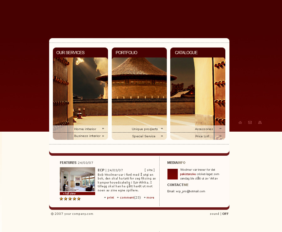
Published: 2007-03-24 15:34:42 +0000 UTC; Views: 5255; Favourites: 30; Downloads: 211
Redirect to original
Description
2007 - Just for funRelated content


Comments: 16


Veldig bra! Fin og ovresiktilig, freshe bilder og font!
👍: 0 ⏩: 0
controlthepixel [2007-03-25 05:10:14 +0000 UTC]
I love it overall. Just on the right side, you have the pixel icons.
they seem pointless.
Home icon, decent.
But email icon? What kind of user would use email there?
And what's with the Flow chart icon?
Any purpose?
Layout looks great, it all works,
Very good. 
👍: 0 ⏩: 0


Fantastic Web Design, Very nice color scheming, i like it............. Oh bye the way visit my profile and leave your comments also please.
👍: 0 ⏩: 0


Looks great! Though, it might be cool to remove the "Features" and "Media Info" sections and just letting the red wrap completely around the main pic and nav area. You could then put the Home, Mail, and (I can't tell what the third one is supposed to be) just below the main picture and nav area. Doing this would make the design look cleaner, imo  (Smile)")
I'm not sure what you could do with the "Features" and "Media Info" sections, however. Maybe replace two of you main nav links with those two sections instead? **shrug**
👍: 0 ⏩: 0

yeah nice i like it
only minor thing is spelling lol
under portfolio
it says 'unique prosjects' should be projects i think lol
very nice interface
")
👍: 0 ⏩: 0

søt du.. fremdeles mistet gleden ser jeg? håper vi får den igjen snart da kim!
med andre ord.. sett bedre fra deg!
👍: 0 ⏩: 1