HOME | DD
 ECP-Pro — UFC Redesign.
Published: 2011-05-28 12:59:44 +0000 UTC; Views: 10287; Favourites: 112; Downloads: 346
Redirect to original
Description
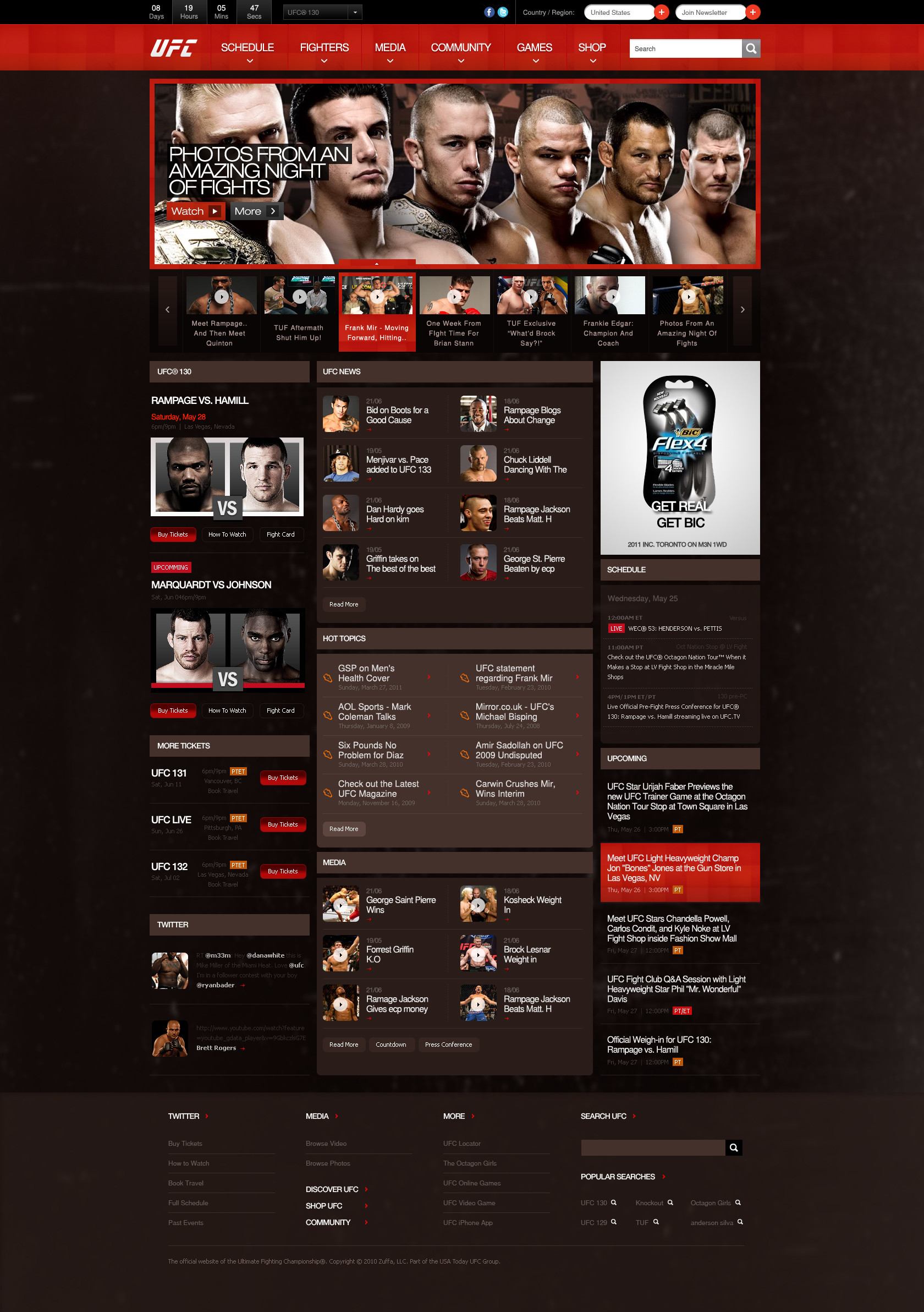
Download for better view.I am a big UFC fan, so I thought a redesign could be pretty interesting.
Just for fun..
ECP Production
2011
Related content


Comments: 27

")


Brilliant work. No doubt in it. Super awesome....
👍: 0 ⏩: 0


B-E-A_Utiful!!! How much would you charge for a design like this normally? Just curious
P.S Can't wait for Brock Lesnar to come back!!!
 (Wink)")
👍: 0 ⏩: 0


Thanks mate  (Smile)")
👍: 0 ⏩: 0

To be more specific, I'm referring to the schedule on the right side of the page. I know you have the main fight cards listed on the left, but you might as well put the rest of the pertinent information up towards the top as well.
👍: 0 ⏩: 0
A very good and informative layout. The colors remind me of dried blood stains on a cage mat, and the locations of each widget are very intuitive. One thing I'd suggest though, is putting the upcoming matches above the advertisement. That way, if someone is looking for what the UFC is coming up with next, it's right there at the top. To a fellow MMA fan, that's very important to me (who's fighting next), and I'd rather not have to scroll down the page to find that info. Beyond that small suggestion, it's still a very good design, and I wouldn't mind seeing this as the official UFC website! ")
👍: 0 ⏩: 1
Thanks mate.
I would put it on the top, but I think UFC has to have the advertisement on the top. But if not, ofcourse it would be like you explained!
👍: 0 ⏩: 1
Ah, very good point, one that I didn't even think of. I'm sure it costs quite a bit of money to rent some advertisement space on a big high-traffic website such as the UFC's. I'm sure they would want the ad up on the top as well, simply for that reason alone.
👍: 0 ⏩: 0


looks very professional.. and I quite like UFC also..
👍: 0 ⏩: 1


I actually dont like UFC. But ur design is pretty nice
👍: 0 ⏩: 0


