HOME | DD
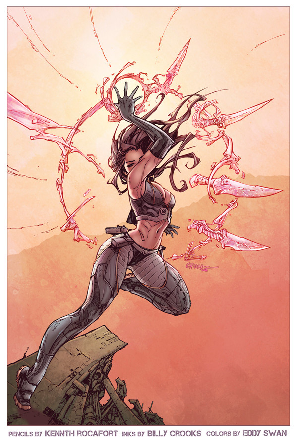
 Eddy-Swan-Colors — Cyblade redux 2.5

Published: 2012-01-09 06:52:21 +0000 UTC; Views: 4224; Favourites: 160; Downloads: 315
Redirect to original
Description
Pencils by kenneth RocafortInks By
colors by me.
this is the last time I promise!
I decided to try the same pallette but without the heavy atmosphere, I might use these images as part of a style guide for my commissions since there is so much variety.
Related content
Comments: 14

Reminds me of a champion from league of legends, blademaster
👍: 0 ⏩: 1

Im not familiar with that.
👍: 0 ⏩: 1

Here's a picture of her for you, you might see some similair.....things [link]
👍: 0 ⏩: 0

My 2¢, which is really worth about 0.005AUD, would be to soften the areas of the colour hold so as to create a semi-transparent effect, rendering the psi-blades more like the energy blades they are as opposed to physical. Does that make sense? It's gorgeous, as is, but just because I know you're trying to improve your craft. Much goodness, here, tho. Winner!
👍: 0 ⏩: 1

thanks for the tip man!
👍: 0 ⏩: 1

You bet! I'm no colorist, but I know what I like. You probably guessed that, working with me, eh?
👍: 0 ⏩: 0

you're very welcome!
👍: 0 ⏩: 0

The figure doesn't look like she's being swamped by the bloom so much in this one, but I really liked the richness of the colours in the last one. Saying that, the figure & ground does look a little more ... kinda solid here, and I think it shows off your rendering to better effect too. Hard to pick really.
👍: 0 ⏩: 0


