HOME | DD
 Eddy-Swan-Colors — Velocity(redux)

Published: 2013-05-07 13:15:08 +0000 UTC; Views: 17875; Favourites: 796; Downloads: 396
Redirect to original
Description
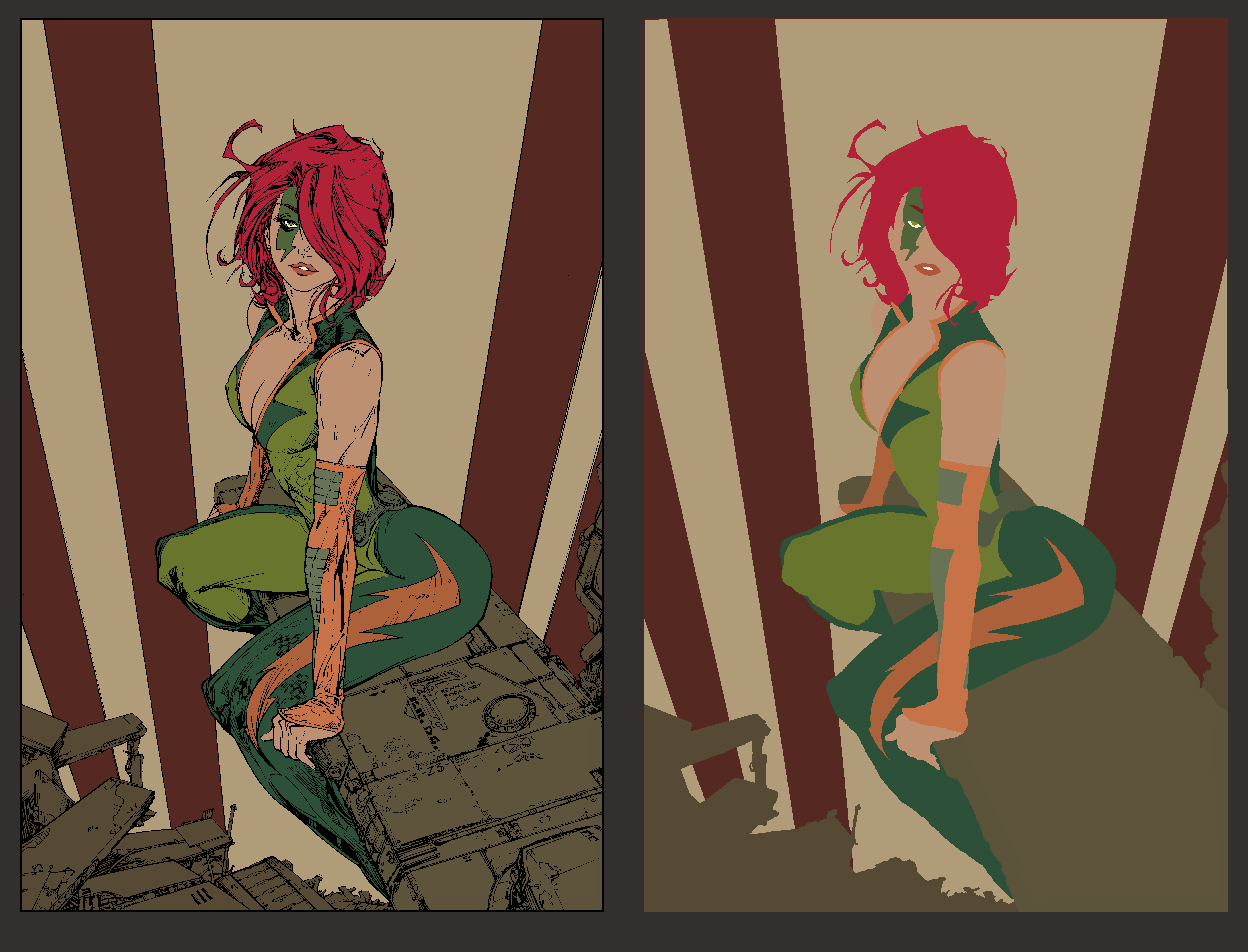
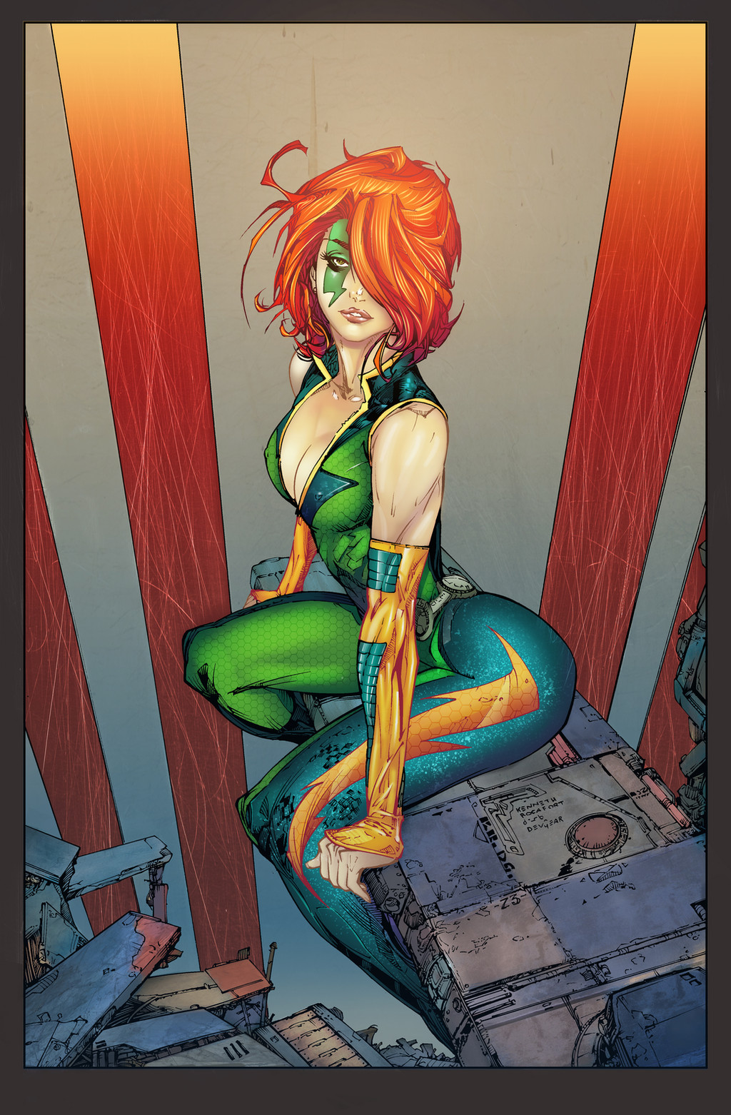
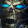
Pencils by Kenneth rocafort
Colors by me!
Well this one was a tough one to redo. high expectations for myself, the first time I colored this I got my first daily deviation. I'm not expecting the same success, I just wanted to have a crack it again to see how far I've come. my first attempt had a certain look, which I still kinda like, but I think this pallette is better suited to the character. I think this version also shows an improvement in my rendering.
Here is my first attempt for those who never saw it.
My Twitter | My Facebook | My Tumblr
Contact me at:Eddy_Swan@live.com.au
Related content


Comments: 53

Cheers adam! Im open to the possibility that's for sure.
👍: 0 ⏩: 1

Cool. Let's both have a think about what
 (Smile)")
👍: 0 ⏩: 0

Don't know who this is, but gorgeous colors and I love the lips
👍: 0 ⏩: 0


This one is def better than the fist one. It's so much more vibrant and alive. The lighter background also makes her pop even more.
👍: 0 ⏩: 1

Eddy!! Lookin great! I saw this one clicked on it to see who did it! Glad it was you, I remember the old one. I really like how your color choices are evolving...
👍: 0 ⏩: 1


Nice! I really like both, but this one seems to bring the character out more. <3
👍: 0 ⏩: 1


I definitely highlights the growth in you skills! Awesome job!
👍: 0 ⏩: 1

")

Dynamic! Although I can't decide if either is better than the other.
👍: 0 ⏩: 1


I love the red textural detailing in the shadow at bottom-right - another simple little touch that just works so bloody well!
Still love the original, but you've owned this again in a completely fresh way.
👍: 0 ⏩: 1

Love the lighting in this one! Seems we are both revisiting our Rocafort lines
 (Wink)")
👍: 0 ⏩: 1
Thanks man! yeah, I tend to revisit old lines alot.
👍: 0 ⏩: 0

I like this but the first one is ultra-sweetness
👍: 0 ⏩: 1


oooh hypnotic icon... o_O
👍: 0 ⏩: 1
You are getting sleepyyyy... sleeeeeeepppyy *Yawns*
👍: 0 ⏩: 1
rrrrrRRRRRrrrZZZzzzzz rrrrrRRRRRrrrZZZzzzzz ....

👍: 0 ⏩: 0

Very interesting mood, quite post apocalyptic. I think I love the two versions, each one bringing a specific look. Good work, as always
👍: 0 ⏩: 1
| Next =>