HOME | DD
 EduartBoudewijn — Commission: Big and Smaller part 1
#cinderella #cindy #comic #disappear #disappearance #fairy #fairytale #female #girl #magic #magicpotion #mouse #potion #princess #rat #rodent #shrink #shrunk #tale #tf #transform #transformation #woman #fables
Published: 2019-03-14 22:08:26 +0000 UTC; Views: 21514; Favourites: 112; Downloads: 35
Redirect to original
Description
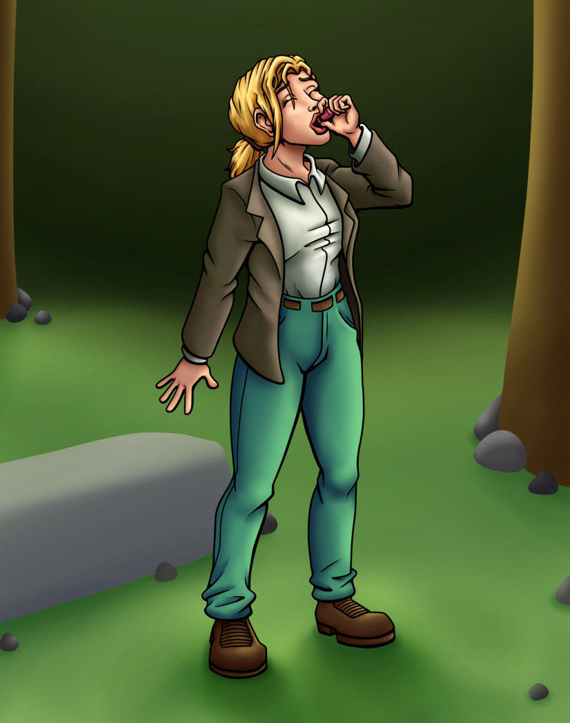
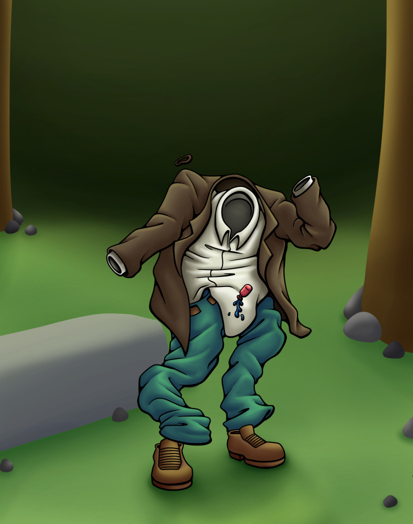
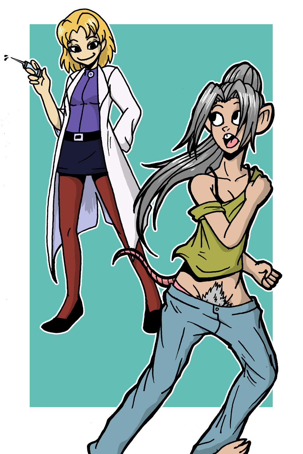
Here's a new commission I drew for mad-charles . He asked me to draw this sequence based on a very similar transformation in Fables #51; where Cinderella drinks a potion to turn into a mouse to get into Smalltown. Check out Fables #51 if you can track it down because it's quite an awesome few pages.Anyway this is my take on the sequence; based on mad-charles 's preferences. I'm really quite happy how it turned out and I hope you all will enjoy it too!
Next:
Related content


Comments: 22

Hey I critiqued the last part of this sequence so Ill cant wait to also check out this one!^^
First Impressions:
I recognize the cloths from the last one! and now I see the actual human before they transform and it still looks really great <3
Strengths:
1.) Character design:
I dont know why, maybe the overcoat look, but she reminds me of a ranger, scout, or wildlife person and I don't know how intended that is but it matches the scene and it does look really great ")
2.) Shading:
Wowow just as good as the other and it looks very similar in style and I love it O: I can clearly see where the light is coming from and there is very little hiccups in it. Again all I can say for this is that i t could use some more darker shadows, the amount of highlights is strong and fine as is. Some areas would be right under the coat, in the creases of the clothing and under hair strands.
3.) Anatomy:
You also did so great at the position she is in, and the anatomy that goes with it! even the hands are pretty good except for one little thing I will mention later^^ You can clearly see where things like the knees, elbows, chest, neck and it protrusions are and I applaud you for that as she also has cloths that makes it harder to show those definitions at times.
Things To Work On:
1.) The One Hand holding the Object:
Its a really great hand drawing actually (better than anything I could ever do haha) but there is one little problem, the fingers are closing in too tight. She is holding something and it needs to be accounted for. I think what should be done is this- angle the hand upwards a bit more as it seems to straighten out a but, and the make her grasp on the object a bit more wide so it looks like she is hold the whole bottle.
2.) Shadow casted:
First off, it should be a bit darker, and then getting lighter as it expands out. but its also not in the most correct place. Looking at the shading on the character, the light source seems to be coming from her front side, and not behind her as the shadow suggests. What i would do is simple, move it over so its behind her backside and getting cast over the rock.
3.) Background:
said this in the last one so Ill just summarize what i said before;
The Background lacks the detail compared to the characters detail, looking very empty with only 3 main props to stand for. Its boring and I think you should add more to it!
Bushes, more trees or a skyline to the background.
adding foliage, more grass detail or rocks to the middle ground
making that rock in foreground more naturally shaped (not a perfect square) and detailing the shading a bit more to the more nature textures. Also add more grass detail/foliage.
You can also use the skill of breaking down the background again to help you
Overall:
I love the idea of a sequence! The person reviving these must have enjoyed them so much
👍: 0 ⏩: 1

Thanks so much for your very helpful and very in-depth comment! I'm very glad you liked the general look of the image and the points you brought up as improvements are definitely valid and clearly presented. I'll be sure to try and keep them in mind for my next images!
Thanks again!
👍: 0 ⏩: 1
<3 no problem glad to have helped
👍: 0 ⏩: 0

hi there! i'm here because of
here are my thoughts on this!
the thing that immediately grabs my attention is the grey shading. one great way to improve the content of your post is to shade with the colour that compliments the colour that the shadow is on! this post right here ( 66.media.tumblr.com/177930b895… ) has helped me so much with this specific problem. taking a little bit of extra time to add those little shading details can change so much in a piece for the better.
another thing i noticed is the background. it just fades off into green nothingness, and leaves me guessing on where the heck she is! obviously, she's in a place with trees and rocks, but is it a park? a forest? i can't figure it out for the life of me. taking a few extra minutes to add some details onto the background can improve the quality of a piece so much, i find!
good luck in your future art endeavors!
👍: 0 ⏩: 1
Thanks a bunch for the tips; I'll be sure to keep them in mind for future images!
👍: 0 ⏩: 1

Hello, I’m here as a part of ProjectComment. You did a really nice job on your image!
I especially like the details in her hair and clothes. The wrinkles on her clothes are well placed. The main places where her hair is displaced really draw my eye.
I like the use of heavy lines for the character. It really makes her stand out from the background, which has none. While the background could have a bit more detail, I feel as though it is fine, because the image is primarily focused on the character’s transformation, and you don’t always need to have a detailed background for that. The background itself has a decent depth of field given the shadows and highlights placed in consistent, realistic places. The colors overall feel very good. I like how they’re not too bright, but still catch your eye.
Overall, the art style reminds me of the animation styles used in mid 1990’s to early 2000’s children’s programming like Where on Earth Is Carmen Sandiego, The Book of Virtues, Adventures in Odyssey, and Captain Planet. I’m a big fan of that style, so it’s nice to see it again. Do you have any plans on doing any animation at some point?
Hope this was helpful!
 (Smile)")
👍: 0 ⏩: 1
Thank you very much for your comment; I really appreciate the feedback!
I think my style is definitely inspired by a lot of old children's cartoons, it's a style that appeals to me a lot. I have done a small amount of animation before and I hope to return to it in the future. It's a very interesting medium, unfortunately it also takes a ton of time to make anything
")
👍: 0 ⏩: 0

Hi I am IblisTriger , I am from and I have mini critique for ya
For starters I love the colors and texture you were able to create for the gal. You were able to create an actual story from such small movement of her arms. I am really impress, plus the short story is quite humorous
I believe you could do a bit more within the transformation, don't get me wrong I do find it unique that you referenced no poof or any signs of changes. It was quite interesting. The only recommendation I can give you is to create the surroundings more alive as well, it looks quite plain and simple. I believe you could of added in a bit more different shades of brown, gray, and green.
Well that is all I could really say, hope you have an very lovely day
👍: 0 ⏩: 1
Thanks a bunch for your feedback; I really appreciate it! I'll be sure to keep your tips in mind for the future!
👍: 0 ⏩: 1
Your very welcome >w<
👍: 0 ⏩: 0

Hello, commenting on behave of ProjectComment ´s Big comment contest.
I think that this drawing looks very good. Especially anatomy is well drawn. You even drawed her hands and fingers in natural and realistic pose, that´s great. Also, her whole pose looks realistic, I like that she´s shading with feet some space apart for better stability (because person needs some extra stability when leaning back to drink like this).
Also the colouring looks well. The colours seem to be blended together well and there is visible shading. However, the shadows don´t seem to be completely consistent. On her body, the shadows are on the right/back side, so the light source is presumably on the left/front side of picture. However, her shadow is on the ground in front of her, while it should be more behind her. Similarly, the shadow on the tree in the right side should be consistent with shadow on her body, and hence it should be on the left side, not right.
Overall, I think that you did a good work drawing this and that you showed clear skills with drawing people.
👍: 0 ⏩: 1
Thank you very much for your comment! I've recently been trying to be more consistent in my lighting and shadows; that was definitely a big miss in these images. Thank you very much for the feedback!
👍: 0 ⏩: 1
You´re welcome. I wish you good luck with your drawings.
👍: 0 ⏩: 1
Thank you very much ^^
👍: 0 ⏩: 0

Hi there! I'm from .
First of all, beautiful work! You have an incredible grasp of proportions, and the shading is spot-on. The creases in the jacket and trousers add another level of dimension to your work, and the colours all work well together. I'm especially impressed by the accuracy of the hands - her left hand is curled around the bottle in a completely believable position. Great job!
There are just a couple things I'll critique. The major thing is that it's quite obvious that the trees and rocks have been shaded with an airbrush, and that just isn't realistic. If you have some sort of textured bark brush like these , it'll make your trees look more believable. There are also other brushes out there for rocks. I think there are also grass brushes, which would help. Right now, the grass beneath her feet has no clear distinction from the forest behind her, and it doesn't make sense to think she's on a mountainside with the grass really stretching that far up behind her. So just a couple blades of grass here or there could set the horizon and add some variety to the ground, which is just a smidgen on the plain side right now. Textured brushes really do help make artworks more interesting, and are a quick way to up the level of detail without too much work.
If there aren't any good free brushes you like, then perhaps consider following a tutorial like this , this , or this . (Just search "rock/bark/grass digital art tutorial" in Google, you'll find tons of resources.)
A few things about lighting - for the most part, you've kept the lighting very consistent, so props to you! The only discrepancy I see is that while the primary light source seems to be to her left, her cast shadow on the ground is in front of her when it should be to her right. This last part isn't strictly necessary, but I personally believe it makes pieces look much better: rim lighting . Adding some rim lighting or changing the lineart colour will give you a less comic book feel, and considering you're shading with an airbrush, I'd assume you're not going for comic-book style.
In all, amazing work! Excellent proportions, lineart, and shading of the human figure - just a bit of work on the background could help. Otherwise, this piece is great!
👍: 0 ⏩: 1
Thank you very much for you comment; I really appreciate the kind things you said as well as the very helpful resources you linked. I'll be sure to experiment a bit in the future and hopefully I'll be able to improve upon my images through it!
👍: 0 ⏩: 0


I remember seeing this on the stream a while ago. This is what inspired me to do the Princess Peach sequence, especially Parts 2, 3, and 4.
👍: 0 ⏩: 1
I remember as well; Thanks for joining the stream! It was great to have you there!
👍: 0 ⏩: 0

Awesome set my friend! I love the effect of the clothes~
👍: 0 ⏩: 1
I'm really happy how it turned out in the end; but it was quite tricky to get there!
👍: 0 ⏩: 0