HOME | DD
 edumicro — ThunderBlog

Published: 2010-04-09 17:08:55 +0000 UTC; Views: 57526; Favourites: 451; Downloads: 1895
Redirect to original
Description
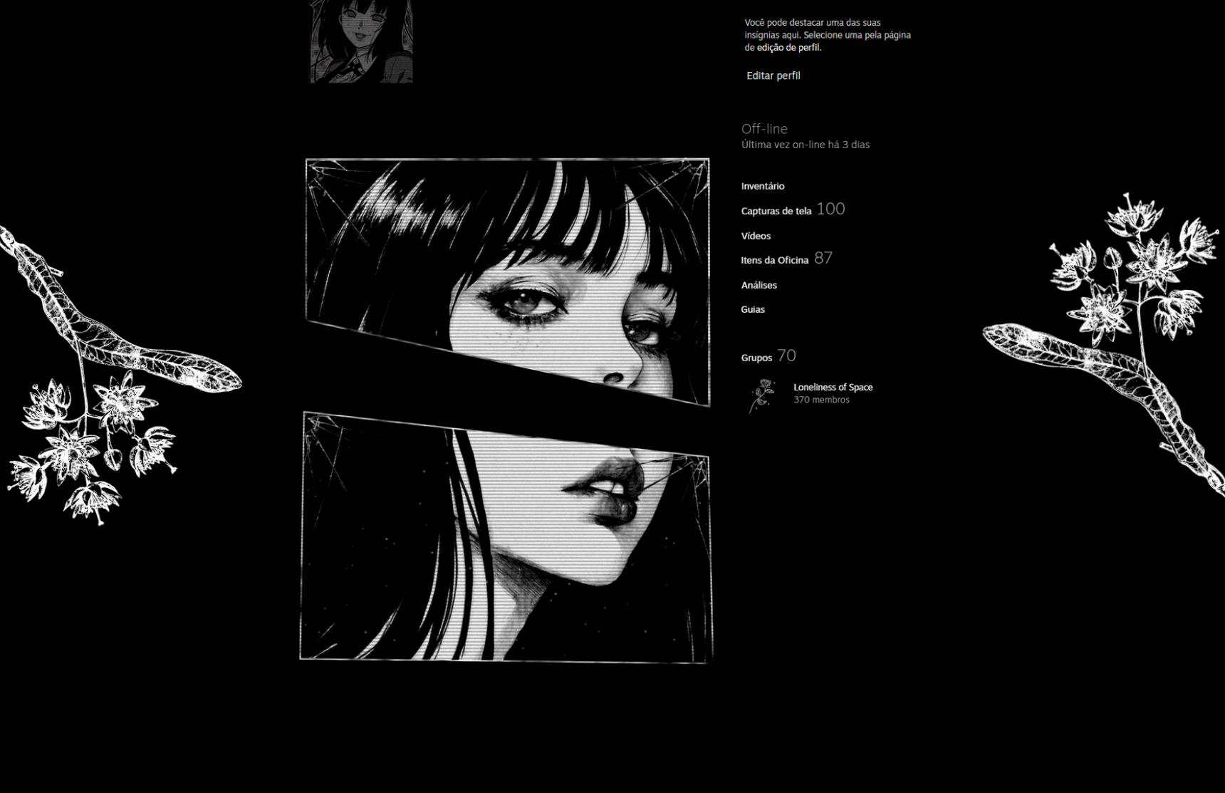
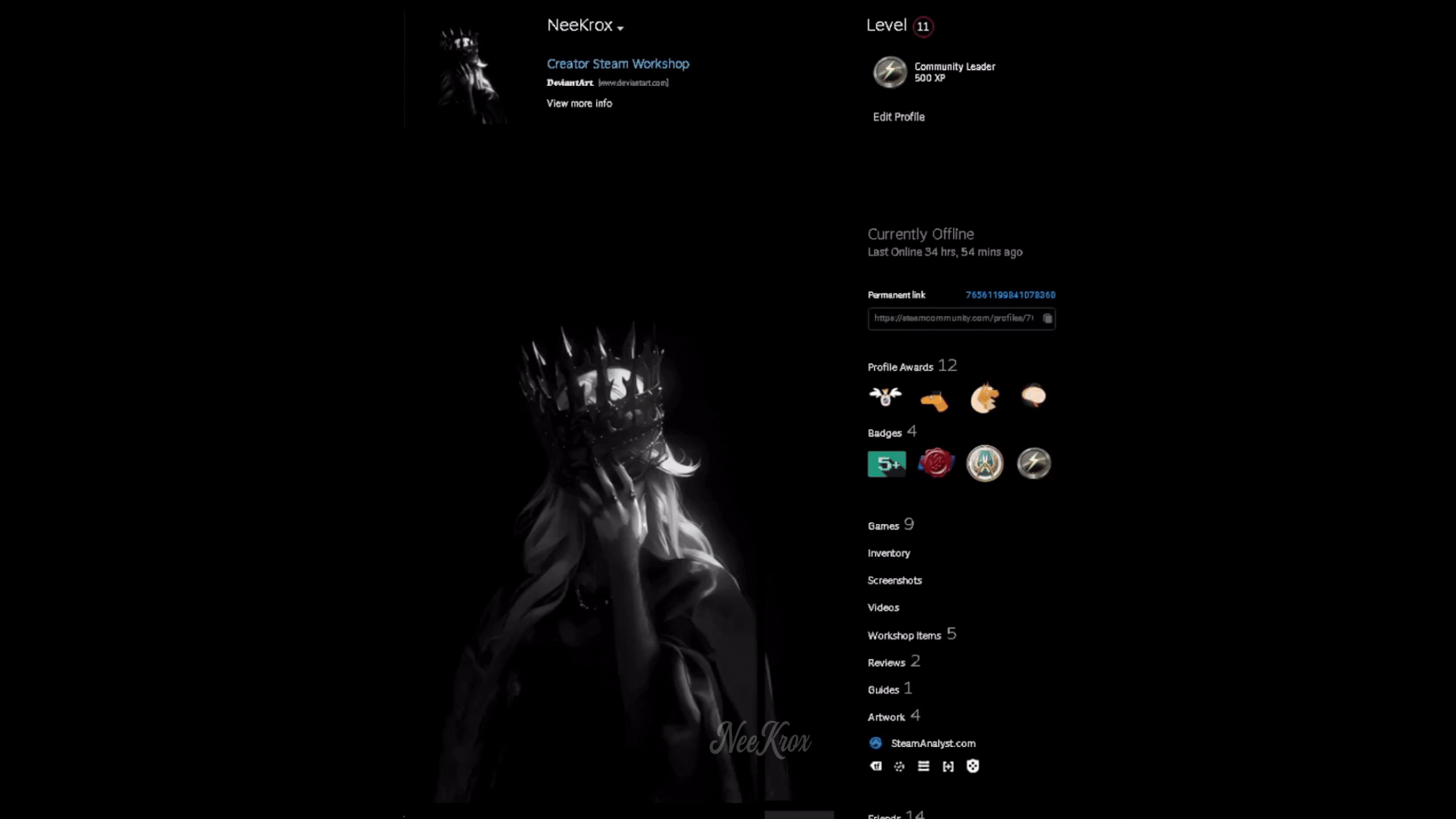
Description: ThunderBlog is a Wordpress Theme with subtle pixel perfect details, nice gradients and an atractive color scheme. For an alternative color scheme please visit this link .Credits: The artworks or photography that you can see in this work, were only used for demonstration purposes.
Please support these amazing artists.
» Breezy Day.
» Redemption.
» Nika.
» Delirium.
» Silk Icons.
» Fugue Icons.
» WooFunction.
 very appreciated!
Related content


Comments: 74


 (Smile)")


why do you keep saying this is updated, When it's not 
👍: 0 ⏩: 1

Well, actually I updated it. A minor update. ")
👍: 0 ⏩: 1
your just after more views ")
👍: 0 ⏩: 1
👍: 0 ⏩: 1


Not a big fan of the etched-in edges EVERYWHERE, but it works great for the dark areas (the buttons and such).

👍: 0 ⏩: 1
Thanks!
👍: 0 ⏩: 1
")

wowser 
👍: 0 ⏩: 1


oops sorry 4 the double post
👍: 0 ⏩: 0

wow i'm impressed!
It would be very kind of you if you'd tell me what type of font you've used..
👍: 0 ⏩: 0

This is really an inspiring work, congrats - you should start selling at themeforest.net.
👍: 0 ⏩: 0

Really like the simplicity mixed with the polished pixel details ! Great work
Can I ask what is the font used for the logo btw ?
👍: 0 ⏩: 1

very well done I just do not like how the category titles are just left there as if they are buttons.
Overall good clean design
👍: 0 ⏩: 1
They're not buttons but they're bars.  (Wink)")
👍: 0 ⏩: 0


is this for sale at all? contact me with a price please
👍: 0 ⏩: 1
It's not for sale. Thanks.

👍: 0 ⏩: 0

"So Mac" ! AM JUST IN LOVE, very very nice work. Well done
👍: 0 ⏩: 1


You ain't as good as you used to be
Don't get me wrong, the layout is very nice, but not as your previous ones. I don't quite feel the light grays.
")
👍: 0 ⏩: 1
Personally I think this is my best.
👍: 0 ⏩: 0


This is great design, absolutely stunning. There's so much attention to detail and your use of gradients is (and this sounds very corny but I can't think of a better word) inspiring.
👍: 0 ⏩: 0

your works is always awesome, but can't u change your web style i mean use images on the header try to put people on the design for the next design try to put highlights do stuff and maybe you can design for any other thing like os commerce and vb galleries not always blog
im not that good at web designing but i just see you super massive with web designing that why im telling you to use more ideas with ur good work
👍: 0 ⏩: 0

Verdadeiramente um ótimo trabalho. Gostei muito do esquema de cores e dos gradientes.
Parabéns!
👍: 0 ⏩: 0

| Next =>