HOME | DD
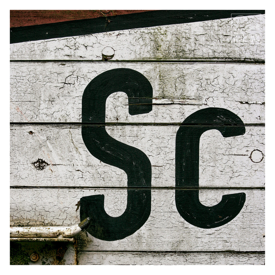
 EintoeRn — Sc
by-nc-nd

#boards #letters #planks #museumrailroad #abstractphotography #railroadcar #squarephotography
Published: 2008-09-26 15:58:14 +0000 UTC; Views: 1354; Favourites: 99; Downloads: 3
Redirect to original
Related content
Comments: 30

Great stuff,as usual !! Don't quite understand the title,though !!
👍: 0 ⏩: 1

"Stay cool" ... after all, the letters seem to float on the cracked surface. The red detail is very beautiful too.
👍: 0 ⏩: 1

This is the finest interpretation EVER !!! 
👍: 0 ⏩: 1

(most) Sexy Canan
(not going to change the title, though. so that the others will not find out 
👍: 0 ⏩: 1


👍: 0 ⏩: 1

So much about secrets
👍: 0 ⏩: 1

hard to keep a good secret ! 
👍: 0 ⏩: 0

Oh - such an old one with the 400 D - even from a time before good old Lady S.
👍: 0 ⏩: 1

Reading the comments, I believe you gave back the colors, maybe trying to make them *looking better* than how they were... ^^ ...So now you can say it is... ...Surely Cool!!... 
👍: 0 ⏩: 1

yes, it was black and white, indeed before
👍: 0 ⏩: 1

...Well, it looks great anyway!
👍: 0 ⏩: 1

Strong one, does well in b/w
I like the image and the texture of the wood.
Well seen.
👍: 0 ⏩: 1

Thanks Rob - colours were quite faded (also in the older version) anyway. Either pushing them with some lomo effect or the b-w. I like b-w quite a lot recently as it seems to condense the view without irritating colours ...
👍: 0 ⏩: 0


