HOME | DD
 ekud —
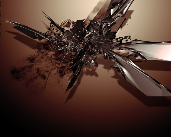
TUSK
ekud —
TUSK

Published: 2003-12-12 07:22:18 +0000 UTC; Views: 8948; Favourites: 171; Downloads: 4020
Redirect to original
Description
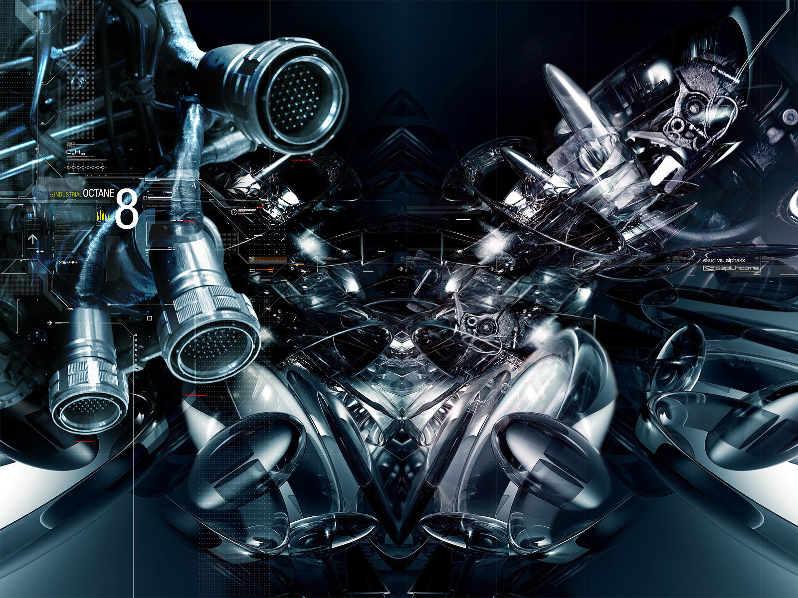
+TUSKMade for the new depthCORE release.
A piece that I could do absolutely nothing with, that still seems to have turned out alright.
jus
Related content


Comments: 147

Ha this piece got some funny comments in the first page, gotta love those pseudo-intellectuals. I vividly remember this piece as a flash front page (Webdiod made it I believe) and the music that went with it. Created a mood and thats what I used to love about the old Depthcore releases. The front splash page of each theme set the tone for what was inside (Favourite splash pages were Symphony, forgot what pack but it was the Reticore(Niteangel) piece and the one that was released to mark Dc's 1st birthday, accompanied by that song "The Fall' by sr-7(?))Made one want to explore the rest of the pack even more. BRING THE SPLASH PAGE BACK!!!!
👍: 0 ⏩: 1

Splashes will be making their return shortly! Alphakx did this one actually, not webdiod, though he did do most of them.
Yeah, back in the good ole days when people actually wrote more than 'this is cool lol'
👍: 0 ⏩: 0


you know the last time i remember ever looking at your stuff you were just beginign 3d and you were far from spectacular. No offense, wait has it been that long. Damn I suck anyway moving on. You composition in this is awesome you really activate that negative space nciely. The utilization of color and light to create this lumianry dream like focus is more than elegant. Ashame you never got into breed but who the hella re they now anyway. I think I got kicked out of breed now that i think of it. Oh well I just wanted to say your progression is fantastic and I lvoe what you've done with your hair?
👍: 0 ⏩: 1
Thanks for the comment bro.
I'm glad Breed didnt take me as well, I wouldn't have started depthCORE otherwise..
and yeh, i've been featuring dd's since 02 man. Glad you're on the ball
 (Smile)")
👍: 0 ⏩: 0


Dont know if i have given a comment yet...
But this peace shows what a real own style is...
A great piece, clear an clean with a great intension and a really great athmospheare.
Indeed amazing!
👍: 0 ⏩: 0

Going through your work looking for prints to buy. I am quite angry to find you only made this 4x6" ! BASTARD!!
👍: 0 ⏩: 1

i know this comment is a little late- just browsing through your gallery and it caught my eye. this is probably one of the few 3d works ive looked at for more than 5 seconds before getting bored. you've done a great job, picked great colours too, very tasty. i love the transparencies, the kinda organic feel (someone mentioned that before) and the shadow is a nice touch... the only negative i find in this piece is that its so smooth is most parts, and then i come across some jagged bits (eg. where the two most bottom parts join). its not a big deal, just something that irritates me a little. im not familiar with the 3d world, so i dont know how difficult/easy this piece would have been. either way, congrats on that DD, well worth it
👍: 0 ⏩: 0

I know you dont like me ")
👍: 0 ⏩: 1
why the fuck do you have my emoticon in your signature?
👍: 0 ⏩: 0

great piece! i love the colors and just everything about it. amazing!
👍: 0 ⏩: 0

This is my favorite abstract ever. Love the material you used. Perfection man.
👍: 0 ⏩: 0


Sometimes you pump out these sexy things with fresh and purty colors. This is one of them!
👍: 0 ⏩: 0


I LIKE THE 3D ...^^
it looks so simple, but very pretty..^^
👍: 0 ⏩: 0
I LIKE THE 3D ...^^
it looks so simple, but very pretty..^^
👍: 0 ⏩: 0
I LIKE THE 3D ...^^
it looks so simple, nut very pretty..^^
👍: 0 ⏩: 0


this should be a print, nice work, id love to have it on my wall
👍: 0 ⏩: 0

This is one of the most original abstract images I've seen this year. Remarkable.
I absolutely think the colours are sweet, and the contrast between the objects and backdrop is suttle, yet fascinating.
Sweet.
Keep the good work up.
👍: 0 ⏩: 0

damn missed this when i didn't login for a while.
anyways, IMO, this has to be one of the best pieces you've ever made and it definately deserves a fave.
the dazzling colours are amazing..and the simplicity without the 2d
friggin great piece, i hope you do more stuff like this. or something. whatever.
fav!
 (Wink)")
👍: 0 ⏩: 0


this is very interesting justin, not like your normal stuff.. but still turned out very nice, i love the render.
👍: 0 ⏩: 0

positive: great sense of flight as well as the fact that the shapes are almost organic in nature despite the fact that they have a metallic texture to them
negative: a couple of people have compared this to 'winter' and i can see why as both fall into a similar style. however in this piece the balance of elements is not as strong as it was in winter. im not saying it has to be centred but having just looked at winter again that piece has a better impact and feel than this one by a long shot. i cant say why - its just how i respond to the piece. also i have a problem with the background. one of the reasons why i really like your other pieces as well as depthcore stuff is that in many pieces there is an immense sense of distance, scale and size, which is evident in winter but strngely lacking here. it feels like instead of the piece coming out of the background, its just resting on it.
just my 2cents
👍: 0 ⏩: 1
this is a very good comment, very relevant to this piece. i agree with you.
👍: 0 ⏩: 0

This is so beautiful!!! The contrast of the colors is so... perfect! I love blue/orange combinations, and that metallic material is awesome!
👍: 0 ⏩: 0

Perhaps oddly, what I like best about this piece is the negative space. Rather than being outer-space like or filled with stuff like other computer-made abstract pieces I've seen, this one looks light-filled and airy.
👍: 0 ⏩: 0

we all know how hard it is to comment on these abstract things constructively nowadays (i'm passing on the "cool work!" and the " ^____^ " 's for now .. ) but i always try and relate this kind of work to something that remotely makes sense sense to me.
in which case, i see a metallic stinger .. possibly from a .. a .. mosquito. (spelled that right? boo-yah, if i did!) love the rather warm harmony of colors. perty render to boot.

👍: 0 ⏩: 0


This is kind of an odd piece. In design terms there aren't many good things to say about it. All I can think of is a warm/cool contrast, and the warm heavily outweighs the cools. The objects are kind of interesting, although you can't really identify them well with that...overly mettalic texture? All the business within the shiney stuff and the position of them throws the whole picture off balance. And the gradient is just oogie. Very edgey. Other than that though I guess it is interesting.
All IMHO.
👍: 0 ⏩: 1
fair enough!
i have never really been sure about this piece or how i feel about it. i agree with what you have said though.
thanks for your honesty.
👍: 0 ⏩: 0
| Next =>