HOME | DD
 El-ArGeNtO — SLIM and SHADY

Published: 2006-09-23 05:05:17 +0000 UTC; Views: 230; Favourites: 0; Downloads: 4
Redirect to original
Description
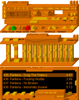
my try for a slim skin,first time i try this technique...inspired on stillwater's workscomments are welcome...
Related content


Comments: 14

I love the graphical aspects, though I agree with abe-x, it needs to be more sharp.
Other than that, very nice start.
")
👍: 0 ⏩: 1

thanks  (Smile)")
👍: 0 ⏩: 1
todavia no lo agrege...ni el boton "abrir" XD es q esta hecho por capas...esta todo separado ")
👍: 0 ⏩: 1

equivocarse...
Está muy bueno!
👍: 0 ⏩: 1
bueno si si...perdon equivocarse XD yo soy como la karina jelinek...no soy de la generacion de leer libros XD
👍: 0 ⏩: 1
Bueno, no te preocupes, conocí a una chica que leía muchísimo y escribía "güebo".
👍: 0 ⏩: 0

Nice start.. looks kinda empty though... but i'm used to one click controls of all the buttons. I'd like to see how this one turns out.
👍: 0 ⏩: 1
thanks
👍: 0 ⏩: 0

awesome idea... however, i'm not a fan of the bevel... it could be more detailed. plus, the symbols in the cbuttons could be sharper, and the world 'shuffle' needs to be in a slightly smaller font to fit the button properly. You could also try other colour themes. Great start!
👍: 0 ⏩: 1
thanks for the advice ave
👍: 0 ⏩: 0

Save it with an alpha channel!
Looks good, though, I think you ought to make the back-part darker to offset the front-white-part
👍: 0 ⏩: 1