HOME | DD

El3ment4l โ€” Razor

Published: 2007-03-03 20:24:50 +0000 UTC; Views: 3419; Favourites: 20; Downloads: 155
Redirect to original
Description 
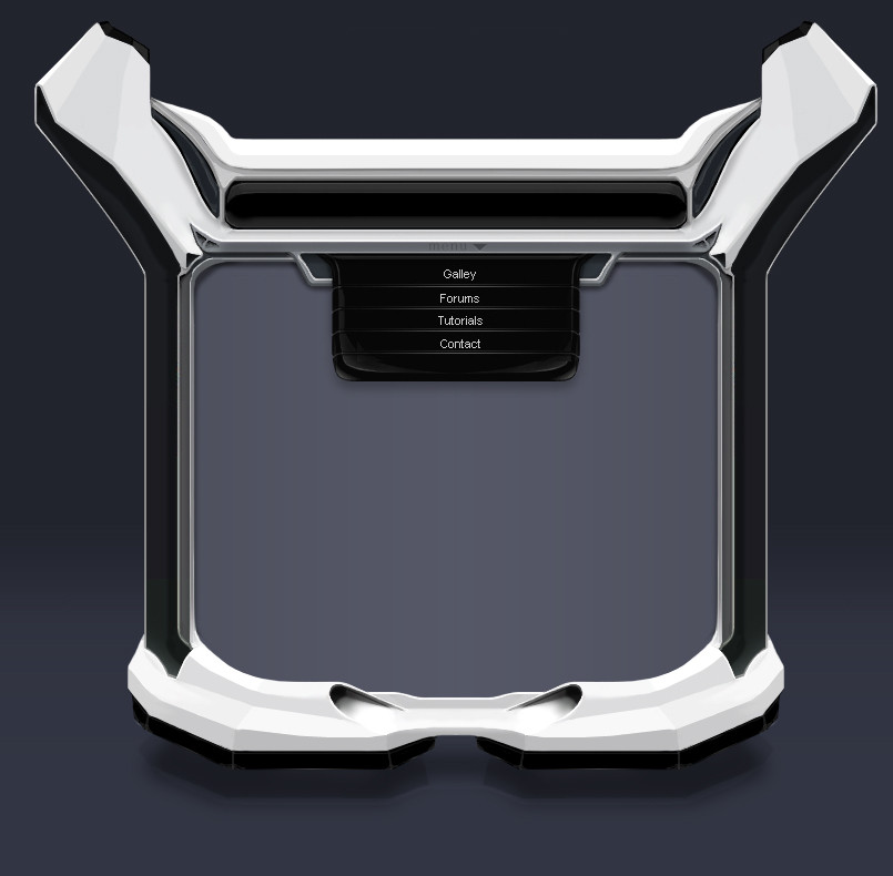
Spent about 6-8 hours on this thing. i see a lot of improvement needs to be done to this thing, but again, I'm not good with fonts, and I like it enough to post it.
Related content
Comments: 36

SimplePine [2008-04-04 04:37:18 +0000 UTC]

hey dude i coded this for you awhile ago.... under a differnt name.... do you rember? i would like to talk to you... simplepine@gmail.com

๐Ÿ‘: 0 โฉ: 0

BreconJordan [2007-09-02 10:44:17 +0000 UTC]

schweet! i love it

๐Ÿ‘: 0 โฉ: 0

incarnateddevotion [2007-08-16 20:54:27 +0000 UTC]

I love this footer

๐Ÿ‘: 0 โฉ: 0

Xiion [2007-06-21 23:49:41 +0000 UTC]

sexy, wish it were mine!

๐Ÿ‘: 0 โฉ: 1

El3ment4l In reply to Xiion [2007-06-22 00:01:48 +0000 UTC]

thanks, wanna buy?

๐Ÿ‘: 0 โฉ: 1

Xiion In reply to El3ment4l [2007-06-22 00:51:36 +0000 UTC]

lol i wish! no moneyz tho :'(

๐Ÿ‘: 0 โฉ: 0

theBlackBoard [2007-06-19 10:03:14 +0000 UTC]

Man love this temp

๐Ÿ‘: 0 โฉ: 1

El3ment4l In reply to theBlackBoard [2007-06-19 17:42:21 +0000 UTC]

thanks man lol

๐Ÿ‘: 0 โฉ: 0

BladeAce [2007-05-30 04:44:22 +0000 UTC]

Very nice

๐Ÿ‘: 0 โฉ: 0

yushii [2007-05-16 18:26:17 +0000 UTC]

great work man!

๐Ÿ‘: 0 โฉ: 0

Mattoman [2007-04-19 01:21:01 +0000 UTC]

Certainly got skill mate. lovely work

๐Ÿ‘: 0 โฉ: 1

El3ment4l In reply to Mattoman [2007-04-19 02:14:52 +0000 UTC]

thanks man

๐Ÿ‘: 0 โฉ: 0

bj1605 [2007-04-15 20:30:55 +0000 UTC]

*adds to favourites* If this isn't amazing then I don't know what is...

๐Ÿ‘: 0 โฉ: 1

El3ment4l In reply to bj1605 [2007-04-15 21:49:30 +0000 UTC]

well thank you lol

haha BJ

๐Ÿ‘: 0 โฉ: 0

the-danzor [2007-04-04 12:22:36 +0000 UTC]

amazing layout,color and effects.

great job!

๐Ÿ‘: 0 โฉ: 1

El3ment4l In reply to the-danzor [2007-04-04 18:44:09 +0000 UTC]

thanks
remember, there are no layer effects or anyhting, this is all one layer

๐Ÿ‘: 0 โฉ: 0

escanive [2007-03-23 08:38:57 +0000 UTC]

The template is really great, but I think you should concider cleaning up the code in your online portfolio. I see you're using tables, which really isn't the best solution. I understand it however if you don't want/have time to learn XHTML and CSS, but all I'm saying is that you should concider it.

But again, the template was really cool so I'll it!

๐Ÿ‘: 0 โฉ: 1

El3ment4l In reply to escanive [2007-03-23 11:33:15 +0000 UTC]

yep that's the reason it's messy. and i promissed myself i would get some help from some other peeps for V2 of the portfolio.
thanks fot the comments!

๐Ÿ‘: 0 โฉ: 0

forexus [2007-03-21 22:50:39 +0000 UTC]

Awesome design!

๐Ÿ‘: 0 โฉ: 1

El3ment4l In reply to forexus [2007-03-22 00:24:57 +0000 UTC]

thanks man

๐Ÿ‘: 0 โฉ: 0

El3ment4l [2007-03-14 06:32:14 +0000 UTC]

thanks guys.

๐Ÿ‘: 0 โฉ: 0

Barbroute [2007-03-13 17:07:05 +0000 UTC]

great ! nice effects and shapes
but i don't like the menu :/

๐Ÿ‘: 0 โฉ: 0

P3xelArt [2007-03-13 17:06:04 +0000 UTC]

Some really nice work mate keep it up!


cheers!

๐Ÿ‘: 0 โฉ: 0

kakefat [2007-03-13 13:56:39 +0000 UTC]

Awesome

๐Ÿ‘: 0 โฉ: 0

Couto [2007-03-13 13:55:51 +0000 UTC]

! done!
awesome design! very simple very metallic...

๐Ÿ‘: 0 โฉ: 0

Zmash [2007-03-05 16:31:43 +0000 UTC]

yeah, the footer is great!.
but the navi is a bit to gib, make it smaller. great work

๐Ÿ‘: 0 โฉ: 1

El3ment4l In reply to Zmash [2007-03-05 18:26:37 +0000 UTC]

yep im working on it, and i just have to code it. ive pretty much redone the nav. ill announce my site launch in a journal when im done.

๐Ÿ‘: 0 โฉ: 0

Axertion [2007-03-04 23:03:40 +0000 UTC]

cool man, some parts seem kinda etchy and yea, the fonts need some work like you said

๐Ÿ‘: 0 โฉ: 0

EnzuDes1gn [2007-03-04 06:49:35 +0000 UTC]

hmm i like it , especially the footer and the sides , not really loving the header areas , but the rest is pure sex

๐Ÿ‘: 0 โฉ: 1

El3ment4l In reply to EnzuDes1gn [2007-03-04 14:44:56 +0000 UTC]

cool cool, i can see what you don't like. i think the header doesn't look very good either. too much gray ill see if i can fix that.

thanks for the comments guys

๐Ÿ‘: 0 โฉ: 1

EnzuDes1gn In reply to El3ment4l [2007-03-04 15:53:57 +0000 UTC]

always welcome mang

๐Ÿ‘: 0 โฉ: 0

krazytim [2007-03-04 01:20:06 +0000 UTC]

Nice man

I really like the corners.

๐Ÿ‘: 0 โฉ: 0

EmpireFX [2007-03-03 20:48:15 +0000 UTC]

very nice dude

๐Ÿ‘: 0 โฉ: 0

ZeroniX-Designs [2007-03-03 20:48:01 +0000 UTC]

Really nice work but iยดd add a dark outer glow to give it more depth.

๐Ÿ‘: 0 โฉ: 0

kailor [2007-03-03 20:42:39 +0000 UTC]

Nice!

๐Ÿ‘: 0 โฉ: 0

chaoslight [2007-03-03 20:35:31 +0000 UTC]

awesome dude.

๐Ÿ‘: 0 โฉ: 0