HOME | DD
 Electric-Bluejay — When the Rocks Fall

#black #cole #colored #cool #cute #drawing #hair #manga #shading #traditional #ninjago #ninjagocole
Published: 2015-05-02 14:18:31 +0000 UTC; Views: 811; Favourites: 21; Downloads: 0
Redirect to original
Description
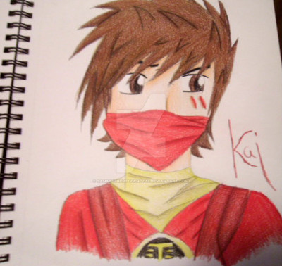
Don't mind the random title.So I stayed up until stinking midnight to draw this nut... But he turned out all right, so I can forgive him. ;D
I was actually redrawing a super terrible piece I did 6-7 months ago. I'll put them up together in a minute here.
Oh, and sorry his name got a bit cut off. Scanner issues. Too lazy to fix.
HOPE YOU LIKE!!
Oh by the way, PLEASE CRITIQUE! I don't mind criticism at all, cause then I can work on making things better! Thanks!
~NINJA OUT~
Related content


Comments: 22

Overall

Vision
Originality
Technique
Impact
Going to be brutally honest here, watch yourself.
This does not impress me.
For the following reasons:
The coloring is very sloppy, there's not enough lighting, there's very little symmetry going on here, which is critical for drawing realistic anime/people.
But there are also upsides this drawing.
I cheer you on because the lighting of the hair is bearable, you used contour and best of all: You tried.
I know my ratings are low, but I love art that is realistic and creative, not to say this is not. But this is only what I think. I was always told that if you want to be good, you need to harden yourself to criticism. I respect hard work, so don't stop. If I have offended you in any way, disregard it. Use what I said against you to your advantage and learn. I know you are a worth while artist, I can see it. So please, don't. Give. Up!
👍: 0 ⏩: 1

Thank you so much for your honesty~! c:
I am rather sloppy with the coloring... I just don't know how to improve. I'm not very good with colored pencils, and I haven't figure out how to make the coloring smooth. It always looks so scribbled. 0.o Have any tips?
Mmm, lighting.... I'm not sure what you mean by that.. Do you mean more shine in some places? Cause I've figured out how to shade...
The head goes by the manga symmetry. I use a specific grid/outline every time I draw the face. So do you mean the body/neck has bad symmetry?
👍: 0 ⏩: 1
-Nods- Your welcome. I really am sorry if I seemed harsh, but I have One thing that helps me with sloppy coloring:
1. Color lightly following the lines of the shape you're coloring/painting/ whatever it is you're doing. In this case, I'd use a grey colored pencil.
2. mark an area where the shinny places of the hair/ whatever you're coloring, would go. But do so lightly!
3. following the contour of the object, add another layer of color with more (Just a tiny bit more!!!) pressure using the same color.
4. Use a darker color, in this case black, lightly color the undersides of the hair to make it look more real.
5. Following the contour of the object give it a final layer.
It took forever for me to master that but it really works! So fun to use!
Lighting? Yes, make them shine a bit more, but there are places you should make darker too.
Yes, the head was fine but the body had little semmetry.
Once again I'm so, so sorry if I sounded mean, I just go overboard with wanting to help improve people....
👍: 0 ⏩: 0


First off, THIS IS ABSOLUTELY AMAZIN'!
Everything down to how you wrote his name is fantastically done. Like how you got all the details on his outfit, too. e.deviantart.net/emoticons/b/b… " width="15" height="15" alt="
")
The shading around his facial features looks good as well, pretty spot on with that. Also nailed his eyebrows quite well ;D
Also like the shine on his hair, that came out good. Seems staying up after midnight payed its toll. e.deviantart.net/emoticons/l/l… " width="19" height="19" alt="

I never get over how nicely/adorable the way you draw eyes, I love them so much. ;v; Shading and all!
This piece is mighty fine, my friend! You're improving fast, keep it up!
-Ande
👍: 0 ⏩: 2
Thanks Taichou ^u^
👍: 0 ⏩: 1
I agree that this is a marked improvement, but you can't always encourage. You must point out some flaws in order for them to me fixed. I assume this artist here wants to get better, so you have to criticize them just a little.
👍: 0 ⏩: 1
Yes, that is very much true, but this drawing is perfect the way it is, is it not? ;D
Why criticize it when it isn't necessary? :'D
👍: 0 ⏩: 1

I see where she's coming from. There's little symmetry, the coloring and countour is pretty sloppy too.
I like it and all, but you've gotta admit it could be WAAAY better.
👍: 0 ⏩: 1
Maybe it could, but this is her style and this is very well, one of the best she's done!
To be honest, tho, the colouring goes well with the outline because if it were too dark and shaded, it would throw off the line art.
👍: 0 ⏩: 1
True, true! I'm willing to admit that it's a really adorable drawing!
👍: 0 ⏩: 0

Overall
Vision
Originality
Technique
Impact
The ratings look more harsh then they should; I think originality and vision are irrelevant in portraits (unless the portrait breaks some rules that make them so).
Your technique is in the upper level of learners I've seen. I gave a high impact score plus some vision for attention to detail, such as making the hair the same shape as for the original Cole. Also there's feeling-you made him feel alive!
The greatest deficiency is the arms-Cole's arms should be big enough to be cut off by the edge of the page.Your next step should be study real muscle structures. You should easily find charts on Google Images...
👍: 0 ⏩: 1
Thanks so much for the critique!
Yes, I do admit I need some work on muscle structures... Guess I'll go work on that c:
👍: 0 ⏩: 0

Woo! Finally did my first critique!
Nice Cole!
👍: 0 ⏩: 0

STOP MAKING ME FALL FOR THE OTHER NINJAS!!
Kai: What'd you just say?
👍: 0 ⏩: 0


THIS LOOKS SOOOOOOOOOOOOOOOOOOOOOOOOOOOOOOOOOOOOOOOOOOOOOO VERY VERY VERY VERY VERY VERY VERY VERY AWESOME!!!!!!!!!!!!!!!!!! AWESOME!!!!!!!!!!!!!!!!!
👍: 0 ⏩: 1
Thanks so much, Nim! ^^
👍: 0 ⏩: 0