HOME | DD
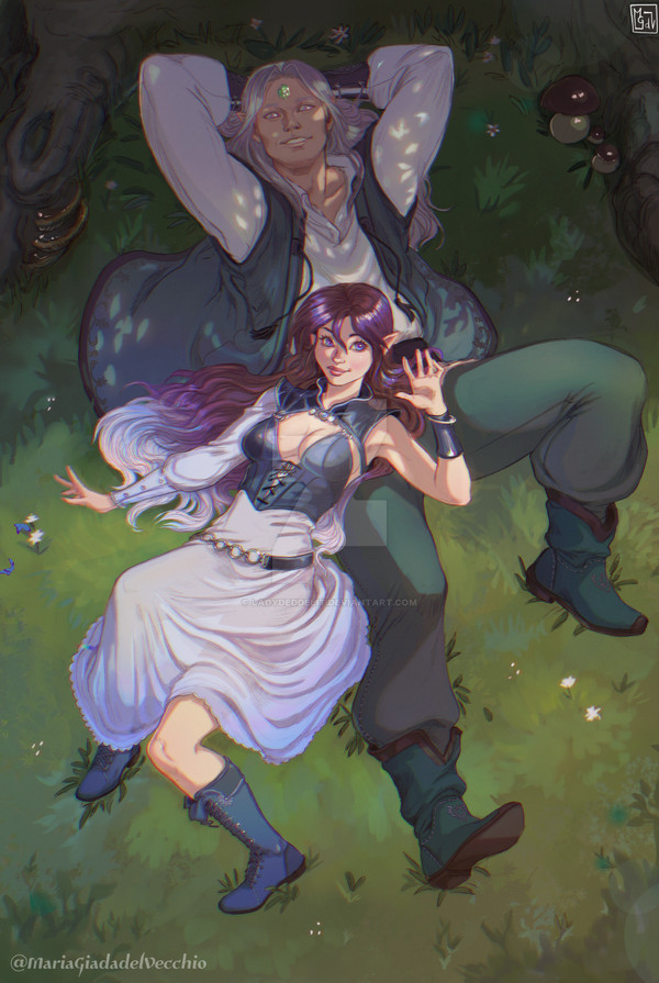
 ElsaKroese — Spindrift, chapter2 page 87 (no txt version)

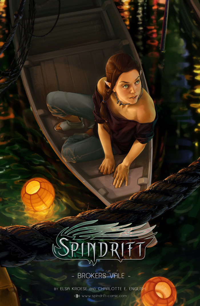
#fantasy #spindrift #webcomic #cheves #fantasywebcomic
Published: 2014-10-31 19:06:22 +0000 UTC; Views: 5979; Favourites: 113; Downloads: 0
Redirect to original
Description
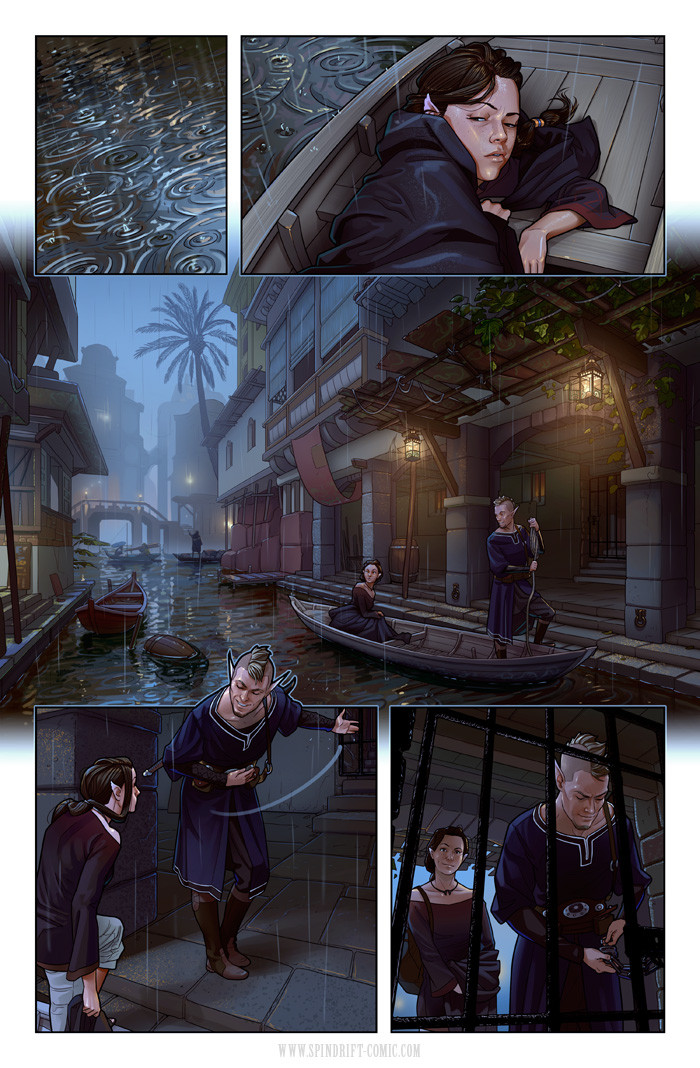
Sometimes a page just feels off to me, and I can't really decide why. This is one of them. I think my style has become too realistic in some panels, and I'm not sure if I'm entirely happy with that. It was never a conscious choice I made, it kinda just happened. I think I'm going to try to go back to stylizing a bit more again, just to keep things in balance. I hope you guys like it though! <3Read spindrift:
 This page with text: www.spindrift-comic.com/comic/…
  New readers start here: www.spindrift-comic.com/comic.…
  Le facebook www.facebook.com/spindriftcomi…
  I've a tumblr now too
 ") spindrift-comic.tumblr.com/
spindrift-comic.tumblr.com/  Vote for us on TWC: topwebcomics.com/vote/13319/de… (I'll put up a new incentive somewhere next week )
And a tag to one of the super nice Spindrift fan-arts I've received. Cute!!:
Related content


Comments: 17


I still think it's very lovely, but compared to your previous pages, maybe the colours could be pushed some more, overall? Maybe that's why it feels more realistic in here - the more natural, desaturated tones.
👍: 0 ⏩: 0


Woo!! It's awesome to see a new page
It does look pretty realistic. I look forward to seeing how you'll stylize your art
Thank you for tagging my art

👍: 0 ⏩: 0

Finally we get to see a page! I think I squeaked a little when I saw this in my inbox.
The more realistic style is very much obvious, it shows that you've come a long way, but choosing to go back and make it more stylized is a good choice since you can easily get carried away with detail and such  (Smile)")

👍: 0 ⏩: 0

ooh another page  (Wink)")
👍: 0 ⏩: 0

The backgrounds are stunning! I might see what you're saying about the realisticness in panel 5 - my first reaction was that it was indeed very photorealistic! Displays your skill wonderfully though, the colours are amazing. But if more stylizing feels better, then go ahead. We shall continue to enjoy the visual feast that is your art, no matter the direction. <3
👍: 0 ⏩: 0

I really like panels 2, 4, and 7. They're just super duper pretty.
👍: 0 ⏩: 0

I will probably never get over the awesomeness of your art! I love looking at the pages without word balloons to spot as many charming little details as possible!
Keep up the wonderful work
👍: 0 ⏩: 0
