HOME | DD
 elusive — Interface - Aeon
Published: 2006-12-13 17:17:28 +0000 UTC; Views: 10342; Favourites: 53; Downloads: 0
Redirect to original
Description
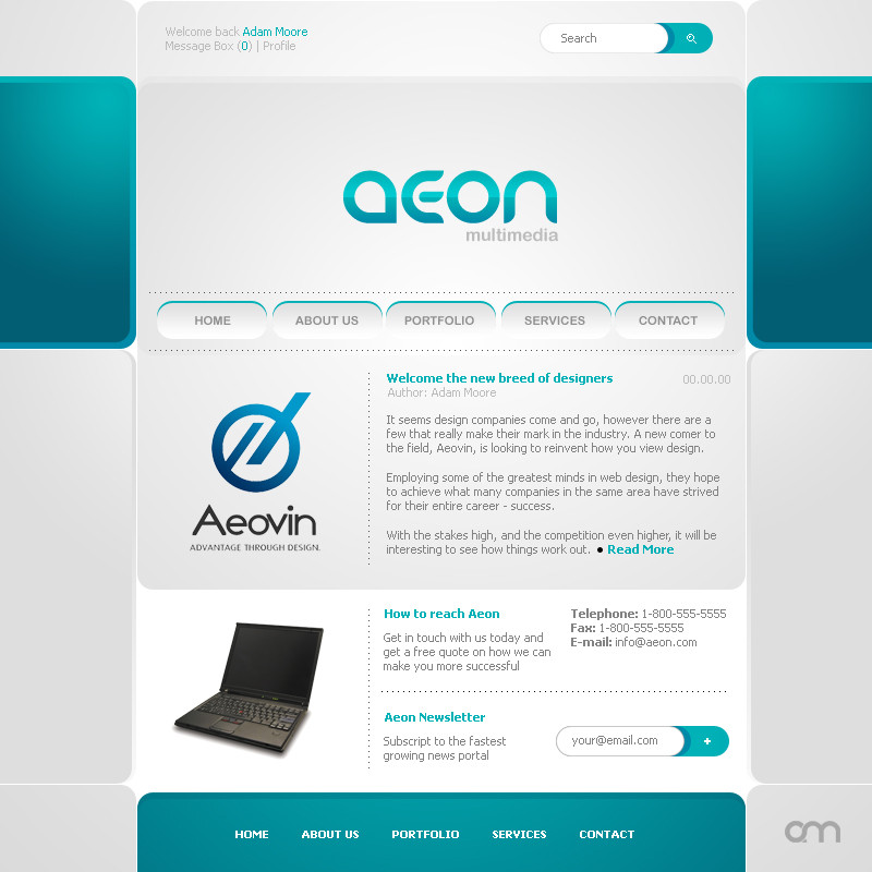
Made this during lunch at work. ~1 hour. PhotoShop CS2.Logo design for Aeovin by Burnsflipper & Aeovin design.
Related content


Comments: 91

Your style is very nice. Super structure. Maybe navigation should be darken (but it's my opinion).
👍: 0 ⏩: 1

Yeah the nav is something i'm looking into.
👍: 0 ⏩: 1
It's would be nice to do orange or yellow navbar.
👍: 0 ⏩: 1
")
I think it will be great to do orange.
👍: 0 ⏩: 0

Looks really nice, but could you explain me what those box-thingies left and right mean?
As usual really clan, which makes it great. <3
Ah and I would make the space inbetween the "segments" larger, would have a nice effect.
👍: 0 ⏩: 1
Thanks. The things on the side are nothing
👍: 0 ⏩: 1
Okay, I just thought of them being ubar irretating and actually quite spoiling the fresh colors.
:]
👍: 0 ⏩: 0

really cool layout
maybe you'd change the main navi buttons
 (Smile)")
👍: 0 ⏩: 1


Thanks...It means a lot to me from you. As usual.
👍: 0 ⏩: 0


 (Wink)")


yay elusive...kick ass layout we have here, i would just change the main buttons but its good has always..
keep it up mate
👍: 0 ⏩: 1
I added a little to that menu, not much, but enough to make it a bit better. I see what you mean in your comment though.
Thanks again for the feedback
👍: 0 ⏩: 1
If you don't mind. I can remove it if so. Your work is so pretty
👍: 0 ⏩: 1

no I dont mind at all, it is just a test logo ")
👍: 0 ⏩: 0

I like the simple yet refreshing look.
👍: 0 ⏩: 1


<= Prev |