HOME | DD
 elusive — Interface - Envira
Published: 2007-01-16 20:00:47 +0000 UTC; Views: 16844; Favourites: 150; Downloads: 0
Redirect to original
Description
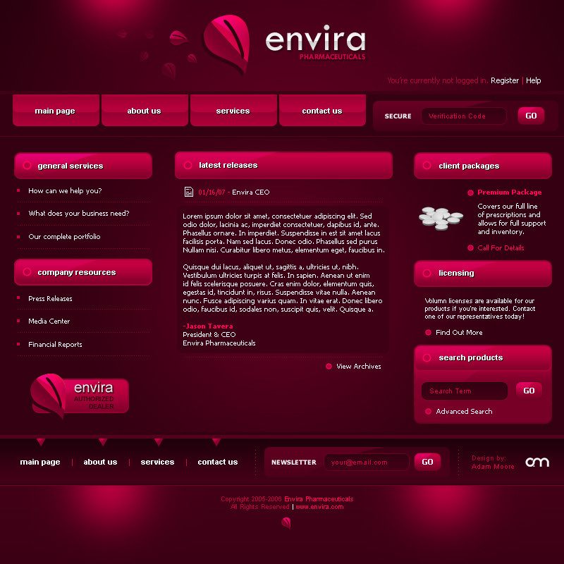
Just messing around.Photshop CS2.
*Everyone else has these nifty point-of-light designs, so I made one of my own
")
Related content


Comments: 134

i love your color choice man (Wink)")
👍: 0 ⏩: 1


Maybe a little too much color? Overall the design looks nice though
👍: 0 ⏩: 1

Yeah I had some urge for wine-colour for some reason
👍: 0 ⏩: 0


this is great ... i love the style of this one, beautiful colors and great work overall ... love it
")
👍: 0 ⏩: 1

lovely! did u make the shapes in Illustrator?? or all PS?
👍: 0 ⏩: 1


that's cool. i'm doin somethin' like that too. because the reflection effects are soo last year. hehehe.. love this.
👍: 0 ⏩: 1

 (Smile)")
👍: 0 ⏩: 0


agreed, this is great stuff! so clean and professional!
👍: 0 ⏩: 0


It seems to me that you've always incorporated "point-of-light" and thematic colour in your work. It's one of the things that makes your stuff stand out-- even amongst all the designers couch stuff.
If you take you designs and convert them to black and white; they're still going to have graphic strength and balance.
You're very considerate and respectful of colour and value.
👍: 0 ⏩: 1
That was a very nice comment, and longer than most. Thanks a lot for the kind words, gunplanet
👍: 0 ⏩: 0


I like the idea, although a lot of the elements there feel a little disconnected. Light is a useful design cue, but if there are too many points vying for your attention it can distract instead of attract.
For a design like this to work well, it really needs a complimentary colour to break up the overall monotonal aspect.
Great work overall
👍: 0 ⏩: 1
I really just wanted to use the wine colour is all haha
👍: 0 ⏩: 0
| Next =>