HOME | DD
 elusive — Interface - Digital

Published: 2007-02-10 20:00:43 +0000 UTC; Views: 8244; Favourites: 44; Downloads: 0
Redirect to original
Description
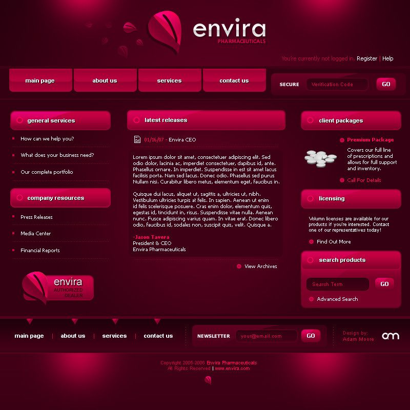
Random thing I put together.Stock images from Stock.Xchng [link]
Related content


Comments: 86

Sweet design. Perhaps just too crowded, and perharps too much light blue. Yeah I know it's kinda the center of attention here, but it's not easy reading anything in the blue color. I hope that made sense.
👍: 0 ⏩: 1

Yeah it did  (Smile)")
")
👍: 0 ⏩: 0


I like the concept but it's way too graphical.
It looks compressed and busy.
👍: 0 ⏩: 1
Yeah it's a bit TOO much. I'll try to fix that in my next design
👍: 0 ⏩: 0

looks nice at a glance. but when u zoom in its rather busy man.
👍: 0 ⏩: 1
Yeah hopefully I never have to make this one
👍: 0 ⏩: 0

")

Hi mate, u have a very good control of color, and font. Today, web designers tend to use more icons instead of text in variety of fonts, however, we can always make a beautiful site without any icons. Very clean and neat design, I really love the blue buttons.
Maybe the reflections on the background are a little bit too much?
👍: 0 ⏩: 1
Yeah I went overboard a bit, I knew I was never going to use this so I figured why not...
Thanks for the kind words by the way
👍: 0 ⏩: 0


It looks clean and cool!
Is it programmed and everything?
With html for example?
👍: 0 ⏩: 1
I think this would be done in flash. It looks too intensive otherwise.
👍: 0 ⏩: 1
Yes, that will look good!
Where have you learned to make flash-pages?
In some school or something?
I would like to teach ^^
")
👍: 0 ⏩: 1
Like everything else, I taught myself.
👍: 0 ⏩: 1
Maybe we could have a talk on msn?
I maybe have it already but i don´t think so ^^
👍: 0 ⏩: 0

Nice layout - I think if you gave the centre panel a little more room it would be perfect - not too much though - or it will look like a phpBB template
I like that theme-wise it all 'belongs'....
 (Wink)")
👍: 0 ⏩: 1


again, another great design thats gonna give this deviation about 4 pages of comments...lol
👍: 0 ⏩: 1


hmm, i dont like the header, the rest is ok.
But i've seen much better works of you.
👍: 0 ⏩: 1
👍: 0 ⏩: 0


I have to say I find the layout confusing - there's too much vying for attention, and not much clear focus on what the page is meant to be conveying. It feels really busy.
And I know it's minor - stationary is as in a car. Stationery is as in paper, which is what I think you meant...
👍: 0 ⏩: 1
haha
👍: 0 ⏩: 0

Thanks Kwaku, still not comparable to you.
👍: 0 ⏩: 0
Thanks Kwaku, still not comparable to you.
👍: 0 ⏩: 0


Hey thanks! And thanks for the 
👍: 0 ⏩: 0

great one ! but u should put the elusive head logo
beside designed by ... it will look funny! lol
great job clean and clear!
👍: 0 ⏩: 1

i like it . maybe it's too bright for my eyes. however nice work

👍: 0 ⏩: 1

| Next =>