HOME | DD
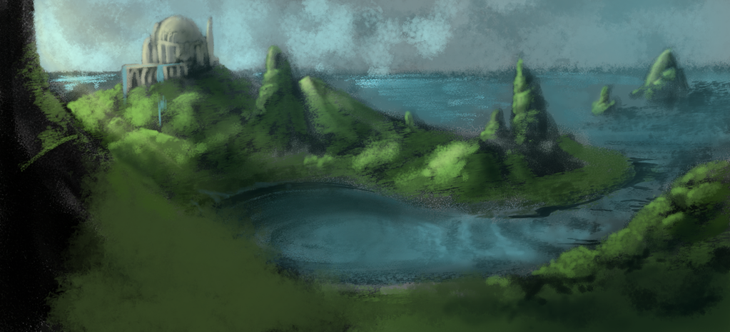
 ElysianImagery — Landscape Study 1
Published: 2013-03-14 08:33:04 +0000 UTC; Views: 345; Favourites: 29; Downloads: 0
Redirect to original
Description
Hopefully the first of MANY MANY MANY to come. One thing I've always been sort of terrified of....backgrounds...landscapes... to me for the longest time they held absolutely no interest, and no need in my pieces. If anything they were a fairly zoomed in area to create some ambiance around a character. Better yet, a window behind the character that looked out into an even smaller space.Well this year I'm saying no more to that. I'm taking backgrounds and landscapes into my own artistic hand and learning how to do them and also hopefully along the way more about composition, lighting, and atmosphere. Three things I also need to work on.
So here's the first one!
PS: my other issue.... I know what to know everything there is to know about that building. What is it? Who lives there? Why was it placed there? What does it represent?..... Oy... The issue with creating worlds XD
Related content


Comments: 13

Overall
Vision
Originality
Technique
Impact
First I'd like to say that I can relate to you somehow because I'm no professional at making backgrounds and am trying to learn how to do it as well! Well I can say that I love this landscape painting. It has that look that it had been painted on canvas, as if it was a traditional art piece and your lighting and shadows are alright as well! But I'd have to say that the piece is quite gloomy because of the lack of light. Perhaps you could have added more sun rays or such, unless you intended the piece to be overcast?
But seeing as you mentioned that you are trying to paint backgrounds this is already pretty decent and there is nothing particularly anything "wrong" with the piece ^_^
I'd definitely frame this painting and hang it on my wall. Good job!
👍: 0 ⏩: 0


Vision

Impact
I love the way you've handled the lighting aspect of this piece!
I can see each individual spire being worked nicely into this, as they are quite interesting natural rock formations,
. You've really created something note-worthy. All of the grassy hills around this lake are absolutely astonishing, and the shades of the lake seem to fit the rest of the piece perfectly!
I admit that the sky does look nice, but is a bit blotched.
Also the building could have a little bit of improvement such as, giving it more depth.
For a first try at something of this standard is absolutely wonderful!
Overall I really like it, and i'll let you off with the building and sky because of how you've done everything else!
i'll give this one a Nine out of Ten e.deviantart.net/emoticons/s/s… " width="15" height="15" alt="
 (Smile)")
👍: 0 ⏩: 0


This is a pretty good study, especially for an early one on landscapes. The overall picture does look a little blurry/smudgy, but you can still tell what everything is, and the colors chosen and the lighting in this is pretty good. So yeah, this is certainly pretty good, especially for an early attempt. I think maybe I might also get off my tail about practicing landscapes and backgrounds and finally do some studies of my own, this helps to encourage me to do it as well.
👍: 0 ⏩: 1

Thank you so much for the feedback I appreciate it
👍: 0 ⏩: 0

remember perspective in your buildings, it looks kinda flat :3
But the small islands are very well done
And the light and shadows on most too
👍: 0 ⏩: 1
How so on the perspective of the building? Can you explain a bit better as I would love to try to impliment that better
👍: 0 ⏩: 1
the dome looks okay if you take away the rest, looks round(I'm terrible at explaining...)
but the front wall looks completely off. The part that in logic would be smallest, is largest.
In perspective what is further away is smaller than what's close(this you know very well), this also goes for things that's taller than what's in front. It'll still be either smaller or the same size(then it's huge).
And even if it's above the horizonline you can still see the water on top of the terrasse, wich in reality would be impossible.
I hope that helped, I'm terrible at explaining, and my lack of english expressions don't make it better xD
👍: 0 ⏩: 1
I think i understand what you were saying with that ")
👍: 0 ⏩: 0

This is very pretty *_* ..... *packs bags and moves into picture*
👍: 0 ⏩: 1
Thank you so much O.O I can't tell you how much it means to hear that. This is something I definitely need honest support with *hugs*
👍: 0 ⏩: 1
daaw! you are very welcome X3, I love the dreamy fantasy feel to it <3 I can't wait to see more! I'm quite similar in the sense that I really avoid doing backgrounds ( unless it's for commissions) I also find them challenging and find myself spending waaay to much time trying to get decent composition X3, you've done brilliant though I do really enjoy this piece especially the pool of water! I really love how that is placed and the rippling! :3
👍: 0 ⏩: 0