HOME | DD
 emberInc — Nothing Is Sound
Published: 2005-09-04 15:07:51 +0000 UTC; Views: 6322; Favourites: 13; Downloads: 1452
Redirect to original
Description
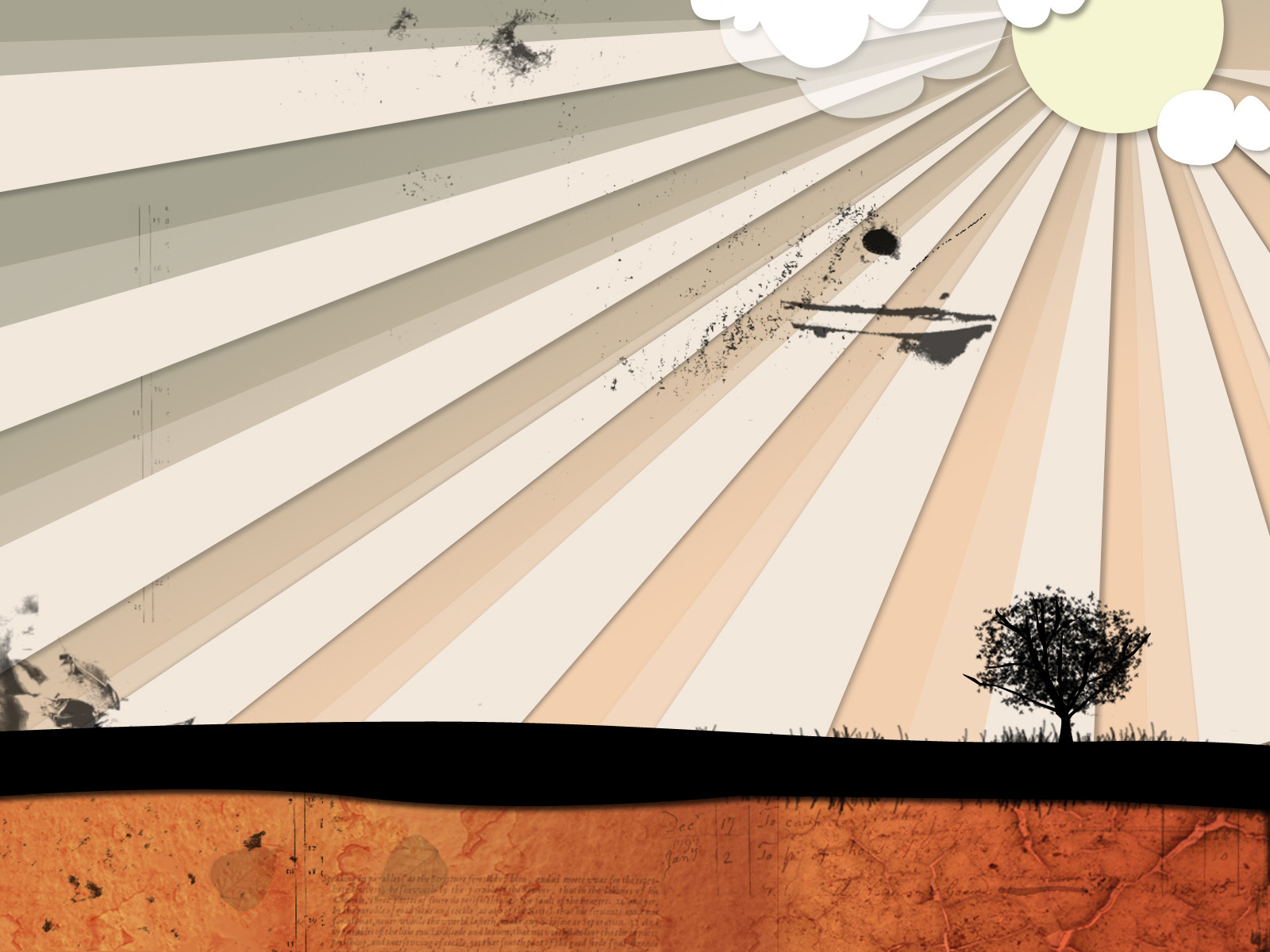
mmm.. grungy")
Based on the CD Cover of Switchfoot's new album: 'Nothing Is Sound'
100% produced by me in Photoshop CS2
hope you'll like it

--------------------------------------
Credits:
Stock photos by =resurgere
Grunge brushes: [link]
Switchfoot, the band, for the idea

Related content


Comments: 15


Hope you don't mind, but I've been using that as my desktop background for a while because it's just THAT cool
👍: 0 ⏩: 1

Why of course I don't! ")
Thanks a lot for the +fave by the way.
👍: 0 ⏩: 0


lol i first thought switchfoot when i saw this then the description said switchfoot. awesome.... very nice! all it needs it the man climbing the ladder.
is the album already out in malaysia?
switchfoot rocks.
👍: 0 ⏩: 1
haha, yeap switchfoot rocks
I dont think the album is already out yet, but the cover is already all over the net.
👍: 0 ⏩: 0

The idea is quiet nice, but you need to improve more the quality of your work
Have a nice day !
👍: 0 ⏩: 1
thanks, but it would be nice if I know what's lacking
👍: 0 ⏩: 1
The whole idea is interesting, the sun to the right and the use of light rays like spreading some kind of 'happiness' is nice too  (Smile)")
The idea of the soil and the text in it is interesting too but maybe it would be better to make either a clean separation between the grass and the soil or to melt them smoothly.
Thanx for asking me
👍: 0 ⏩: 2

i agree with that completely, but would like to add that i really think it would look better without the text
👍: 0 ⏩: 1
hmm... we have to see maybe ur right ! anyway, the choice of the font, its size and the choice of the text to show are capable of changing all the work.
👍: 0 ⏩: 0
I see what you mean, the 'dirt' brushes are there to create a 'grungy' feeling, which has its presence in the cover of the album (switchfoots'), which, the wall is based upon. But I have to agree that i've overdone it to some degree.. but still, the end result isn't so bad. As for other aspects of the wall, as I said, is based on the album cover itself, colours, grass, soil, everything. Anyway, its good to hear your views on this and thanks for replying
Have a nice day to you too!
👍: 0 ⏩: 0

wow. that was fast. thanks, mate
👍: 0 ⏩: 0