HOME | DD
 emeraldiris — From a different lifetime

Published: 2006-04-14 20:26:28 +0000 UTC; Views: 1401; Favourites: 24; Downloads: 60
Redirect to original
Description
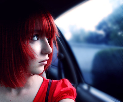
I tried to give this one an antique look.Model: Rebekah

Photographer: myself.
Related content


Comments: 15

wahou, la façon du tu as fait ressortir les yeux est très bonne.
J'aime beaucoup cette photo, son style et l'effet qu'elle produit !

👍: 0 ⏩: 1

Merci! I'm glad that you like it!
👍: 0 ⏩: 1

wow wow wow wow wow wow wow
really beautiful!!!!!!
👍: 0 ⏩: 0

That is a really great job trying to do antique... ")
👍: 0 ⏩: 1
 (Wink)")

I really like this, you've pulled off the antique look well.
👍: 0 ⏩: 0

Aww this one is really cute! I like it alot!
👍: 0 ⏩: 0


Nice Photo ... The antique slightly over-exposed grainy slightly desaturated feel works really nicely ... and it looks like a really honest photograph of your model ... very characterful pose and your composition complements this.
I think the green in the eyes is overdone though, I'd have left this how it was or gone for a desaturated green ... (take the tonal contrast you see in the lips vs skin as a guide to your saturation) ...
great photo tho!
👍: 0 ⏩: 0

This looks very old-fashioned, especially the polka dot shirt. I wonder, what did you do to make it look so overexposed (in a good way). It looks like a magazine ad photo. And cute, too.
 (Smile)")
👍: 0 ⏩: 0

Personally I reckon the contrast is a little too strong on this; the eyes in particular (although I'm sure was the intended effect) seems a little too strong / out of the picture.
Love the lighting
👍: 0 ⏩: 1
I tend to go a little crazy with the contrast, sometimes. ")
👍: 0 ⏩: 0
