HOME | DD
#mechaandstem #characterdesign #mecharobot #emptybrooke
Published: 2015-08-04 10:30:48 +0000 UTC; Views: 1064; Favourites: 17; Downloads: 6
Redirect to original
Description
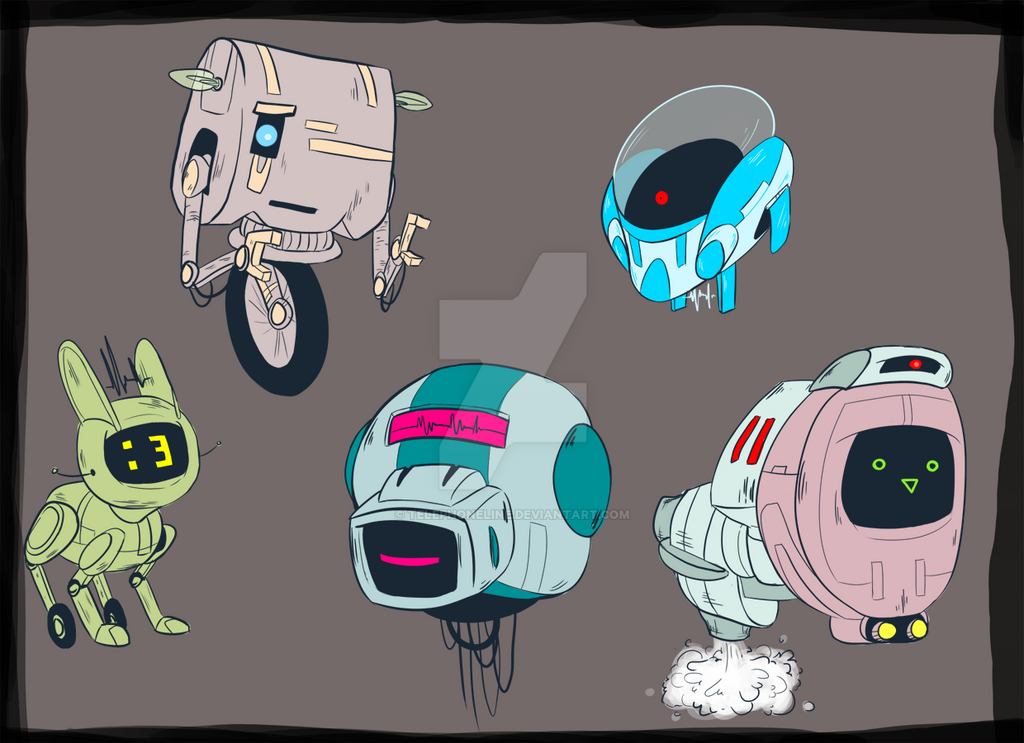
Back to trying to finalize Mecha and Stem's colour palettes. Stem's pretty easy; they're going to be probably white with maybe a little bit of yellow.Still trying to figure out what I like for Mecha. So far I'm leaning a little more towards numbers 1 and 2, but 3 is still a pretty good looking option for me... I just don't like how stupidly american the characters would look when paired up with the predominantly blue flowers that happen to be one of the central focal points of the story I'm writing.
Wrote out a couple PROs and CONs of each colour option to help in maybe narrowing down the options.
What do you guys think?
And just in case you can't read the PROs and CONs (because my writing is stupidly small and illegible at times)
1.
PROs; looks nice, stands out
CONs; might blend too much with flowers
2.)
PROs; blends into environments, rusted appearance
CONs; textures needed (for the rust)
3.)
PROs; stands out
CONS; looks stupidly American, might clash with another character
4.)
PROs; very robo much metal
CONs; could be too bland
5.)
PROs; stands out
CONs; .... super ugly not gonna lie, gender assumptions based on colour
Related content


Comments: 7

I personally love # 4. I don't think its bland at all, It looks really good  (Smile)")
👍: 0 ⏩: 0

NUMBER FOR FO' SHO.
Both Mecha & Stem look fabulous in it- I wouldn't worry about it looking bland since you're using browns, it stands out great, it's a wonderful image.
👍: 0 ⏩: 0
")
Empty-Brooke In reply to TheTubich [2015-08-04 10:43:28 +0000 UTC]
Any input on which you think works better?
(Making note that one of the central focusing points of the comic is a bright blue flower, so I worry about it clashing with Mecha's palette.)
👍: 0 ⏩: 1

Honestly i can t deside between 4,1 and 3.While 4 is kinda generic color scheme for a robot,the desing helps it stand out.
3 is kinda the same,but i can see how it can clash with other characters
1 is has the least problems,just dont use him near flowers
If i HAD choose,id go with 1 and put a thicker outline if you put him near flowers

")
👍: 0 ⏩: 1
Empty-Brooke In reply to TheTubich [2015-08-04 11:08:49 +0000 UTC]
Mkay, I'll keep that in mind for them. Thanks for the input
👍: 0 ⏩: 1
Welcome
I hope i rablings dont cause the trobles
👍: 0 ⏩: 0