HOME | DD
 enixyy — AngelCity

Published: 2011-06-23 08:07:18 +0000 UTC; Views: 774; Favourites: 19; Downloads: 0
Redirect to original
Description
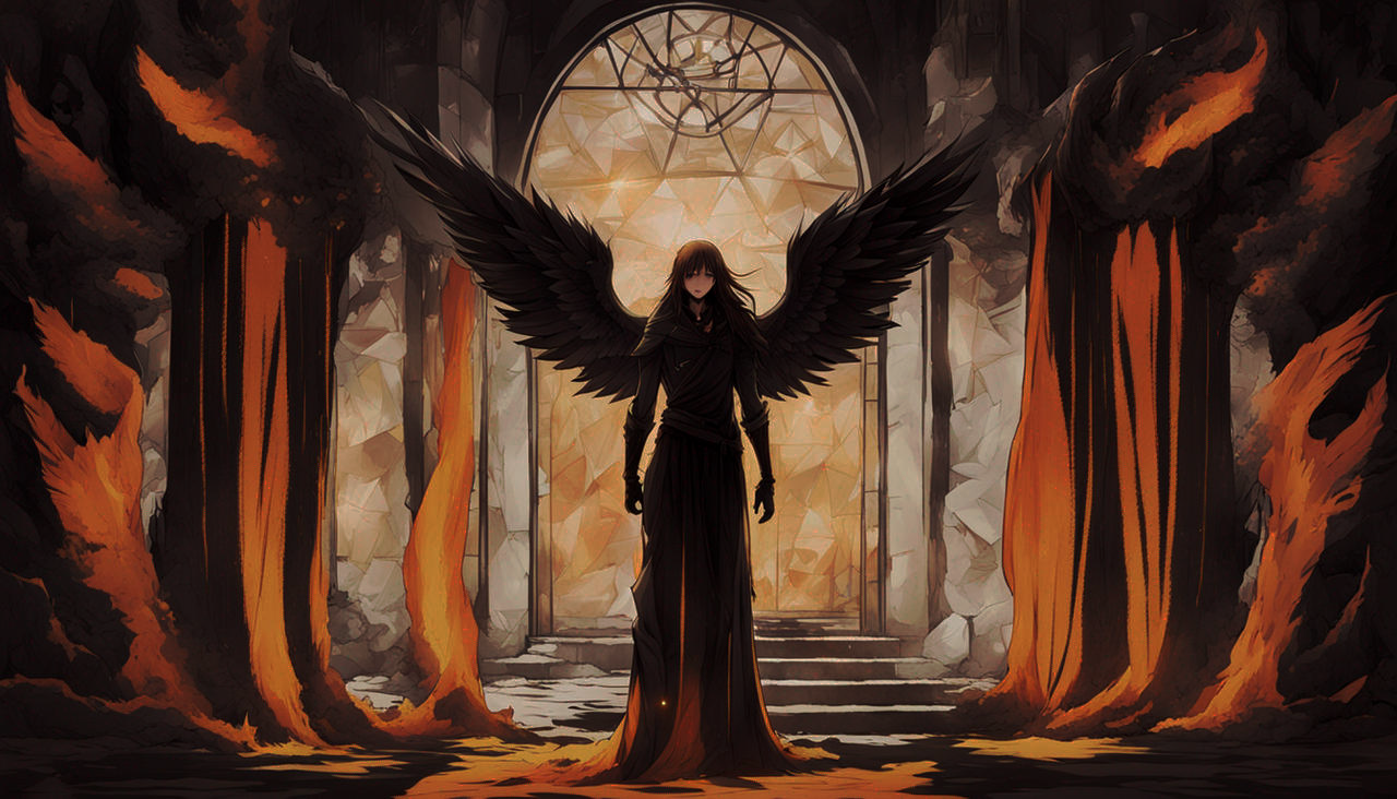
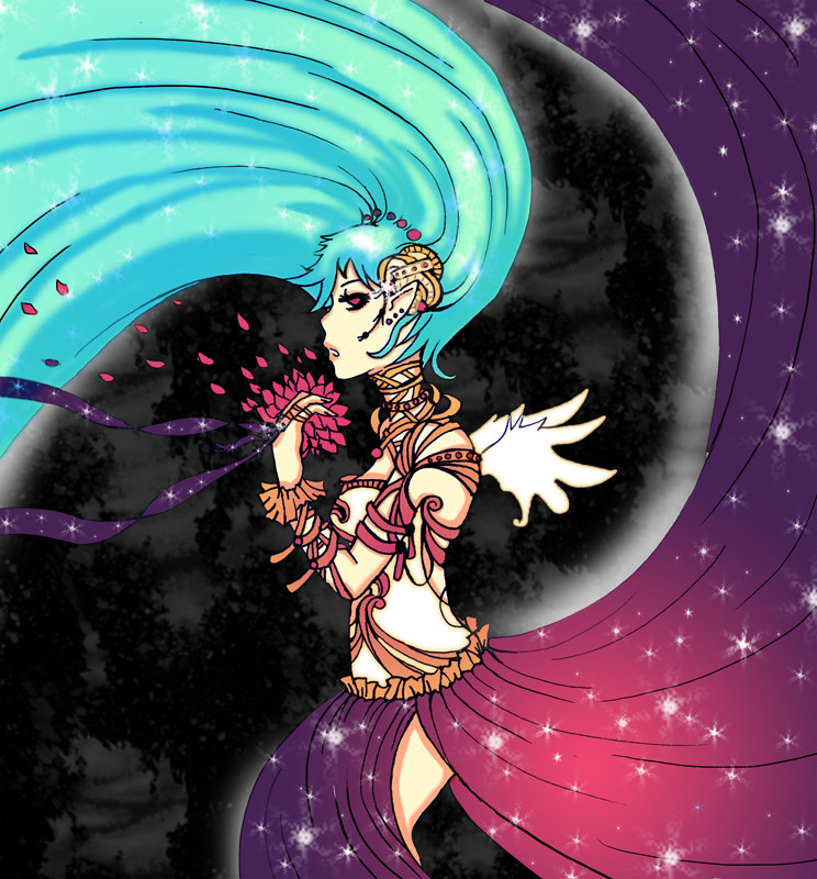
I first did the sketch for this one a while ago, in early November last year.I finally got around to colouring it (:
I had a few variations of the final, im so indecisive. I may change it :\
Related content


Comments: 15

Overall

Vision

Originality
Technique
Impact
Starting with background, it's very nice but those colorful lights shouldn't be there.
Sketch is not messy and that is how it should be. Anatomy is simply awful, doesn't really make sense. Sorry. Her hair is good but you should have shade it little bit more, actually the whole drawing should be more shaded. Wings are in different sizes, I can see what effect you tried to get with that but you failed. It looks like somebody cut her wings. Dress is almost awesome, I don't really like how it's ending. I don't want to comment legs because it's pretty obvious I don't really have anything good to say about them.
Hope you found this critique fair enough.
👍: 0 ⏩: 1

I honestly cannot agree with you. I think in some areas, the anatomy could be improved, and i have improved since this piece was made, however, unique styles is something to take into consideration when you are writing a "critique".
Art "shouldn't" be anything. Art can come in any form that it likes to. Such as clean linework, instead of sketchy linework. The lights SHOULD be there, because i wanted them too, they are the city in the background, Perhaps i could have given an alternative method to make that idea come across, but you gave no alternative for me to think on.
Maybe the "cut wings" was what i intended? did you think of that?
All in all, this "critique" has only come across as an insult, instead of being constructive in any sense of the word.
So, sorry, I don't find it fair, or constructive. I appreciate that fact that you put time into giving me feedback though, but urge you to give alternative ideas, and constructive critisism for future critiques. Thankyou.
👍: 0 ⏩: 1
It's fine. Not anybody needs to like my critiques, right?
About ''shouldn't'' word - that is what I think. Like lights, it's not like they really ''shouldn't'' be there, but I just think drawing would be better if they aren't there.
I don't know about ''cut wings'', but to me, as somebody who didn't draw that, it looks like you were trying to get perspective but it didn't work.
It's just my honest opinion.
It's also good to know what somebody likes about critique or not (instead of starting drama). So, Thank you for your critiques to me, too.
👍: 0 ⏩: 1
no problem, wish you well (:
👍: 0 ⏩: 0

Nice work with the background and her outfit! Just one thing--where is your light source in this one? It'll make your pic more dynamic if you have a single light source to work with. Otherwise, great job
 (Smile)")
👍: 0 ⏩: 1
i think the idea was that it would be coming from the moon, and it shows a little, but if the light source was behind her, the front of her should be darker. woops
👍: 0 ⏩: 0


I love how you did her face, hair, shading, and the background! Her body is a bit too small, though, and her legs are a bit too close together. Also, be careful about giving her "two right feet!" Still, this is very lovely, especially that gorgeous background!
👍: 0 ⏩: 1
Thank you.
Ive worked on my anatomy since this, so hopefully my next few pictures will flow better (:
👍: 0 ⏩: 1
")

Nice, sharp edges on the character and soft edges on the background gives a good depth to it. Colours are good too
👍: 0 ⏩: 1

Very wonderful bright colours and softness to it. I like the patterns on the clothing it's faint but noticeable. Where is exactly is the light coming from? I'm guessing the Moon in the top left corner? but also there is some kind of disco lights in the bottom right corner too. I can see some translucent music notes too what is the meaning behind that? Maybe you could add more toned shadow so it helps bring out the bright colours even more and to establish where the direction of the light source is coming from. Other than that I like it good job Zomo!
👍: 0 ⏩: 0