HOME | DD
 enris — analysis

Published: 2006-06-07 09:33:34 +0000 UTC; Views: 2135; Favourites: 33; Downloads: 385
Redirect to original
Description
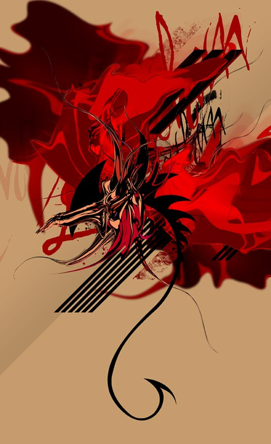
analysis (Smile)") freehandMX
freehandMX
Related content


Comments: 23
")


no prob is an amazing work, i love people can uses just a little shapes and make a composition good as this
👍: 0 ⏩: 0


bu da super ")
👍: 0 ⏩: 0


nice and crispy. it lacks a big (50%) plain color shape as a background or something... i like it nevertheless

👍: 0 ⏩: 0


i've always loved this style!
👍: 0 ⏩: 0

eline saglik , gerek renkler, gerek yapilandirma cok basarili olmus.
👍: 0 ⏩: 0


Ooh pretty! Love this subtle tech style, gj. Only "critique" I have is as mentioned before: the quality of the jpg. Especially with the details in this piece, I think it deserves a better quality jpg.
👍: 0 ⏩: 0


Simple until you look at it in more depth. I think you've done a great job here, it's just a shame you can see the artifacts from the jpg compression.
👍: 0 ⏩: 0

Very nice. It's got a very dynamic feel to it. Nice use of type and color.
👍: 0 ⏩: 0


huh. Freestyle vectors always get me...I love the clipped letters, the C and Q. Gorgeous little barcode, too!
👍: 0 ⏩: 0