HOME | DD
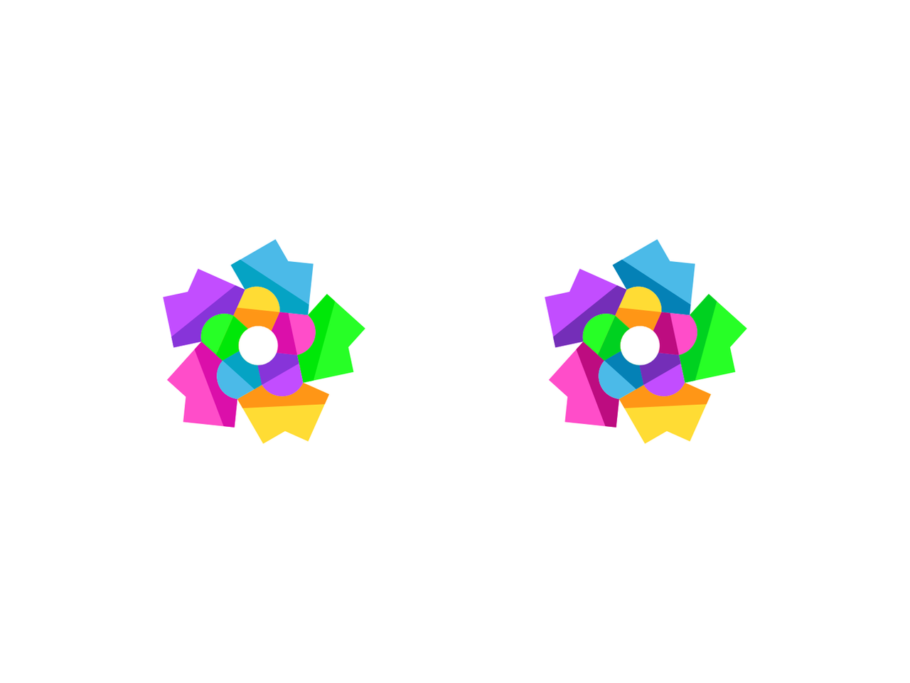
 ENTO-ART — Old vs New, which one is better?
#color #colorful #colors #design #designs #ento #logo #logos #entodesign
Published: 2021-03-29 12:59:31 +0000 UTC; Views: 538; Favourites: 4; Downloads: 1
Redirect to original
Description
Feedback pleaseRelated content


Comments: 7

👍: 0 ⏩: 1

👍: 0 ⏩: 0

This is much better (right one). Still not as I'd have done it but then it's not my design afterall. I'd just rotate so the pentagon formed in the inner ring had either horizontal or left hand side vertical
👍: 1 ⏩: 1
Yes, much more vibrant, which will mean you'll have a harder time working with it on a dark background and an even worse one on colored bkgs
👍: 0 ⏩: 1
Dark is not necessarily black or dark grey. If you use a wine red or deep blue (as examples) it's likely that at least one petal will kindda fade/become visually less vibrant whoch might be detrimental to the whole piece. (not to mention that if your plan is to have it animated full time as in your profile pic, the speed in which it's turning is too fast and makes the whole shape blurry)
👍: 0 ⏩: 0