HOME | DD
 eqosol — amos_compilation

Published: 2004-08-31 04:32:19 +0000 UTC; Views: 1041; Favourites: 12; Downloads: 345
Redirect to original
Description
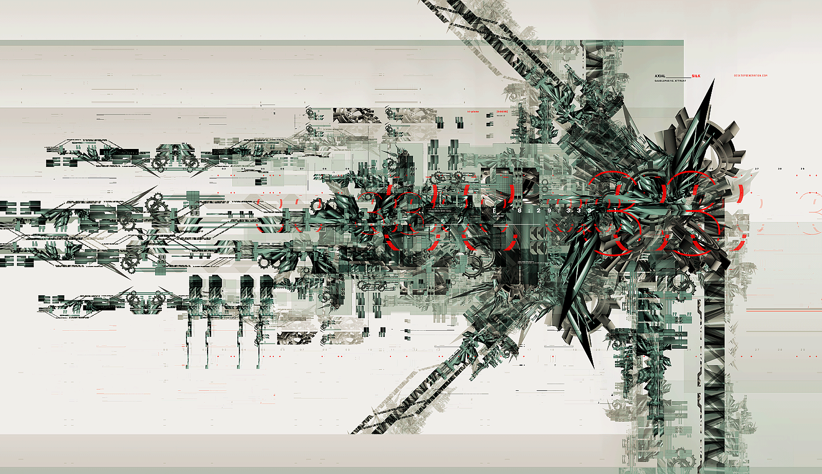
A series of wireframe structure study.Hope you like it
 (Smile)")
Related content


Comments: 22

looks a little low quality but thats most likely my monitor
i really like everything else, nice job
👍: 0 ⏩: 0

feels a little too stretched out but i like it and those models are looking good
👍: 0 ⏩: 0

")

i like it. your feeling for good typography is nice. execellent composition.
offtopic: what is the name of the typo you've used to write "a mos"?
👍: 0 ⏩: 1

thanks for the comment. the font is one of the ds fonts purchased over at [link]
👍: 0 ⏩: 1
 (Wink)")

Yes, I like it! Nice colour combination (grey-red). Awesome details and good composition. Well done

👍: 0 ⏩: 0

Nice job man , but did you resize this? because the pattern in the back looks sorta distorted and the wireframe itself is awefully jagged. If you didn;t resize this you should always render at 2 times the size you're eventually using so if you resize the renders you won't lose any quality.
he models are nice though .. good composition as well
👍: 0 ⏩: 1
yeah it was resized, I appreciate the comment man.
👍: 0 ⏩: 0

thats cool as hell, It came together well I believe.
👍: 0 ⏩: 0


This is great Jesse. The only think i don't really like about this is the default shapes, there isn't many but i think it reduces the quality/impact of the work. I do love the patter in the background, thats a great idea. And the colours are fantastic! Nice one
👍: 0 ⏩: 0

I love the pattern in the background, but if anything it sticks out a bit too much. The render is nice, great choice of perspectives, and the wireframe fits nicely into this style of pic. The logo in red makes this piece though, but on the smaller ones, the tm is too blurry.
👍: 0 ⏩: 1
it's originally double the size so the tm's aren't blurry that way
thanks for the indepth comment.

👍: 0 ⏩: 1


when you showed me it in series form it reminded me of motion right off the bat, you should give it a spin. it'd look dope as fuck, but for now i guess i'll just have to whore this on my favs. sigh..
")
👍: 0 ⏩: 0


Some amazing modeling. As swank said the background pattern is very unique and creates a great effect. Nice colors too. Awesome job.

👍: 0 ⏩: 0

love the patter work in the background. you dont see that very often. the colors contrast well and the 3d looks pretty good although with some global lighting the render would look better.
👍: 0 ⏩: 0
