HOME | DD
 Eques-Design — Equesdesign.com Corporative
Published: 2011-04-20 01:29:06 +0000 UTC; Views: 4315; Favourites: 60; Downloads: 113
Redirect to original
Description
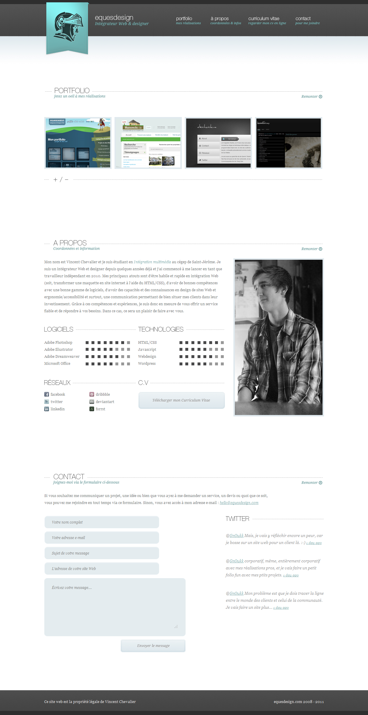
After my questioning in relation to my current website which is not bad too personal for my taste and especially the taste of a potential client, I decided to make a new version is much simpler and more corporate. I created it in 2 days, but I would not worry, I still put the packet. I keep the old site for my personal projects here: [link](Sorry for the bad translation, I'm tired and Google Translate is so... tempting.
") )
)See it here : [link]
Related content


Comments: 40

I wanna learn how to do this stuff in html! so cool I love one page design idea's
👍: 0 ⏩: 0

")

Thanks.
Yes you're right.
 (Wink)")
👍: 0 ⏩: 0

Thank you for comment.
For faving too.
👍: 0 ⏩: 0

Très jolie
Faut arrêter de reprendre mon hello devant les adresses web XD
👍: 0 ⏩: 1
Ton hello? Me semble que je vois ça partout 
👍: 0 ⏩: 1
[link] » hello@jeandelbrel.com
[link] » hello@tchikito.com
Finalement, ces deux adresses, c'est 66.6666% périodique du « partout », avec ton hello plus le mien, ça fait un gros 99.9999% périodique.
👍: 0 ⏩: 1
j'ai rien dit, *siffle*
👍: 0 ⏩: 1
Hhaha, je *siffle* aussi.
👍: 0 ⏩: 0


you`re welcome and you absolutely deserve it.
👍: 0 ⏩: 1


moi juste le bleu de ton logo qui me derange
👍: 0 ⏩: 1
Bah, je suis pas prêt à débattre là-dessus. Ça devient peut-être plus une question de goût rendu-là.
👍: 0 ⏩: 1

Like the minimalism
A minor thing is the boxes indicating skill levels and technologies. A bit low contrast on them and might be a bit hard to look at on some monitors.
But good job!
👍: 0 ⏩: 1
You think I should make the boxes more dark?
Thank you.
👍: 0 ⏩: 1
Maybe just a bit more contrast, not much but some
👍: 0 ⏩: 1
Seriously, I don't think so. In my opinion, there's enough contrast, but maybe you're right. I just don't know what to think about your opinion.
👍: 0 ⏩: 0

Super clean j'aime beaucoup !
Par contre j'aurais aligné les pointillets par rapport au centre du texte
👍: 0 ⏩: 1
« Par contre j'aurais aligné les pointillets par rapport au centre du texte » c'est pas très clair. Si tu pouvais m'expliquer. :S
👍: 0 ⏩: 1
Les pointillets qui entourent globalement tes titres sont pas centrés verticalement avec ces derniers, par contre ils sont centrés par rapport au "+ / -" . Mais ça c'est mon côté perfectionniste qui ressort ^^
Par contre comme l'indique le gars en dessous, c'est vrai que quand on porte plus d'attention sur les box qui indiquent tes niveaux de compétences, ça trouble un peu l'oeil.
Une solution serait peut-être de reprendre la couleur de fond de ton logo pour mettre en couleur les barres indiquant ton niveau de compétence. En plus de ça, ça rajouterait un peu plus de contraste sur cette partie.
Mais là encore ce n'est que mon avis  (Smile)")
Sinon c'est parfait dans son style et pour son utilisation, y a juste ces petits détails qui "gênent" un peu à mon humble avis!
Bon boulot
👍: 0 ⏩: 1
Les détails, ce sont ceux que tu as cité plus haut? Ou d'autres détails?
👍: 0 ⏩: 1
