HOME | DD
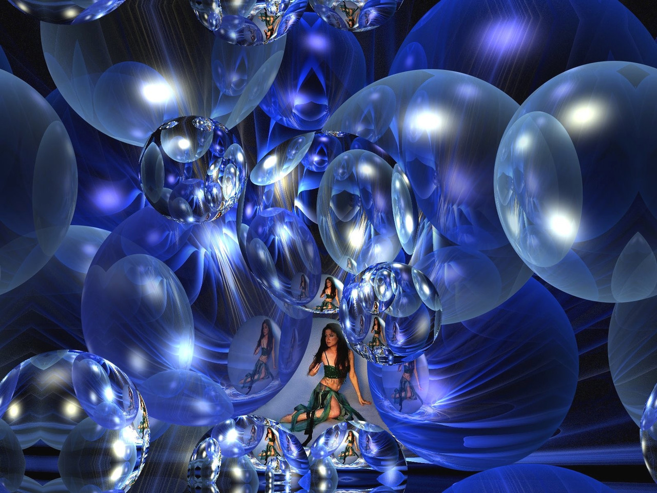
 eReSaW — A touch of spring

Published: 2013-02-10 19:37:07 +0000 UTC; Views: 481; Favourites: 21; Downloads: 11
Redirect to original
Description
apoRelated content


Comments: 7


First off, great job. I like the little flower shapes in the center, and I think the vibrant green in the middle really works wonders for the piece. I'm not so sure whether I like the 'blue shapes at the edges of the flower-middle. I feel it works for every branch, except for the top-left one which is a bit too circular to my tastes. I think it would be more visually pleased if it was more an eclipse-like shape like the one below it.
I also think the piece would have worked better on a black background, as opposed to the blue you currently have. Although the blue makes for an interesting kind of marble-like feel, like in the bottom-right corner, I think a black background would have made the piece pop out a little more.
Overall, I like it, however, it has some points which could make it even better for me.
♥♥♥
👍: 0 ⏩: 1

Thank you for your critical words. It can certainly be improved. But a dark background - this just isn't on. Spring fever are simply bright.
👍: 0 ⏩: 1
I can see why a blue background would work for the theme, yes. It's just that I think that a black background would make the piece pop out a bit more and show off the vibrant colours. (There is also some personal preference involved, though.)
👍: 0 ⏩: 0