HOME | DD
 eric- — Mobile Desktop
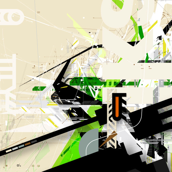
Published: 2002-04-08 06:36:32 +0000 UTC; Views: 11317; Favourites: 46; Downloads: 2786
Redirect to original
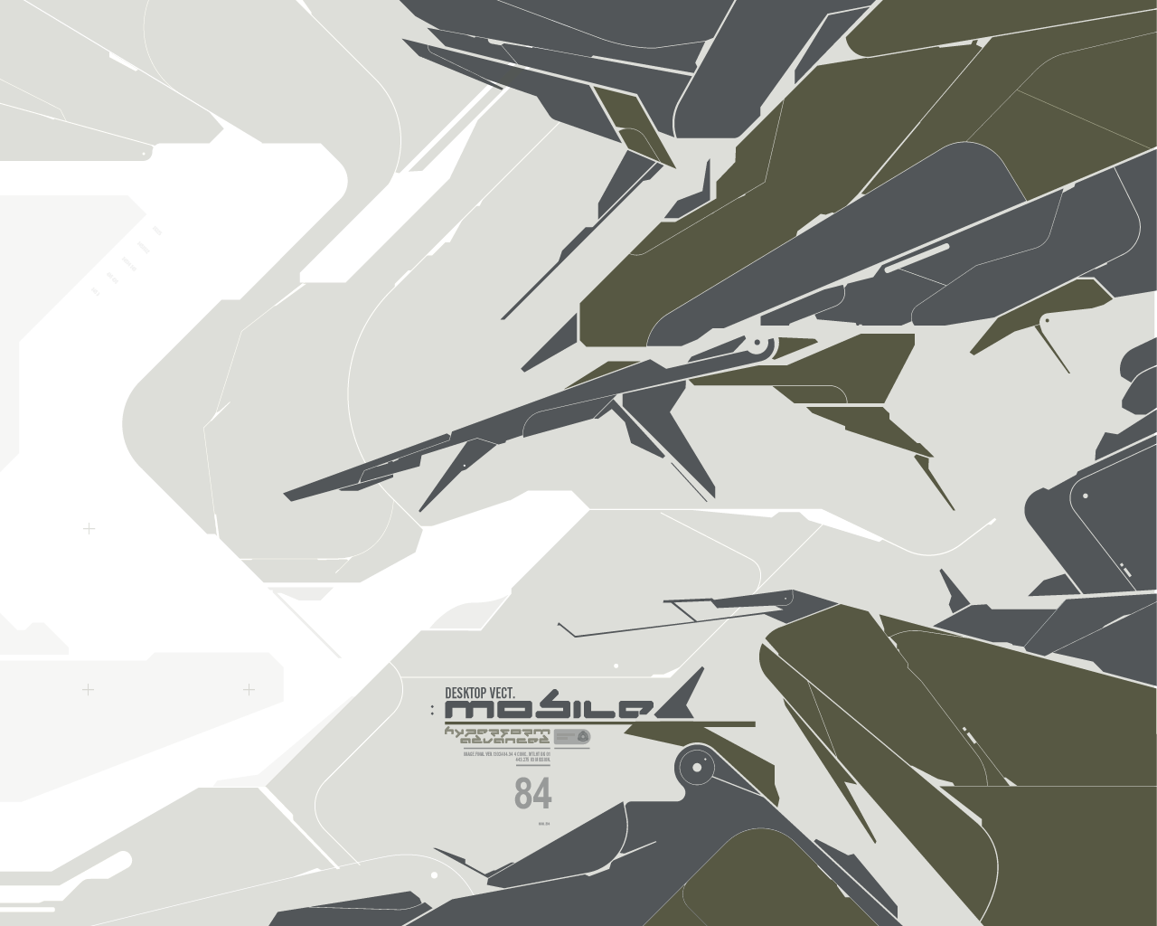
Description
A wallpaper in progress, I may still add some more to it and I might rework the type a bit. Please lend me your constructive critisism and let me know what would improve it.Related content


Comments: 35


nice work. im sensitive to bad typography and this is good, works well.
👍: 0 ⏩: 0


this is extremely delicate vector work, and i think if u do more of these u'll get extremely big here.
to me everything seems awesome... except maybe the middle 'island' could be taken out there. but i donno..
👍: 0 ⏩: 0


")

colors n shapes r great!
but the text bit mit need revising
n i think the trendy +s r bit too big?
duno bout u but i like keepin those tiny decorations tiny and no anti-aliasing
but im expecting a great wallpaper after ur done remaking!
👍: 0 ⏩: 0


just bopping thru deviants and saw this work, amazing shiz bro.. makes me wanan go leanr how its done.. maybe ina few years.. lol.. i love this style.. keep it up
👍: 0 ⏩: 0

....I really, really wish there were classes available around here...
I've got a copy of Illustrator, but I can't do this. No way.
Amazing stuff. I've been looking through your gallery... you do what I wish I could.
-Digital
👍: 0 ⏩: 0


Colors are great, I would just keep it as-is, But add some more typo to it, I think this would be bad ass, as a flash animation, starting out from a object, and all these arms grow out and the white lines grow as the arms are coming out.....That would be insane. Anyways its looking good.
👍: 0 ⏩: 0

yeah nice shapes are colors there dude.
a little reminiscent of 123klan tho.
👍: 0 ⏩: 0

A little too overkill for me. Compisition is nice though.
👍: 0 ⏩: 0


added to fav
-----
See what I see [link]
>_2 [link]
detected......
👍: 0 ⏩: 0

i love this style you've come up with.. *uses* hehe
-----
glasswillow.com
:dancies: Support Dancing Emoticons TODAY! [link]
omg! [link] lookie! [link] oh wow! [link]
👍: 0 ⏩: 0

vectors rock... but you should start that pick at something like 1600 x 1200 or higher so that when you make it smaller it looks less jagged (that will also please some of the people with higher resolution)
👍: 0 ⏩: 0

interesting style, unique, but I dunno how well it'd work as a wallpaper. Like formaldehyde said, looks more like a poster
-----
I Are Ninja!
👍: 0 ⏩: 0

Man i love this. I'd like to use it, 'cept it's too large for my desktop. Another res maybe? (1024*76
👍: 0 ⏩: 0

i just love it... amazing colors, very smooth design... just doesnt fit as a wallpaper. i think the print version would be much better, as a poster maybe, i dunno.
great work though
-----
----------------
» formaldehyde
👍: 0 ⏩: 0

Interesting design and color scheme. I like how it's trendy but with a somewhat different twist from the "usual" trendy stuff. Lol. Hope you know what I mean Anyways, I like this.
daGUY :: DGD2k2
👍: 0 ⏩: 0

Eric, i cant believe it. Every wall gets better. You = one of my fave artists. GJ! +fave
👍: 0 ⏩: 0

eric, you rock. what else is there to say! im not sure if i want to call it looking hitech or .. almost even organic in a way.. love how it blends together!
👍: 0 ⏩: 0

Thanks for the comments everyone. I'm using Illustrator 10 for the whole thing, so I can get a hi-res print of it if need be. The anti-aliasing problems are probably just from the way Illustrator renders thin edges on-screen, I had to take a screenshot of the work in Illustrator for the image. Copying and pasting it into Photoshop kinda screwed up my colors, although was better for the anti-aliasing. Ah well, thanks again.
-----
- eric
http://www.turpentinegfx.com
👍: 0 ⏩: 0

yeah this piece is amazing! but i want a bigger version (1600x1200)! *begging*
the only thing i dislike with the design is the '84', its to high, i would have shrinked the height with about 20%, but thats up to you
like archnemesis said, i wonder what program(s) you used..?
-----
Adelpha
Alternative prison cell: http://adelpha.plastiqueweb.com
👍: 0 ⏩: 0

finally i found a new wallpaper. i loved the one you did before, cant remember the title though. this one is even nicer, very good work
👍: 0 ⏩: 0

.type is good
.i'm not sure about the blue and the dark olive color going together, but i think thats just me
.vector work is great
.all in all i like this. you have some great vector skills. nice job.
-----
.sean
👍: 0 ⏩: 0

Damn eric, your vectorial work is perhaps the best i have ever seen. The style is oh so tight, u must note me on what program u use, if this is just using the photoshop pen tool u are amazing
The colours are very military which is what u were after i am thinking...I am actually seeing a vectorrifle in the center there...which is very cool, not sure if u intended it or not.
The font and typo works amazingly well there, not exactly sure what u could add here to improve this. As Iji said there is a bit of aliasing on a few lines, but that could just be from the compression. Badass work Eric, badass
-----
||D.V.S||
👍: 0 ⏩: 0

kick ass shapes - this would look sweet if you gave the dark shapes a camo texture and some good shading, would turn out to look like some futuristic war machine. Maybe even put a cockpit in there and put a picture of some guy driving it
-----
_. http://r107studios.com ._
👍: 0 ⏩: 0

Actually i like this very much.. A few quips i have with it tho is that. Certain lines look jagged compared to the cleanliness of the rest of the work.. just a few real thin lines i see this happening on.. other than that looks really really good.
-----
elle.
👍: 0 ⏩: 0

Very nice, i like the colors that you picked and i think the text works great with the design cant think of anything you could do to improve A+++ nice work
👍: 0 ⏩: 0