HOME | DD
 eric- — TV6 Teaser

Published: 2001-09-06 04:32:48 +0000 UTC; Views: 8245; Favourites: 36; Downloads: 4429
Redirect to original
Description
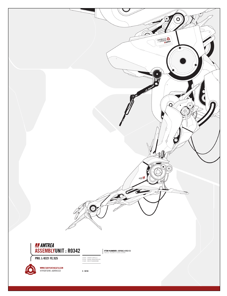
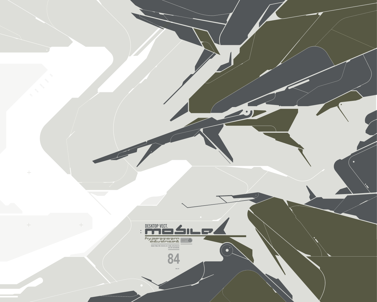
Since Devart is slizno', you can view it fullsize here:[link]
It's pretty much all based off of a picture I had taken of some flourescent lights during my trip to NY.
My only problem with it is that I think there may not be enough substance to it, like it all feels kinda thin and light, it needs some back-bone to it. Guess I'll have to see what I can do.
The www.turpentinegfx.com addy in the wall isn't active yet, should be soon though.
The final design of TV6 may not even look like this, depends on how anal retentive I get while working on it all the freakin' time.
Edit: I also meant to mention that there's a Precurser wall that this tends to resemble; this I realised about halfway through working on it. =\ The resmblance is completely coincidental, this wall wasn't inspired by his or anything. Sorry Pre. =[
Related content


Comments: 18

sanitized, urban, professional and impersonal... simply sexy. 
👍: 0 ⏩: 0


very nice indeed. I need a new wall and you sir, have filled the need.
👍: 0 ⏩: 0

indeed this resembles one of pre. works.
mech.warfare i guess... i luv that wall!! and this one looks very nice too  (Smile)")
congrats
")
👍: 0 ⏩: 0

")


Love it. Going to use it as wallpaper, RIGHT NOW. +fav.
👍: 0 ⏩: 0


Wow this is very nice. I love a light colour work of art :-D. Keep it up ^ ^ ^
👍: 0 ⏩: 0

very cool man, its alot diffrent than alot of wallpapers around here
👍: 0 ⏩: 0

That is fuckin' tight man, u are an underrated designer round here...
composition and minimalism is wonderful...badass piece, very badass.
-----
||D.V.S||
👍: 0 ⏩: 0

great composition...............ya got style man
https://www.deviantart.com/deviation.php? id=219535
-----
--------------shapero
👍: 0 ⏩: 0

Awesome minimalistic piece... I'd like to know what it was made from??
You got ski11z
-----
.
👍: 0 ⏩: 0

Ever since i saw your site, i have been a big fan of yours. I cannot wait to see turpentinegfx.com up and running.
Back to the picture:
I agree, it needs a fixed object to atract attention to it. But at the same time, it gives of this minimalistic feel. Maybe it doesnt need anything more at all? Since its only a teaser for your upcoming site.
Anyways, i waiting for it, i wish you the best of luck!
____// necron
digital.imag ery
coming.soon
👍: 0 ⏩: 0

Damn this is sweet! I really love this. Its light(always a plus) and minimal(another plus.) Keep up the good work
👍: 0 ⏩: 0

I DIG IT MAN! Ya have done a great work with it...really...ITS COOL!
A bit too light for my taste tho
NICE WERK
👍: 0 ⏩: 0

Nifty caosish (is that even a word? ) wallpaper. I like it.
By the way did you desing http://turpentine.ellicit.org/ ? I LOVE that design.
👍: 0 ⏩: 0

Ooooh, spiffy lookin. The way the wide expanses of white and grey clash with the dark blacks is cool. It retains a smooth simplistic feel while still having a slightly techy look as well. Bah, I'm babbling again like I always do XD. Anyway, a cool wallpaper which will no doubt look even better when you finish it.
[Kimiko]
I am lost in my own mind
...are you?
http://www.sekishoku.f2s.com
👍: 0 ⏩: 0