HOME | DD
 Eric-3 — -2016- Catch-A-Ride!

#auto #borderlands #dogmeat #fallout #grand #gta #philips #steve #theft #trevor #claptrap #minecraft #cl4ptp
Published: 2016-12-01 21:21:37 +0000 UTC; Views: 1554; Favourites: 14; Downloads: 2
Redirect to original
Description
Did this for someone.Claptrap from Borderlands, Trevor from Grand Theft Auto V, Dogmeat from Fallout 4, and Steve from Minecraft.
The title is from Borderlands, because that's the only game out of those that I've played to have any knowledge of from experience.


The vehicle was supposed to be a Kalahari from GTA V. I needed a roofless vehicle with room for 4 and that came up in image searches. I couldn't find a front view though, so I had to kinda make it up. I'm HORRIBLE at drawing vehicles even with proper reference, so there was no way that was going to come out decently. I'm not too bothered though since it's not the focus of the drawing.
I left the windows off since it would've covered the characters a bit.
The rest of the drawing came out really smoothly since I've been working on my speed and confidence a bit. Doing the final lines in ink is also so much more comfortable than pencil.
But, in that, I also got a little too careless in some parts in my aim to not dwell on things too long and ended up having to fix a few little things well after scanning the drawing since I didn't notice early enough.
Regardless, I finished this much quicker than I would've just a couple months or so ago. There are definitely problems in this picture and things I couldn't reasonably fix even digitally, but it was good experience.
One thing I couldn't fix is Claptrap's arm that's way too long. I think I was looking at the reference wrong and misjudging the relative length of it compared to the rest of his body. It didn't help that I can't even see his whole body in this drawing to judge proportions with it.
Speaking of his arm, the details on the lower half are totally messed up. Some parts were me misinterpreting the references (some of the cel-shading lines made me look at things wrong), but other parts I don't even KNOW how I got that from the reference pictures after looking at them again.


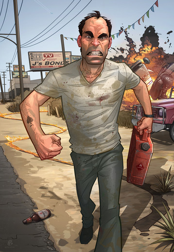
I didn't intend to draw Trevor's head so large. It just kinda came out when I started drawing. Maybe I subconsciously figured it would be better this way to make everyone larger on the page so they're more visible, without cutting anything off the page..?


I didn't do a rough layout of this picture. I just had an idea, figured out the center of the page to start drawing the vehicle, and went from there. I'm fortunate that nothing got cut off or had to be compromised from my idea to fit on the page, considering I did virtually no planning before sketching what would eventually be the final lines.
It was interesting colouring this. Every character was something different; Claptrap had a focus on the dirt on the body, Trevor had a focus on the rough skin and imperfections, Dogmeat had a focus on fur, and Steve had a focus on giant pixels. I actually did a minimal amount of my regular shading method on this because the textures on the different characters made up a lot of the picture already and I didn't feel like I had to do much else afterwards.
Steve was challenging. I didn't think I would colour in the pixels, but I didn't know what else to do to make him look accurate. So I just figured out how to do the pixel look and then used a reference of the Steve model to colour in the pixels exactly as they are on the game model.
Well, almost exactly. Since I was drawing it on paper and without proper measurements, I misjudged the length of his arms. They're about one "pixel" too long. So when I went to colour in the pixels, I had to find somewhere to stretch it by one pixel while I was trying to match the pixel placement of the game model.


Related content
Comments: 7

My XBox 360 experience in a nutshell, sans GTA and Fallout. I always liked Borderlands and Minecraft better anyway.
👍: 0 ⏩: 1

Did you not play much else on 360?
The only thing I played from this picture was Borderlands.
👍: 0 ⏩: 0

so this comment might fall short compared to others, I'm not really familiar with any of the characters. So I blame it on that
I really had to laugh when I read Alex the great
I think one of the first things that sprang to my attention is, that while the colourscheme is fitting and well balanced, every character, as well as the car. Have something distinctly unique with how you coloured them. This makes this really fascinating to look at.
No matter what you say, I think your car is quite decent. How do you even get the idea that you are bad at drawing vehicles, this is not the first drawn by you I've seen. Do you just not like the style? Or what exactly is it? I think this car looks quite narrow, but I think that is due to having the characters oversized and that ended up being part of the concept. I think what it could have used is shininess. But then again, I think it would have distracted and not fit into the colour concept really well and the shininess is somewhat present already, just not in lacquer
I like how you assigned unique textures to each character. The softness of the fur. The skins imperfections The metals I don't even know how to describe the effect (heheh, yeah warning! I had to smile at that too) and also the pixels. I think also all the mechanics of that arm holding the pizza was portrayed really well.
Good job, I enjoyed looking at it and I appreciate all the details that sprang to my attention
👍: 0 ⏩: 1

That's OK. You're not obligated to comment a certain length or comment at all.
Haha. Do you know an Alex?
It was fun colouring them all differently due to their textures; I'm glad you had fun looking at it too!
Well, the car has a lot of inaccuracies when compared to the thing I was trying to draw. Not just with cars, but whenever I try to draw something with a reference and it doesn't look like the reference, I feel that it failed regardless of how it looks on its own. All I see is that I failed being able to do what I intended to do (which is copy something).
Not that I normally want to copy something. I usually make it a point to have things as original as I can. Just that when I meant to copy something for whatever reason, it kinda sucks that I couldn't do it.
I also didn't draw the car very 3D, though this was partly due to not having good reference and having to try and figure out what I was looking at by myself. So it looks kinda flat and overly simple in some places. It's OK for the somewhat cartoony, exaggerated look of the overall picture, but the fact that I didn't mean for it to look like that makes it a mistake to me.
I agree that the car could use a shiny look to it. I was just plain too lazy or tired by then to try and figure out how to give it an accurate shiny look. I often get that way near the end of a picture. I've been working so many days that I start wanting to get it done quickly and let some things get kinda lazy.
I think Claptrap's got dirt and rust on him.
danfasulo.files.wordpress.com/…
Thanks for sharing your thoughts on it! I'm glad you enjoyed looking.
👍: 0 ⏩: 0

What is fitting here (for me) is that I think Kreig and Trevor are brothers somehow.
👍: 0 ⏩: 1

Krieg? The psycho? Sounds fitting.
Thanks for the fave.
👍: 0 ⏩: 1
