HOME | DD
 EricGuzman — Bane Re-Design

Published: 2013-02-14 06:27:03 +0000 UTC; Views: 54999; Favourites: 1072; Downloads: 0
Redirect to original
Description
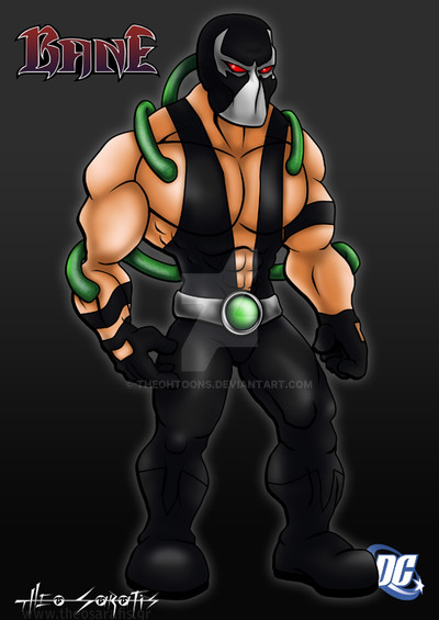
I decided to try a different style so before anyone starts saying that his legs look to small or his upper body is too big this was purposely done as a stylistic choice LOL!! My take on Bane!! let me know what you guys think!!*Bane is property of DC Comics!!
Related content


Comments: 71


I think that this re-design of Bane is incredible. Well done!
👍: 0 ⏩: 0


I love this re-design! It looks like it would fit in a re-vamped version of the Animated Series!
👍: 0 ⏩: 0

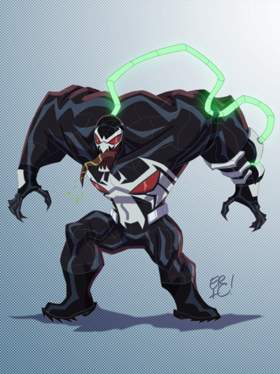
Proportions kinda remind of Venom from Spectacular Spider-Man. Don't know if that's what you were going for, but it definitely works!
👍: 0 ⏩: 0


"YOU'LL NEVER HIT ME! YOU'LL NEVER HIT MY TINY HEAD!"
👍: 0 ⏩: 0


I like this re-design a lot too, mostly because it feels as if you took from the original design, only added on to it and gave it a bit more modern take on it. In fact, I often find myself disliking the ones where they change it so much and his eyes and nose and mouth are overly visible. Most aren't that bad though, but I often find them not using the original design to their advantage, and changing him too much. Still, I think you did a really good job on this.
👍: 0 ⏩: 1

I would love see your art in cartoons or comics
👍: 0 ⏩: 0

In my opinion, the legs are definitely a distraction. Is he really Bane or Gorilla Grodd in a luchadore mask? If the legs were a bit longer, this would be an awesome version of Bane. Again, just my opinion. Thank you.
👍: 0 ⏩: 0

great Bane! Really hope he appears in the new 52
👍: 0 ⏩: 0


I kinda like how non-complex his mask is. A lot of times I get sorta hung up in it, visually, but this is cool. Like it.
👍: 0 ⏩: 1

Thanks Glad you like it!!
👍: 0 ⏩: 0


hahaha, how did Bane ever break Batman with those tiny legs! I'm jesting of course. I like the look, real steam-lined, but keeps it lookin' classic.
👍: 0 ⏩: 0


Love it!! Love the glowy pump ")
 (Smile)")
👍: 0 ⏩: 0

He's fine, top heavy banes are always the coolest. He looks powerful and dominant.
👍: 0 ⏩: 1

Thanks!! I have already done a Two Face if you search my gallery you'll find him as for Scarecrow he's definitely a character I'd like to draw!!
👍: 0 ⏩: 1

Actually this is a pretty damg good take on Bane.
DISNEY, WARNER BROS., DC AND MARVEL, WHY ARN'T YOU HIRING HIM!!!!
👍: 0 ⏩: 1

I think it looks great he should look massive and thats what you have done here! And the detail is great!
👍: 0 ⏩: 1


I like the florescent look that the venom tube has, very cool, as is the whole thing : ]
👍: 0 ⏩: 1
| Next =>