HOME | DD
 EricGuzman — Superman
#dccomics #justiceleague #manofsteel #superman #dcsuperman #manofsteelsuperman
Published: 2015-04-26 20:25:31 +0000 UTC; Views: 115054; Favourites: 1381; Downloads: 0
Redirect to original
Description
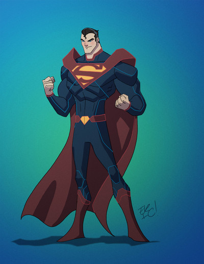
Heres another old redesign I did a little over a year ago of Superman!! Let me know what you guys think!!Superman is © of DC Comics
Related content


Comments: 86

👍: 0 ⏩: 0


Hi Eric. I follow your gallery for some time now and I already know your Superman redesign. What's funny is that it looks like the CW Supergirl's Superman. Not exactly of course, but it quite similar. Look at the shoulder line, the lines on the hips, the shape of the boots, and of course the cape attachement. Today I've looked at your design with a new look. It's funny how things are paralleled or connected sometimes.
I dig your style, I enjoy seeing your stuff. Keep up the cool work,cheers.
 (Smile)")
👍: 0 ⏩: 0


He looks more futuristic, I like it. Definitely a modern version of him.
👍: 0 ⏩: 0


That's certainly a badass Superman! I love it.
👍: 0 ⏩: 0


")

A clever trick to highlight the suit's seams like that.
Having the cape come out of the S-Shield like that, as one solid piece, drives home the old Mantle of Power & Responsibility trope. The belt puts just enough hot-color splash at the waist to break up all that blue.
The pallet could be brighter for this child of the 80s, but the design and its elements rock.
👍: 0 ⏩: 1

Thank You for the comment
👍: 0 ⏩: 1

dude i freaking love you so much
👍: 0 ⏩: 0

The look reminds me of Injustice Superman for some reason. It's still retty good.
👍: 0 ⏩: 1
Yeah I came up with the design before Injustice was even announced but now I can see the similarities!!
👍: 0 ⏩: 1
It's still pretty good though.
👍: 0 ⏩: 0

Looks great, but it could use some more yellow to balance the colours a bit more.
👍: 0 ⏩: 1

While I like the look and overall art, this isn't really suitable for Superman. It's a bit too militaristic and imperial-ish. Something more down to earth and humble would be better.
👍: 0 ⏩: 1


Great futuristic design! IMO a bit more elegant than the initial DCNU redesign, as though it were the same concept better executed.
👍: 0 ⏩: 1

No pure coincidence although now that you mentioned it I always was a fan of eradicators costume!!
👍: 0 ⏩: 0

cool the idea of merging the cape with the symbol! it's futuristic!
👍: 0 ⏩: 1

I like the way the cape is, around the shoulders, though seeing the S not emblazoned directly upon his chest (or on the suit I should say) is a little odd for me.
Still, I like the overall design, and I like that Kal's taken a leaf from Batman's book with the belt. Very cool.
👍: 0 ⏩: 1


| Next =>