HOME | DD
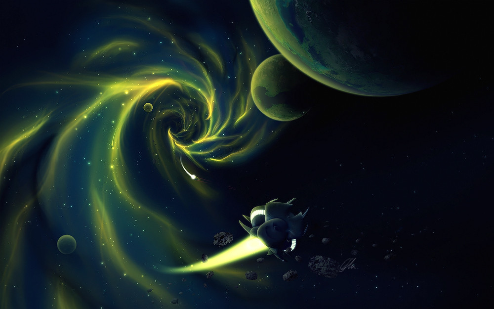
 ErikShoemaker — Cataclysm
Published: 2008-07-09 16:55:09 +0000 UTC; Views: 13316; Favourites: 259; Downloads: 871
Redirect to original
Description
After a long time of manips another space scene. Most of the details are painted from scratch except for the planets which are made with manipulated textures. The space ship is painted with reference of a picture I found on google.")
Actually I'm not that happy with the outcome because it looks more like a cartoon picture rather than a realistic high quality scifi scene...
Hope you like it anyway.
 (Smile)")
hit download for wallpaper resolutions:
1680*1050
1440*900
Related content


Comments: 154

thanks man, glad you like the colors
👍: 0 ⏩: 0


OMG..I love this.You are a big artist man.I like so much the effects.

👍: 0 ⏩: 1
thank you so much ")
👍: 0 ⏩: 1


thank you so much man, glad you like them!
👍: 0 ⏩: 0


cool, I added it to my favorites!
👍: 0 ⏩: 1
wow thanks a lot for your fav and comment man
👍: 0 ⏩: 1
No problem, I calls them as I sees them, and this one looks mighty fine... lol
👍: 0 ⏩: 0

gefällt mir, diese gelben lichter da links sind hammer
👍: 0 ⏩: 1


leider :/ dann gib mal nen Tip wie ich wow draus machen kann
👍: 0 ⏩: 1

ich weiß net^^ die planeten und des raumschiff sehn iwie voll langweilig aus...die felsen bzw meteroiden da in der nähe vom raumschiff sehn auch etwas random draufgesetzt aus und das ganze bild wirkt mir zu eintönig
wobei ich die Sigversion dafür sehr geil find^^ dieses AW taugt als Sig dafür halt mehr wie die anderen von dir iwie
👍: 0 ⏩: 1
ja das geht mir genauso^^ wahrscheinlich liegts daran dass einfach die Details fehlen. Ich werds noch mal überarbeiten, wenn ich zuhause wieder inet habe.
👍: 0 ⏩: 0

The Thing in the foreground seem me low quality..
or Cut Badly...
The Meteorites They seem me flat
And Then you have tried to give more light to the planets?
P.S. It forgives my English...it serves me someone that teaches me him because school doesn't like i has they theach him ^_^
👍: 0 ⏩: 1
Actually the space ship can't be low quality because I drew it in 3000*3000 pixels 
I'm going to fix the meteroids as well, thanks a lot for your comment!
btw don't worry about your English, I understood the most important parts
👍: 0 ⏩: 1

I really like the colours in this piece, I think if you drew more details onto the spaceship, it would look more realistic.
👍: 0 ⏩: 1
yep I think so too, maybe I'll go back and add some more details to it. Thanks a lot for your comment!

👍: 0 ⏩: 0

Niceeeeee aber sieht wirklich bissl aus wie Comik^^
👍: 0 ⏩: 1
jo leider, aber ist mal was anderes
danke für fav und comment!
👍: 0 ⏩: 0


mir gefällt das mehr als deine manips iwie, hat was ")
👍: 0 ⏩: 1
mir nich
👍: 0 ⏩: 0

wie du bereits sagtest, sieht eher wie ein comic aus...
👍: 0 ⏩: 1
joa, weiß auch nich wie ichs anders machen kann -_-
👍: 0 ⏩: 0


errinnert mich iwie an den neuen star wars animationsfilm der bald ins kino kommt
👍: 0 ⏩: 1
lol naja muss ja nix schlechtes sein
👍: 0 ⏩: 0


i see what you mean, but i like that
i know you were maybe going for more realistic but this is no less impressive
i love it
great color contrast and beautifully done
👍: 0 ⏩: 1
thanks a lot for your comment man, glad you like it anyway.
👍: 0 ⏩: 1
<= Prev | | Next =>