HOME | DD
 ernestj23 — Batman vs Predator
Published: 2007-11-14 22:14:46 +0000 UTC; Views: 3711; Favourites: 47; Downloads: 1472
Redirect to original
Description
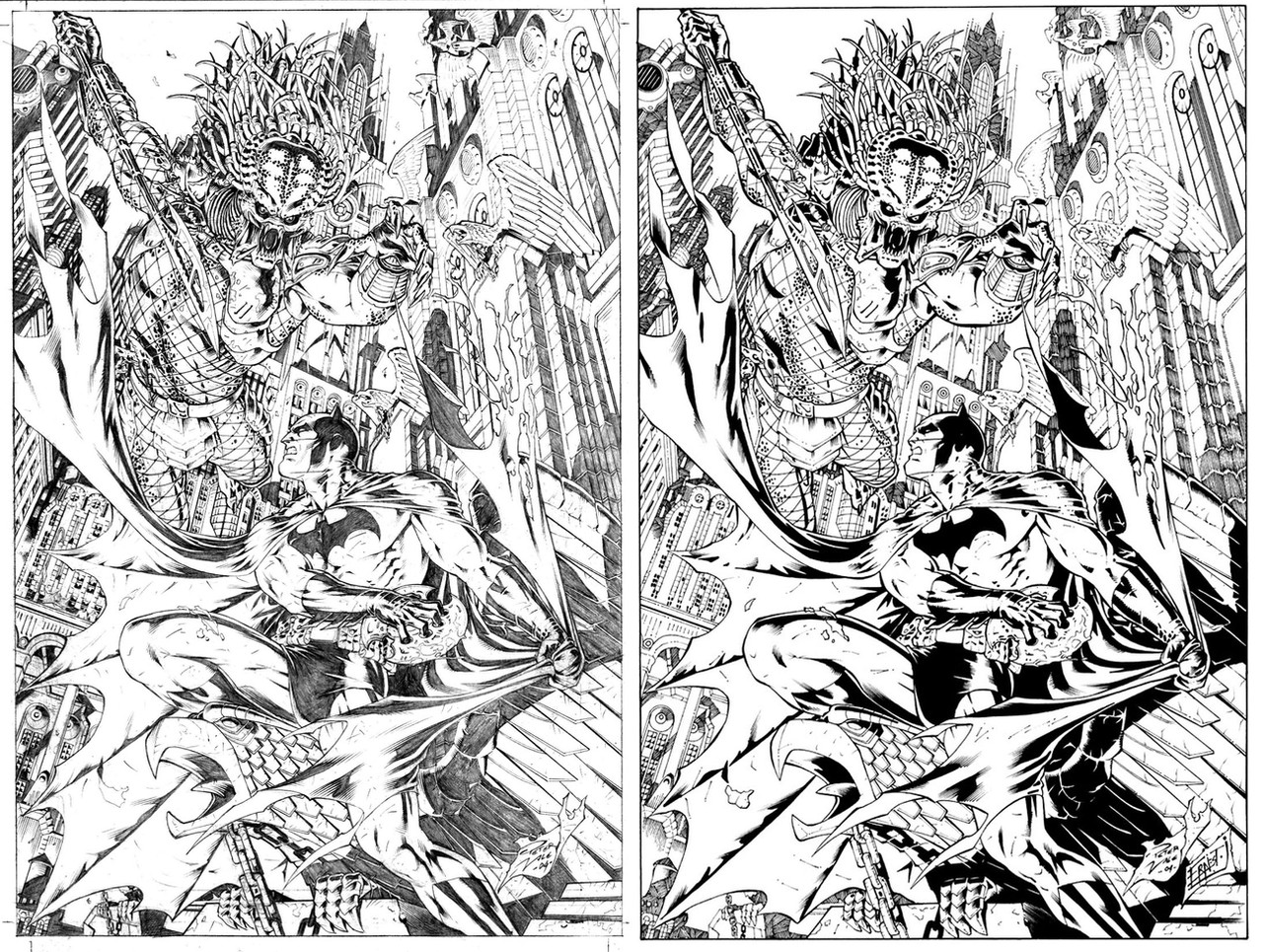
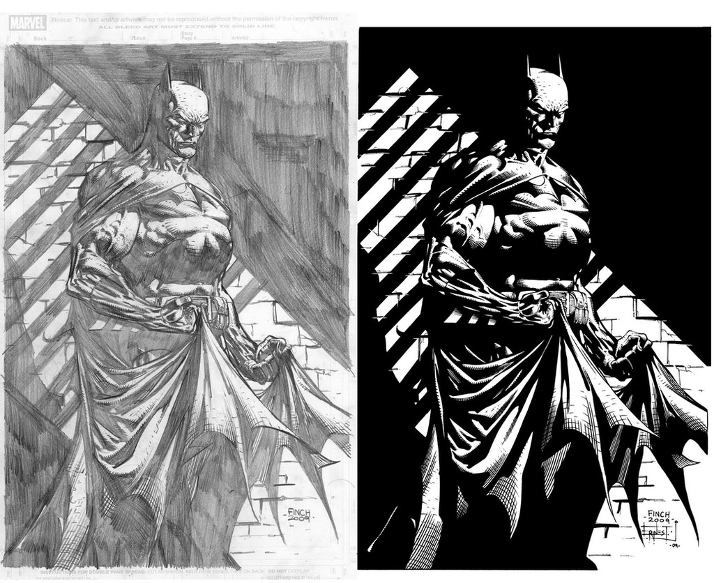
Another sample ink. Batman vs Predator. NUFF SAID!Pencils by:
Inks by: Me
Related content


Comments: 11

It took me almost 2 days to ink it... the detailed kills me...
")
👍: 0 ⏩: 1

Yeah, I thought so (lol). Very cool. Thanks for sharing
👍: 0 ⏩: 0

wow. this is just awesome! would make a kick butt statue. the gothic appearance, the chains on the gargoyle, ferociousness of the pred, just wow!
👍: 0 ⏩: 0

Looks fantastic. But like Splotchy77 said, it needs to POP out just a little bit more. This would look perfect if it were colored, though.
I never really liked it particular crossover, but this piece just floors me. Awesome.
👍: 0 ⏩: 0


I hate to disagree with everyone here, but I've gotta. There's not much Popping out at me in the Inked piece. From the Thumbnail it was hard to tell if it was inked at all. And even blowing it up still left me hanging trying to figure out what was what.
The biggest thing bothering me here is that the Background's not as Heavy with blacks as it should be. This is Gothom City here. It's not a city of Light like Metropolis, it's Batman's home. Dark and Spooky. Killers around every corner. Those buildings behind them need to make the figures Pop out more by Blackening all the shaded peices in it (and not texturing the hell out of them) and making Bats and Pred POP out of this page easier. Make things a lot easier to differentiate between.
👍: 0 ⏩: 0


nice work there matey on the inks if theres any ones you wanna do in my gallery feel free as normal
👍: 0 ⏩: 0

