HOME | DD
 error-message —
Cupidity

Published: 2009-03-13 19:11:57 +0000 UTC; Views: 10583; Favourites: 285; Downloads: 286
Redirect to original
Description
Whether we like it or not, our legacy as designers is ugly. We\'re largely responsible for fueling a culture of consumption.Eric Karjaluoto - smashLAB
Related content
Comments: 81

For the long months I've been dormant on this site, I quickly go over the hudreds of deviations that have been piling up in my messages. Surely enough I find this piece to stick out like a sore thumb in my inbox, being one of the only typographic pieces in my watch list.
I recall your last work which I believe also got a DD 'The Message' in which you used quarkXpress in a time constraint. You've improved a lot since then from what I see and although I had a lot to say about your last DD I didn't fav it due to the flaws which I personally found a tad overwhealming. I'm certainly glad to see that you've been experimenting a lot with type and creating this image as a result.
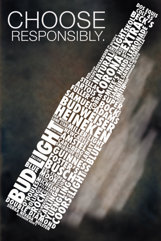
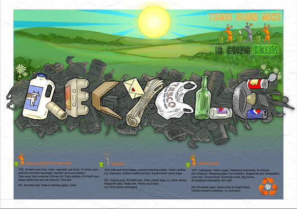
Your concept of strips of paper with text was tastefully done as well as your choice of type (or type treatment). The combination of this with the texture and trash can illutration gives it a lot of depth which I admire most about this typographic piece rather than it just being a flat type design'. Personally I also think the flush right type aligned with the can was a nice touch, a very rare occurance in pieces not related to products. To top it all off you based this design on a very thought provoking statement which even I can relate to as a graphic design student, seeing as I've been questioning myself lately as to what kind of impact I'll have in the design world. Overall this piece is nearly flawless, about the only thing I notice that might need adjustment is the overlayed crumpled texture, though invisible to the untrained eye, the folds from the background actually blend with that of the strips of paper, a little masking around those areas might not be a bad idea. Like I said its hardly worth mentioning since it doesn't hinder the design or the message at all I just like it when people put a lot of attention to their work even in the smallest of details, in general doing so really tends to push an image to the next level even if it seems unnoticable.
Overall this is a very powerful piece which was well executed and I believe fully deserves the DD feature. Congratulations.
👍: 0 ⏩: 1

Its comments like these that make it all worth it. Not only am I honored by your words, I am absolutely astonished by the clarity of your memory pertaining to my first DD. Knowing that I've earned the respect of my peers fills my heart with glee and determination.
I too have been a victim of dormancy on this site. I was kind of going through an inspiration drought which ultimately lead to my absence, however that dry spell is over. I have a lot to prove to myself as a designer and I am more then happy to quantum my growth via deviantART, flickr, Bēhance Network, etc. It feels good to be plagued with inspiration again.
One of my class assignments required me to create a composition using a quote. After I stumbled upon this one (in a computer arts project magazine issue #119), I knew that was it. I wanted to make the piece as powerful as possible. It wasn't that hard to do since that message in itself holds an incredible amount of weight. Most of my work consist of relaying a message so that everyone can take something away from it, whether good or bad. So you can image how fun this was for me to compose.
As of late, I've been experimenting a lot with my designs do to getting over my fear of photoshop. It use to scare the crap out of my because it wasn't anything like illustrator. But now we get along just fine. I'm not as good as I want to be yet . . . but I'll get there. For example that viper you created out of water was SICK!
I really appreciate your comment. we'll speak again soon.
👍: 0 ⏩: 1

Yeah, my issue with illustrator is like yours with photoshop. I've barely scratched the surface of its capabilities and one day I hope to fully tap into its potential. About the only thing I use illustrator for these days is for type and live trace (because I fail, lol). Photoshop's a snap for me because I've been playing with it for nearly 7 years now, theres at least 3 different ways to achieve the same thing. Its all about knowing the tools and from there you have to decide on creative solutions to build whatever vision you may have in your mind. I find a lot of people's issue with photoshop is the use of filters, some people feel you shouldn't touch them over the fear of making your image look 'cheesy' but the more common case is most people use too many in its raw form which either causes images to look chaotic or simply gives it a cheesy look. Knowing what each function does is half the battle of photoshop, the other half is knowing how you're going to apply these effects to complete a desired effect. When dealing with photomanipulation its really all about subtlety, knowing what to add and just how much is key. I think this is why I love photoshop, the construction of an image is like a puzzle and you have to figure out how to put the pieces together.
Anyway, best of luck with your work and hopefully you'll be seeing some new stuff from me as well.
👍: 0 ⏩: 1

the pen tool and pathfinder is the heart of illustrator. If you learn how to use those tools, you will become fundamentally strong in illustrator. the rest is history. All you would have to do beyond that is apply your photoshop knowledge and you're good to go. the pen tool is gonna take some time to master. it tends to act a little wild so you have to learn its behaviors. but once you fully understand it . . . its dangerous. pathfinder is like a cookie cutter . . . use it to add/subtract shapes to get the desired shape you want to create. if you understand graphic symbolism (making logos that can read well while reduced to the size of a dime,etc) then you know everything under the sun can be made when represented with the right shape.
live trace blows dude . . . only use it when you don't have a choice.
the eraser tool is gods gift to illustrator CS3. you'll be able to make quick work of anything with that tool. hold down option/ctrl and you can make a square that will erase any and everything.
the alignment tool is great too. its much more sophisticated then it is in photoshop (or I just don't really know how to use the one in photoshop).
mesh tool and the blend tool is when you're playing with the big boys. when used correctly you can create some insane effects. I'm not even close to mastering the mesh tool but I will some day.
hopefully I helped . . . and I'm definitely anticipating your next piece.
maybe you can show me some things.
thanks for your help.
error-message
👍: 0 ⏩: 1

Yeah, I've fully mastered the pen tool, its essentially the same in photoshop except with extra flexibility in Illustrator (if you don't know how to use the pen tool to extract a model from the background in PS, you're essentially fucked). The pathfinder is a tad tricky, I've only used it to cut out bits and pieces when designing a logo but I haven't had the time to fully explore its capabilities. I usually rely on tracing hand drawn elements if I were to do anything in illustrator. As far as live trace goes, if I ever used it to try and get an accurate vector out of something I'd probably shoot myself first. I've only really used it in relation to grunge themed stuff, specifically rock posters which I had to design as an assignment. I'll agree that live trace is weak but even that has its creative uses. Mesh tool and blend is certainly one of those things I'm afraid to touch. I use blend tool sometimes to blend in lines and add specific steps or create gradients as a base for smoke effects, but essentially I'm still 'thinking in photoshop' as I like to say, and its a wall I'm trying to break down.
Thanks for the watch by the way, I'll try not to disappoint.
👍: 0 ⏩: 1

yeah man hopefully we can learn a lot from each other.
👍: 0 ⏩: 0

I encourage you to become a designer. don't let anything stop you. use this message as a means of change and awareness.
👍: 0 ⏩: 1

Thankyou, I couldn't imagine doing anything else with my life!
Our teachers are very wary of our impact on the planet and encourage us to steer our clients towards better solutions
👍: 0 ⏩: 0

This thought is what is actually keeping me from becoming an industrial designer... Not any other art jobs out there though...
👍: 0 ⏩: 1

don't let this message become a hinderance. I encourage you to become the industrial designer, if indeed that's were you passion exists.
learn all the rules and then break them. make the change. you're more powerful than you know.
👍: 0 ⏩: 1

thanks. im just not sure how it will work out since its a very competitive field and theres not many jobs from what ive heard
👍: 0 ⏩: 1

it's competitive everywhere . . . you just gotta do what chu gotta do
👍: 0 ⏩: 1

true. i guess ill look into it. thanks
👍: 0 ⏩: 1

remember . . . if it's difficult that means you're doing it right.
winners do what losers won't.
you're opposition doesn't last as long as your passion.
sooner or later you'll be amongst the last ones standing.
👍: 0 ⏩: 1

thats really good advice. ive always wanted to be something big
👍: 0 ⏩: 1

go for it! . . . don't hold back
👍: 0 ⏩: 1

Very nicely put together & of course, a great message.
👍: 0 ⏩: 1

thanks a lot . . . I appreciate it.
👍: 0 ⏩: 0

great message!!
this thought also brought me to reconsider my further education.
serving entertainment and consumption !? – aren't there much more usefull things to do?
👍: 0 ⏩: 1

don't let this message discourage you. I think the originator of this quote meant to increase awareness.
go where ever your passion takes you . . . then make a change.
👍: 0 ⏩: 0

that's been on the back of my mind ever since the very first day of my design degree...
👍: 0 ⏩: 1

it is definitely a harsh reality, especially when you're trying to make a living.
but that doesn't mean it has to stay that way.
designers have a lot of power.
👍: 0 ⏩: 1

It's like my age old dilemma. Everybody has a fare traded bio chocolate bar out there. Yet, nobody had the sense to make one of them peanut-free. So here I am, wearing my cruelty free t-shirt, drinking fair trade coffee but eating a Nestle bar some child suffered for just because, well, I'd like to survive my chocolate fix.
I can stop eating chocolate but I can't stop designing. I'd love to make ethical design but in the end, we may ask people to consume better but we still ask them to consume.
This will take a lot of effort from all of us, and a lot of time. But I'm game.
👍: 0 ⏩: 1

that's what I like to hear . . . I'm far from perfect myself but at least my conscious is now equipped with the reality that is followed with cupidity.
your words provide comfort . . . for I know that I'm not alone.
👍: 0 ⏩: 0

thank you . . . this is something that we have to change one way or another.
👍: 0 ⏩: 1

yeah ! step by step, one person after one other
👍: 0 ⏩: 1

thanks!
you have my gratitude.
👍: 0 ⏩: 1

I like your message here, very true, very true.
👍: 0 ⏩: 1

indeed it is very true . . . thanks for your time.
👍: 0 ⏩: 1
| Next =>
